How to create a Squarespace landing page. ( Easy Video Tutorial )
As a website owner, you would have heard the word ‘Landing Page’ a gazillion times. Okay, not that much. But by now, you know that a landing page is an important page capable of turning visitors into customers.
What you may not know is that you do not need to pay for a landing page builder software to host your lead generation landing page. You can host your custom landing page right on Squarespace site and what its platform offers. Yes, you can! You don’t need to spend money on landing page software such as Leadpages. I am sure creating your website on Squarespace is a worthwhile investment and you wouldn’t want to underutilize the benefits.
You can use your Squarespace site to host as many landing pages as your business requires. Well, if you are still not sure what a landing page is, let me be your guide
Related Article: Etsy Vs Squarespace: Which E-Commerce Platform To Choose?

create a Squarespace landing page Video Tutorial
The great thing about using Squarespace is that it’s really easy to create professional custom landing pages, you can simply duplicated your already existing layout and use it as a template. For this tutorial, I am also using the ConvertKit email service provider.
If you’d like to try it out, ConvertKit offers a free plan up to 1000! subscribers, so you can test, how it works for you before committing (woohoo!):
What is a Landing Page ?
Generally, a landing page is any particular page that visitors land on when they visit your website. For example, let's say someone finds one of your url that links to your blog post in search results, that blog post automatically becomes a landing page. The ideal landing page on your website would be the homepage.
In the marketing world, a landing page is a page distinct from other pages focused on serving a specific purpose which is to offer your visitor a valuable product ( lead magnet ) that that will get when sign in for your email list. This can be an ebook, checklist, result etc. In any business, having a landing page is the surest way to grow your email list and make profit.
Let me break it down, remember the time you were told you are going to get a valuable product for free, that all you need to do is drop your email so that they can send the freebie to your email. Then you discover that you started receiving promotion emails from the site. Where you landed to get your freebie is the lead generation landing page and dropping your email to get your freebie is an email marketing strategy.
Email marketing strategy is one of the most effective ways to generate sales. Here’s why
Over 2.8 million people use email and 88% of this large amount of people check their emails frequently. Convince and convert discovered that people who purchase your products as a result of your email marketing strategy spend 138% more than people who never received your email offers. That’s a whole lot of difference if you ask me. That’s not all! If you play your email marketing cards well, which is tailoring your emails offer to each person’s need and not just sending the same offers to everyone, you have a chance to increase your revenue by more than 200%. Whoo! These statistics did justice to the numbers. One email marketing tool I am convinced would help you achieve these numbers is ConvertKit.
An advantage of using ConvertKit is that you can embed their signup form to your Squarespace landing page without needing to create a separate landing page with them.
RELATED ARTICLE: How To Create A Blog In Squarespace
Advantages of using your website to host a landing page
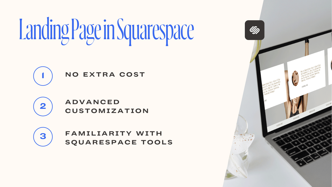
No extra cost:
Let’s face it, Squarespace is quite an investment on its own and spending an average of $60 monthly on both a landing page builder and email service provider software is costly. Hosting your landing page in Squarespace would abate your monthly expenses and give you the chance to optimize your Squarespace investment
Customization:
Most landing page software comes with limited templates and customizations. It wouldn’t be nice if your landing page doesn’t have the brand consistency with your website. Creating your landing page on your Squarespace site gives you the freedom to customize your landing pages to your taste as well as share the same consistency with your brand colors and fonts. Besides that, you can add blocks, images and other elements that would make your landing page stand out.
Familiarity with Squarespace tools:
I am sure writing Squarespace ‘codes’ bores you already, having another software where you need to learn a new set of CSS and HTML codes as in the case of Leadpages may be discouraging. Therefore, hosting your landing page on your website would save you from series of ‘how to’ google search
Why a cover pages isn't the best option for your landing pages
You may be tempted to use the cover page option available in your website for your Squarespace landing page. While that's okay, here are some few things to take note about Squarespace cover pages.
First, one of the goals of creating custom landing pages is to collect contact information from visitors for further marketing strategies and sadly, cover pages don't allow you to embed a form from convertkit or any other email campaigns softwares apart from MailChimp -- the Squarespace email campaigns software.
Another thing to take note of is the flexibility. A normal page layout is more flexible than cover pages, you can add text block, and there to get your desired look, but it isn't so with cover pages.
A step by step guide on how to create a landing page on Squarespace
Let’s get right into how to create landing pages on Squarespace. A dedicated landing page ideally does not have a header and a footer. This is to reduce the chances of visitors leaving to other pages. A reason why experts advise not to use your homepage as a lead generation landing page. Yes, it is a great achievement if you have high traffic on your homepage but by now, you must have discovered that more than half of that traffic does not end up becoming your customers. The reason is that your homepage contains a lot of distractions, links and information
Your landing page is meant to be specific as possible. Apart from drafting a converting copy, removing the header and footer is important.
There are two options available to achieve this in Squarespace. You can decide to go with any of them.
Option One
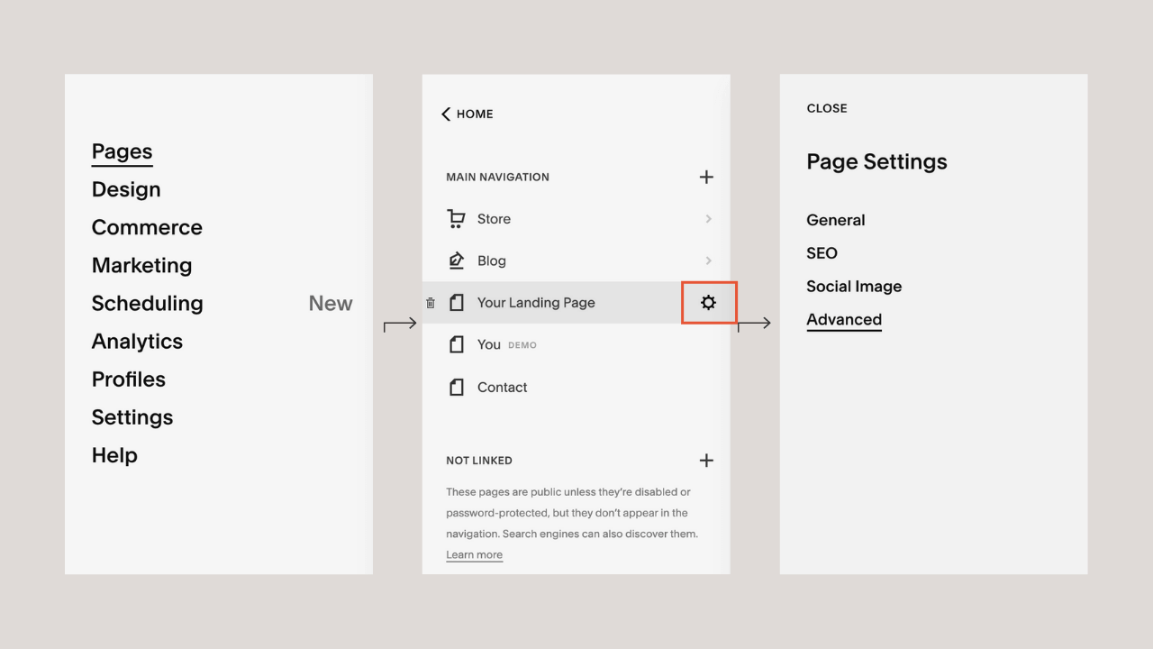
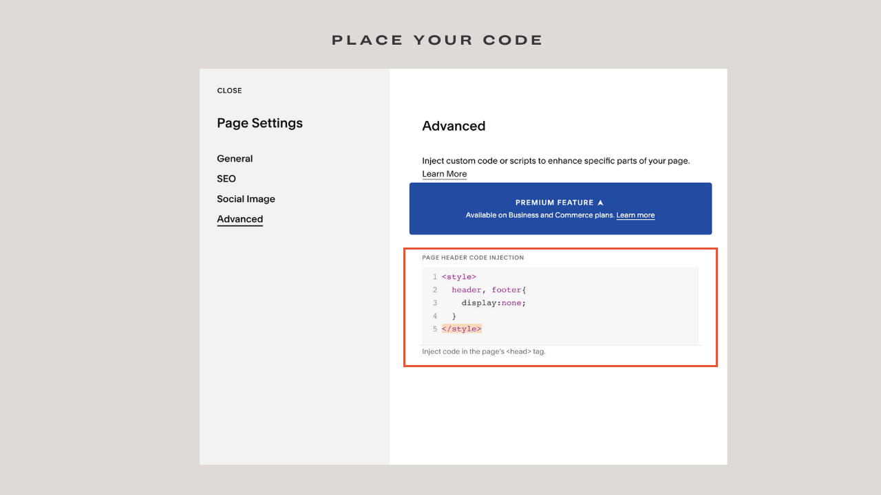
Access your Squarespace account and create a blank page, on your Squarespace dashboard head to Pages. Click on your landing page, you would see a gear icon beside it, click on the gear icon > Advanced
All you need to do is copy the code below into the CSS block and hit save.
<style>
  header, footer{
    display:none;
  }
</style>
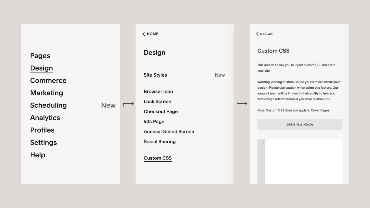
Option two
Login to your Squarespace account, head to your dashboard, click on Design > Custom CSS and input this embed code
Code to remove header and footer in Squarespace
header, footer{
display:none;
}
When you hit save, you would discover that all the header and footer for your pages are gone, including the home page. That’s not what we want to achieve. To specify the command to your landing page, you would need to input the ID of the page. To find out your page’s ID, download the Squarespace ID finder extension on Chrome.
Squarespace ID Finder
After successful installation, click on the extension and you would be shown the ID of each of your Squarespace page, copy the one you need and paste it in the CSS block. Unique page ID will appear at the top of the page, in yellow color.
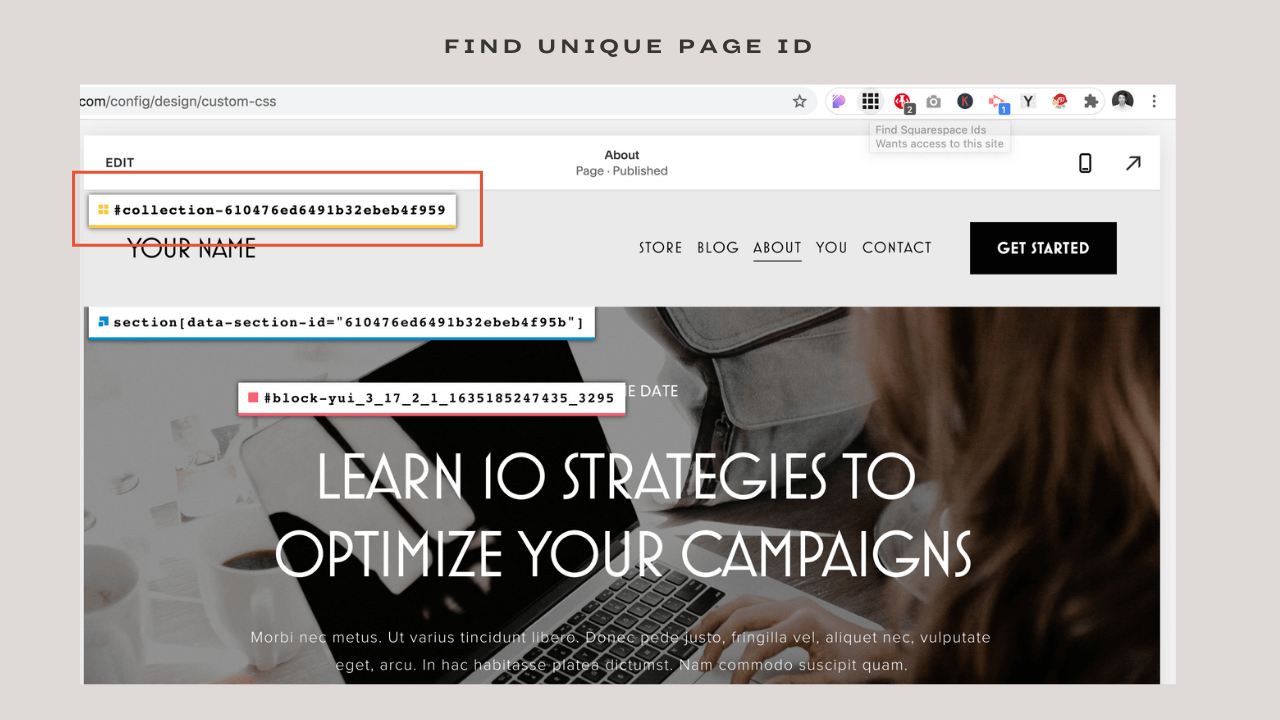
Click on yellow page ID and it will automatically copy it.
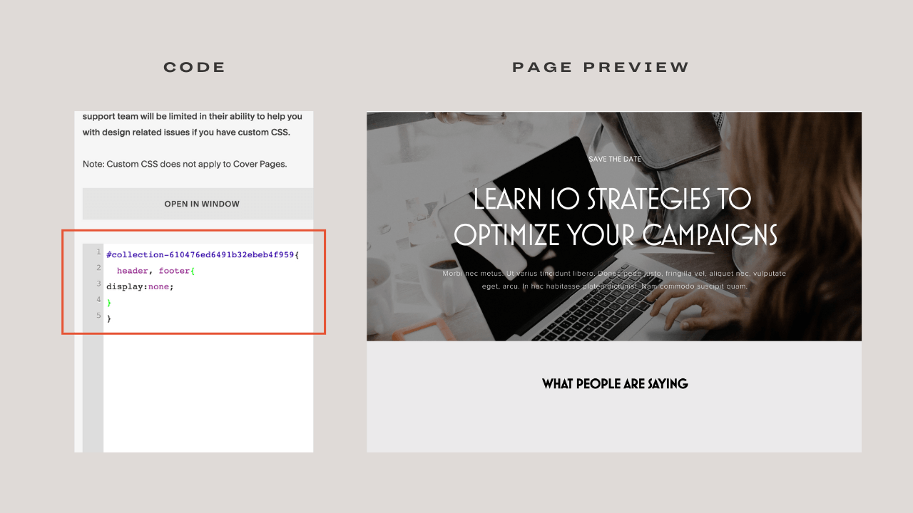
Input your page ID here {
 header, footer {
  display:none;
 }
}
Paste the copied ID text in place of input your ID here, click save and you’ve successfully created your landing page on Squarespace.
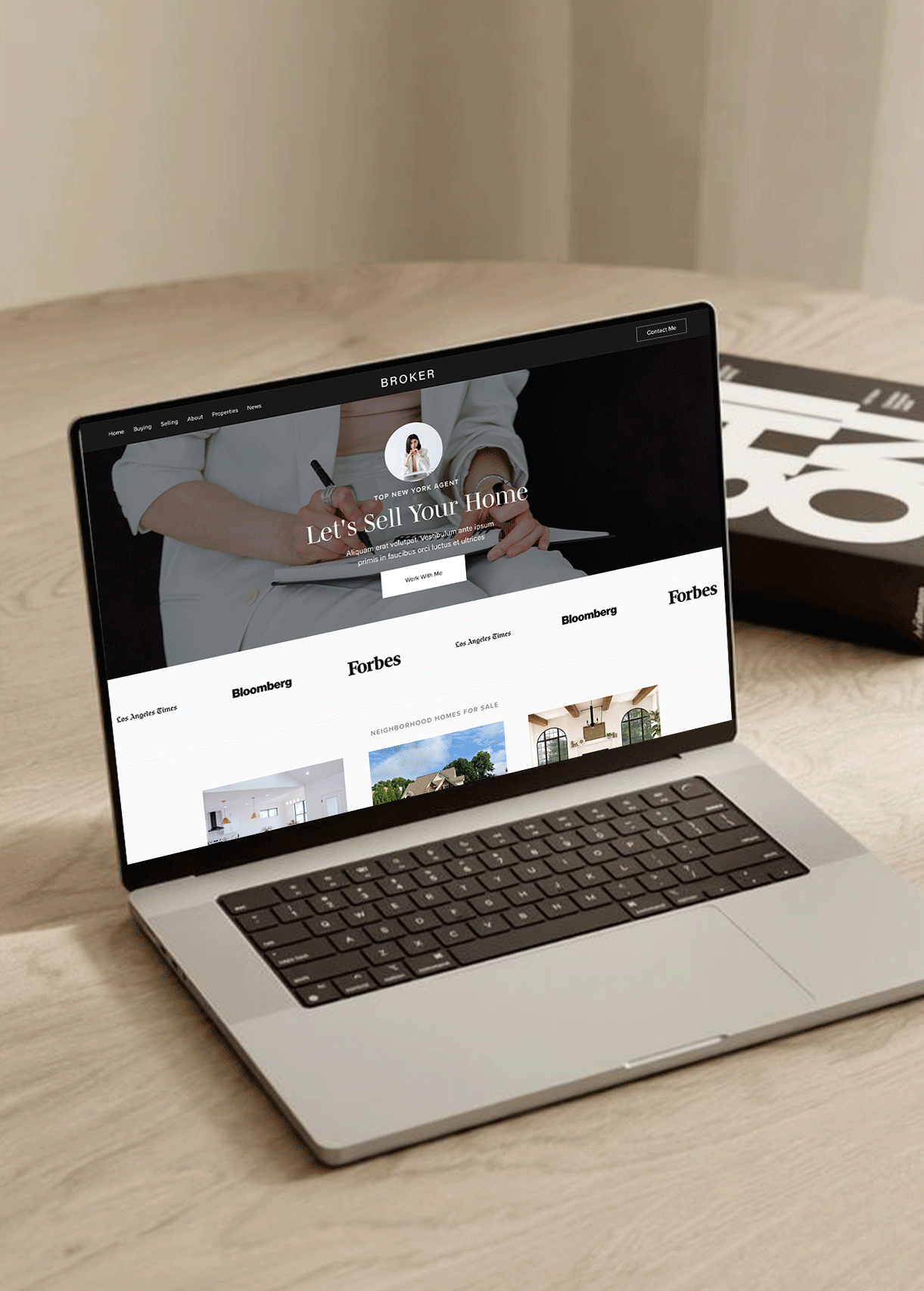
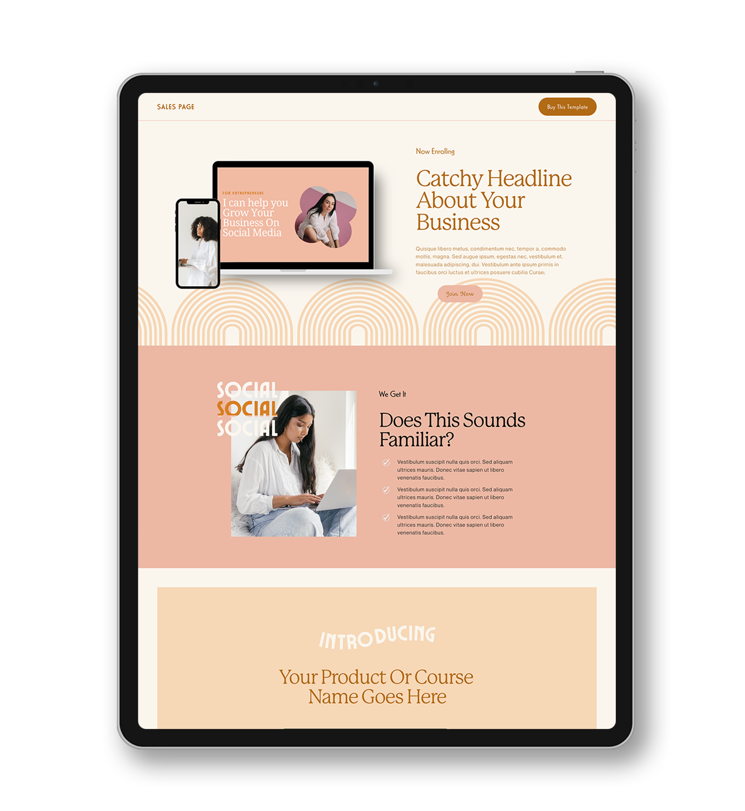
Squarespace Landing page examples
When it comes to landing pages, having a specific and attractive offer written in a clear, articulate and convincing manner is paramount. People are wiser than they were ten years ago and they’ve already figured out marketing tactics. So, getting them to drop their contact information must be worth it.
Fortunately, we are not left in the dark on how to create converting landing pages. People have done it and achieved tremendous results, that’s why we would be looking at some cool lead generation landing page examples you should definitely learn from.
Related Article: 50 Stunning Squarespace Website Examples
FireEye site

I am starting with a ‘complicated’ niche because there is a popular belief that once your product is too ‘tech-intensive’, creating an attractive and effective landing page is out of the question.
Well, FireEye thinks otherwise. FireEye is a company focused on cybersecurity—protecting yourself from cyberattacks. To an average person, not so interesting.
But FireEye knew how to create beauty from chaos. Let’s explore what they did best.
The first thing you would notice on their site is their simple heading. Not only were they straight to the point on what you would benefit if you drop your email, but they also communicated it in a layman’s language. You see, they’ve discovered that humans don’t like whatever would stress their brain out, they want to know what they would gain in seconds. Lesson: Make sure your heading is specific, concise and clearly communicates what a prospect would gain.
FireEye summarized what you would gain from their free offer in exchange for your contact. They didn’t try to play the ‘Find me if you can’ game as most businesses do. In the case of FireEye, they were offering a whitepaper (which most persons don’t have the patience to read) and they summarized the questions the whitepaper would address Lesson: Clearly state what your freebie would provide.
Lastly, their form was specific. Let me drop this here—do not ask for information you do not need. Asking for more details than you need can discourage visitors from dropping their information. If all you need is an email, let your form contain just an email space. Lesson: Don’t stress visitors with unnecessary information
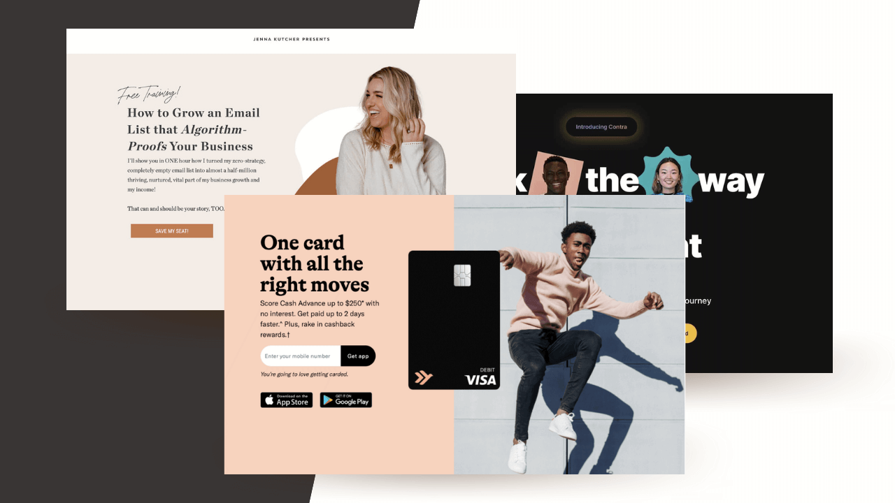
Jenna Kutcher Site
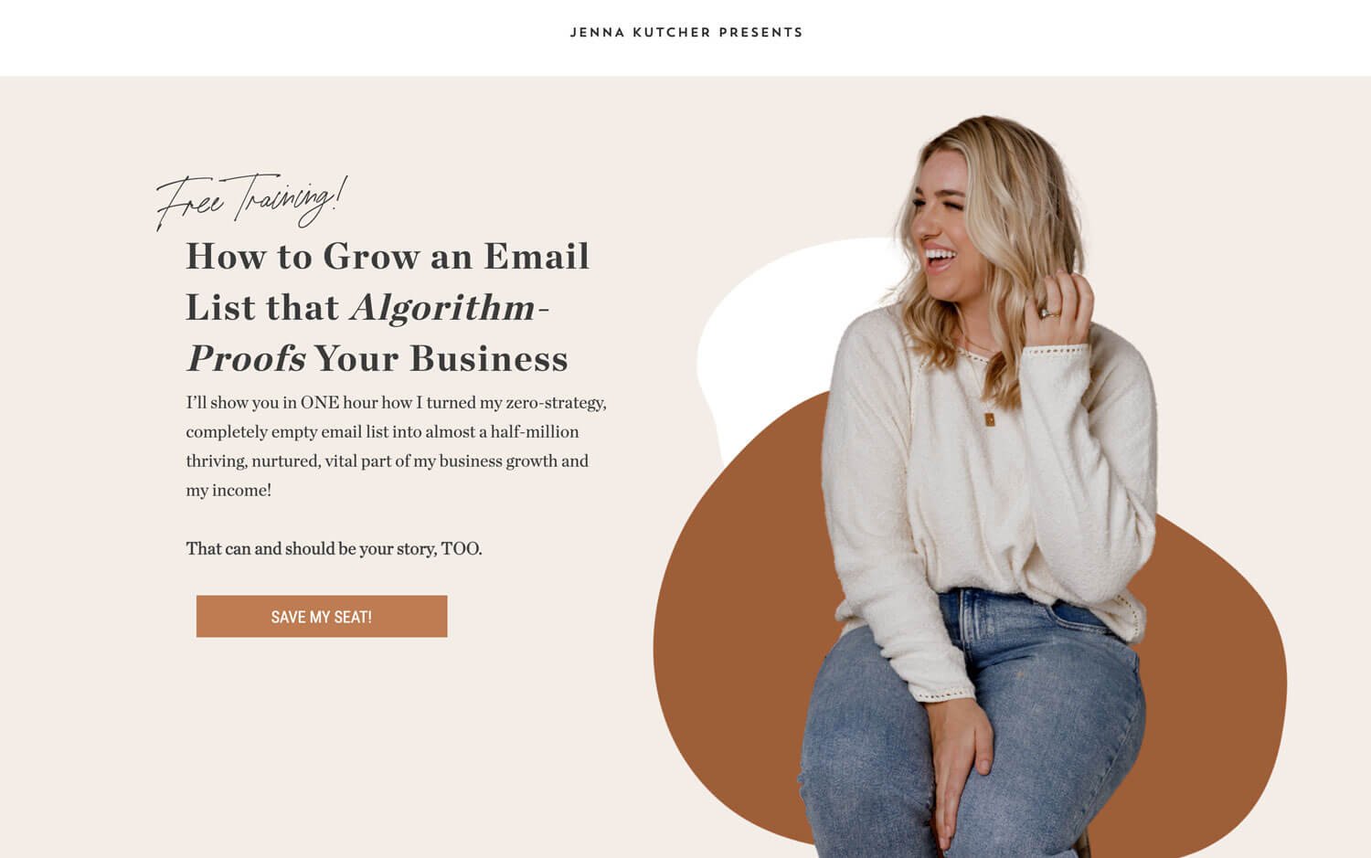
I love this example because of its simplicity and minimalism and just attracts visitor clicks. You would notice that Jenner went straight to the point; ‘Hey, give me one hour of time and I will show you how you can go from zero email list to half a million-dollar worth’.
Jenna’s landing page emphasized what I mentioned earlier—making sure your heading is concise. The heading is providing a free solution to most businesses’ problem.
Minimalism: There are no distracting images or elements on the page. She used two solid background colors and limited elements. Don’t get me wrong, it doesn’t mean you shouldn’t have an image background or other design elements on your landing page, just make sure it is contributing to the whole signup process. In Jenna’s case, she placed a professional, friendly image of herself for visitors to know who would be conducting the training.
The explanation is short and comprehensive: Jenna clearly stated what you’d gain when sign in for the freebie .
Ckbk Site
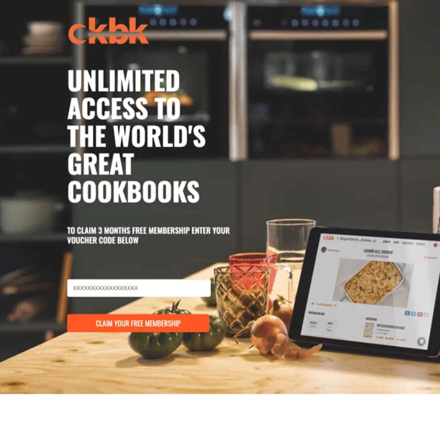
For the love of food, this landing page is compelling! ckbk used an irresistible phrase ‘unlimited access’. Imagine if you are given unlimited access to your favorite places in the world! Exactly, that’s the feeling. Though a voucher code was asked, this can be easily replaced with a contact form. Let’s explore what ckbk got right
You’ve got to give it up for the background image. That’s a thoughtful image used there. The image has a dark background (where the heading is sitting) therefore providing high contrast for the white text. Also, the image used complements their aim. You could see the iPad with the food recipe, some glass cups and ingredients on the table Lesson: Let your heading be visible and larger than the rest of the text. Your photo must complement your aim.
Clear Call to Action button to sign in: The button color stood out from the other elements, there was enough white space and it was also large enough to catch a visitor's attention. Lesson: Make sure your form button stands out and is big enough for a visitor to recognize that it is meant to be clicked.
Irresistible Heading: Once again, let your heading drive the point home. Make sure you communicate what you are offering. Logo to maintain brand recognition.
Quick Tips For Designing Your Landing Pages using your Squarespace account
To summarize, here’s what you should keep in mind when designing your landing page for Squarespace users
Do not include a header or any navigation links and footer on your landing page
Display your offer clear , concise and attractive
Your CTA button must stand out from the first glance and have high contrast with the background
Any element you are using must complement and explain your offer
In rare cases, keeping your visitors in suspense may be worthwhile but it is best to state
Let your users know what they will benefit in exchange for their contact address
Avoid unnecessary information that would confuse users
Make your landing pages mobile-friendly.
Add images if it would make your copy more compelling.
Display social proof from users
Having a Squarespace website means you do not need to spend extra charges on landing page software. All you need to know is how to create effective custom landing pages that would take your business to the next level which I’ve successfully walked you through in this article.