
41+ Beautiful Wedding Website Examples For Your Inspiration
Finally! It is probably a few weeks before your wedding, and you want to share your beautiful story with the world. Why not?! You also want to keep your guest updated about the venue and time for the wedding, which is an excellent substitute for a paper invitation anyway.
Creating a stunning website for your upcoming wedding is a great decision, but your wedding website has to be captivating and feature cool colors that get your viewers hooked to your story. One way to create a state-of-the-art wedding website is to draw inspiration from those who have created great wedding websites.
This article provides you with loads of website templates examples where you can draw your inspiration. Darling, we believe you will find one or two website examples that will create unlimited ideas and help you design that beautiful wedding website for your beautiful story. So, without further ado, let's get this journey started.
Looking for a unique website design for your business? Explore our Squarespace Web Design packages for a stunning website. Need to enhance your site's visibility? Our Squarespace SEO services are here to assist you. Curious about our work? Take a look at our Squarespace website designer portfolio for some inspiration!
Beautiful Website Examples For Your Inspiration
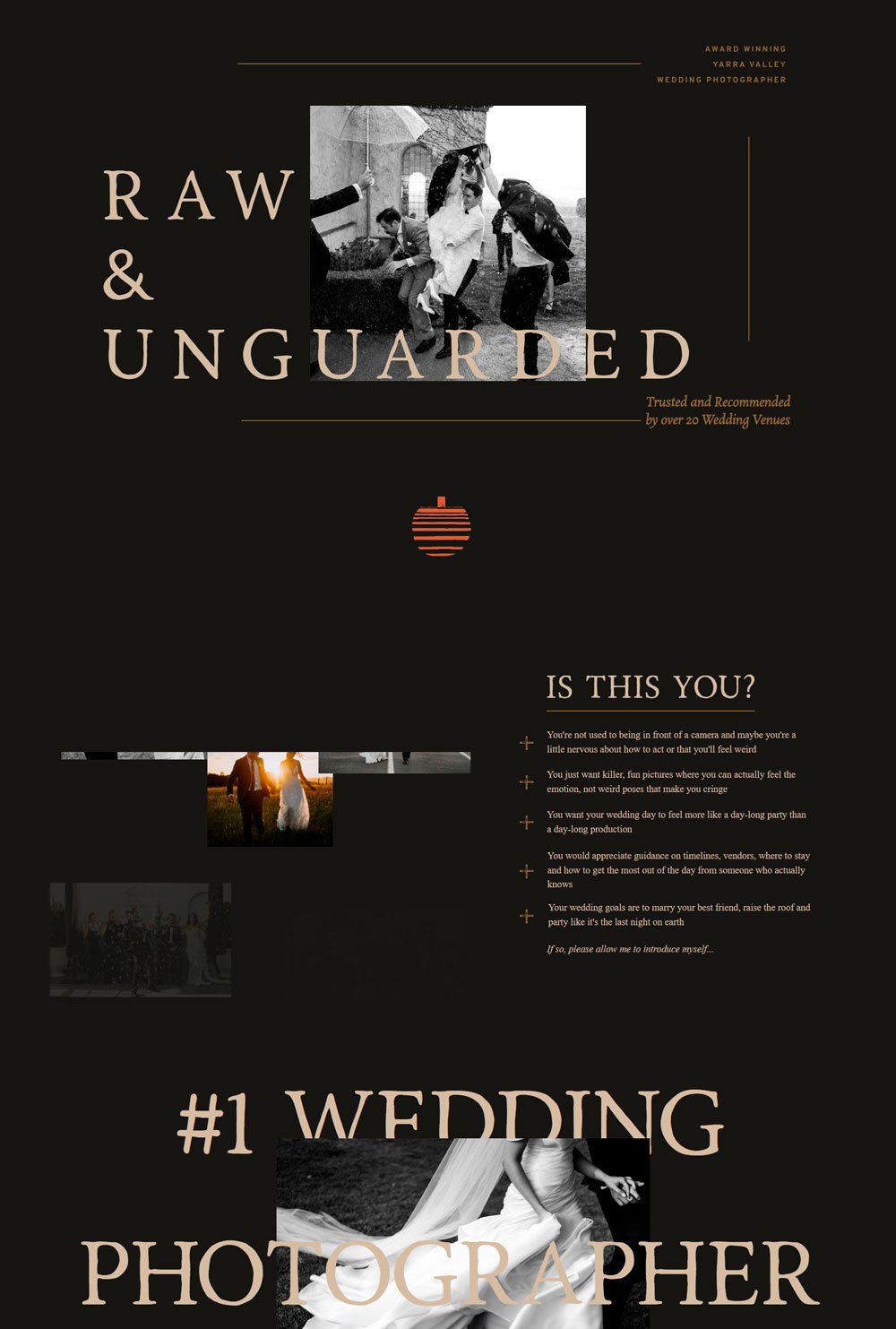
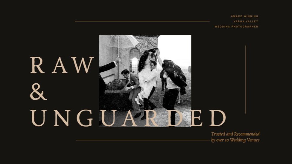
1. Ella Stonehill

We don't need to say much because every viewer will agree that this wedding website is breathtaking - oh my!. Although it is for a wedding photographer, still! This website is excellent for a wedding website. This website opens up with a beautiful picture of the couple and appealing, complementary text at the sides. The use of alternating text and images allows the viewer to have a smooth flow through the website, which will be great for telling you how we met story, engagement story, and wedding venue and time. Lastly, the neutral, cool colors used in the website allow the images to shine.
related article: 26+ Best Squarespace Templates For Photographers2. Sarah & Josh

I like the way this website kept things simple. Simple, clean font, cool colors, and an abundance of whitespace. Perfect for those looking for a minimalist website that is free from clutters. When it comes to the structure, the wedding invitation is displayed first to give viewers the most important information at the moment. From there, it moves to the couples and their thrilling story, ending with a location map for the venue. This one-paged website highlights the most important information, which limits scrolling. Simple, elegant, straightforward.
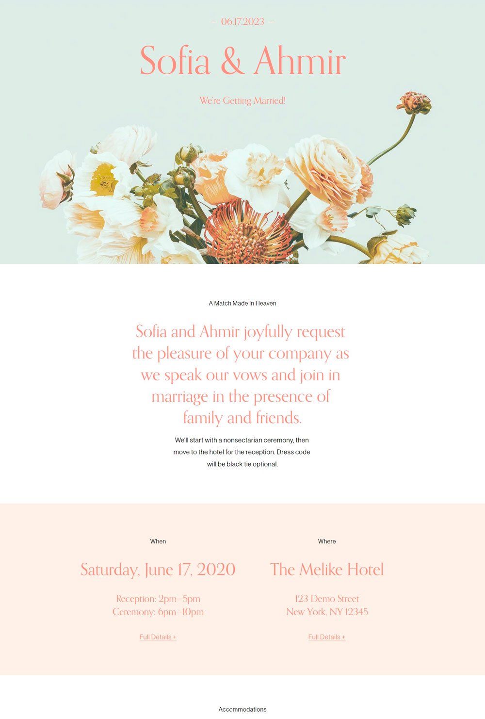
3. Sofia & Ahmer

Add some color and fun to your wedding website while keeping it clean at the same time. Sofia & Ahmer opens up with a gorgeous flora design that already puts you in a good mood. The high contrast of the letter against the background color is commendable. Also, the use of pink lights up everywhere. This wedding website is short and brief, mentioning only important introductory details about the couple and focusing mainly on the invitation. Another thing we love is the RSVP page that allows you ‘book’ your space which is simple and elegantly designed. If you are looking for a clean wedding website, you can draw inspiration from Sofia & Ahmer.
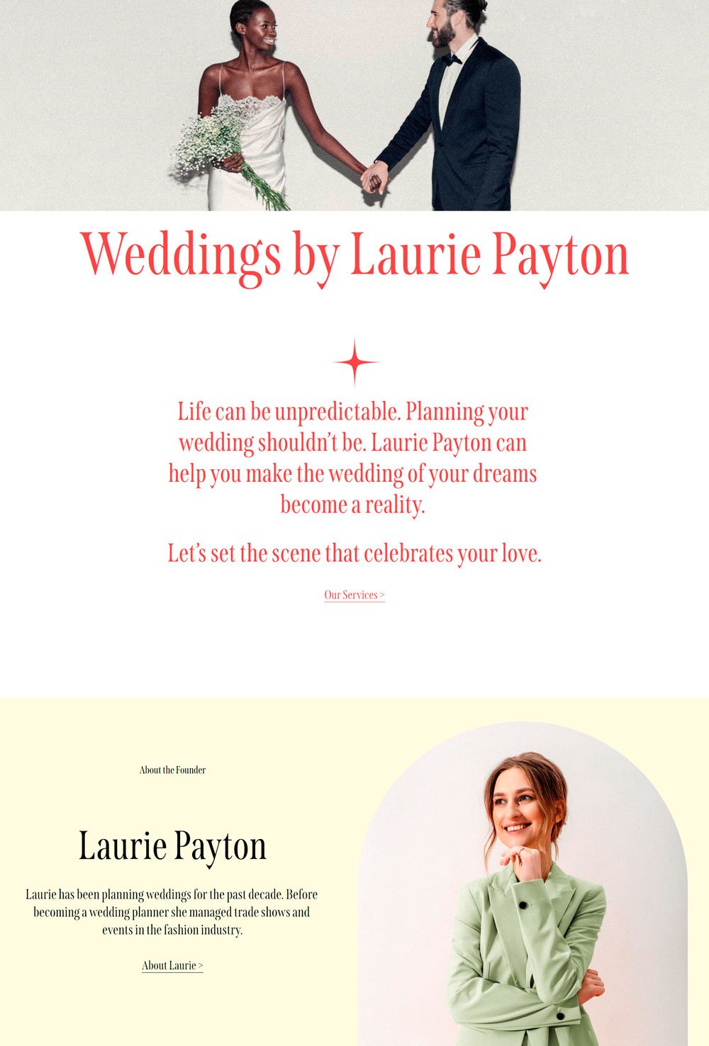
4. Laurie

Laurie is a wedding photographer's website, but we decided to include it because of its page's structure. Who says you need to play by the rules? Laurie ushers in a feeling of love with its header image showing two couples. The bold introductory text is great for a catchy love intro, the about the founder can introduce you and your spouse, and the rest of the page can be used to highlight your invitation details. You also get an extra page that can serve as RSVP page inspiration. Now, you see why Laurie is a great inspiration!
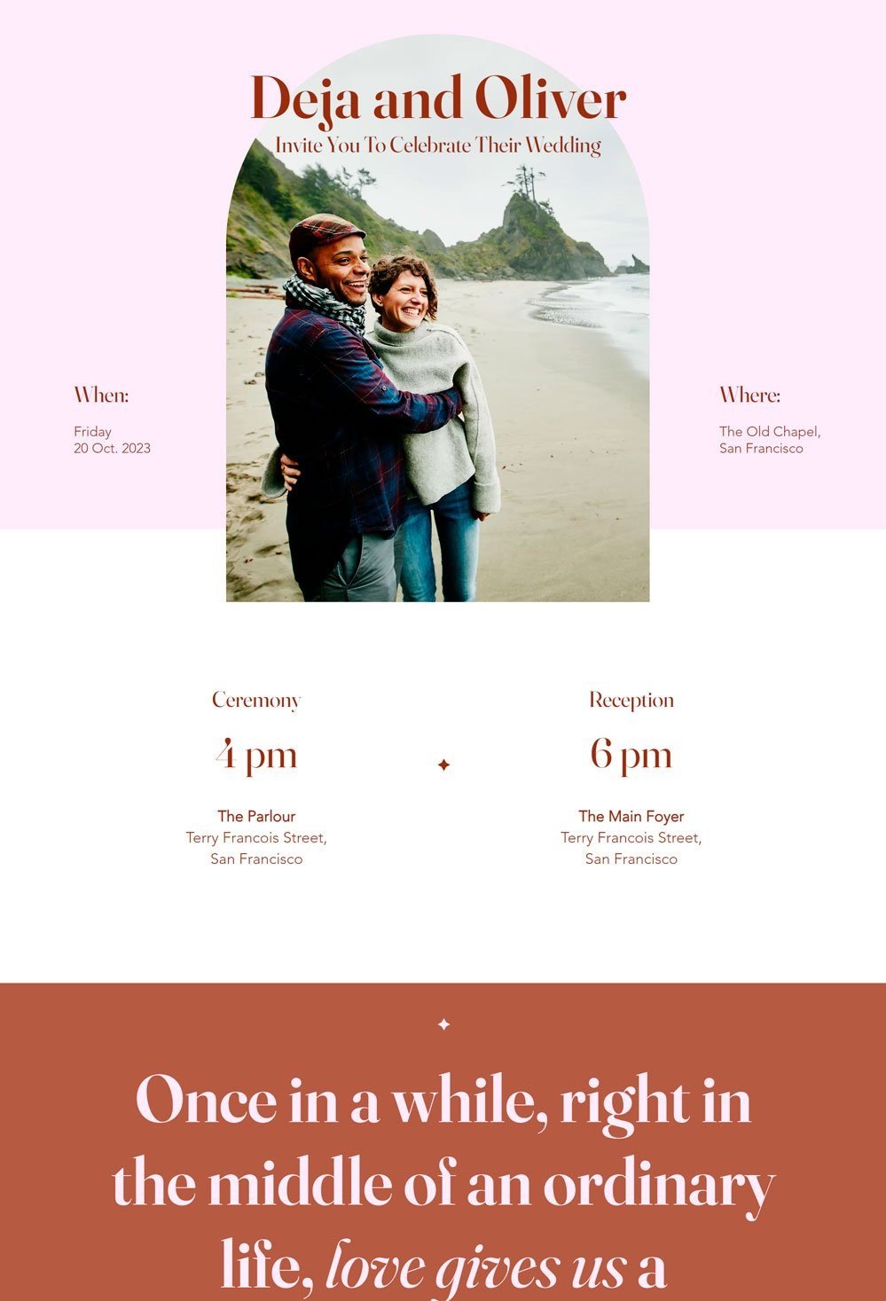
5. Deja & Oliver

I love how this website is so flawlessly beautiful and makes you want to fall in love. It uses cool colors and stunning fonts that add a touch of glam to every word. The sliding animation introducing each picture and text adds a mesmerizing feeling to everything. If you have a lot of pictures you want to display, using an image slider can add a cool effect to it. Another thing I love about this website is its color scheme. It stays consistent with its pinks and browns. It also has an RSVP page allowing your guest to book their space. Simply stunning
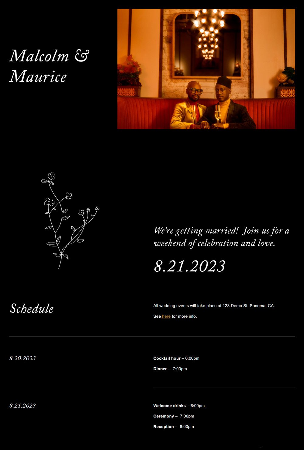
related article: 28 Best Health Coach Websites (Plus Templates!)6. Malcolm & Maurice

If you are looking for a classy website with all shades of elegance, there is no need to search further! Malcolm & Maurice uses a black background that takes this website to a whole new level. The website proves that not just flashy and bold colors can make a website design stunning. This simple white and black website features a schedule page for your invitation and RSVP buttons, a how we met page to feature your stories and beautiful images, a travel page to highlight important information about transportation and registry, and FAQs pages for everything in between. Malcolm & Maurice will serve as a source of inspiration if you don’t want to play by the rules.
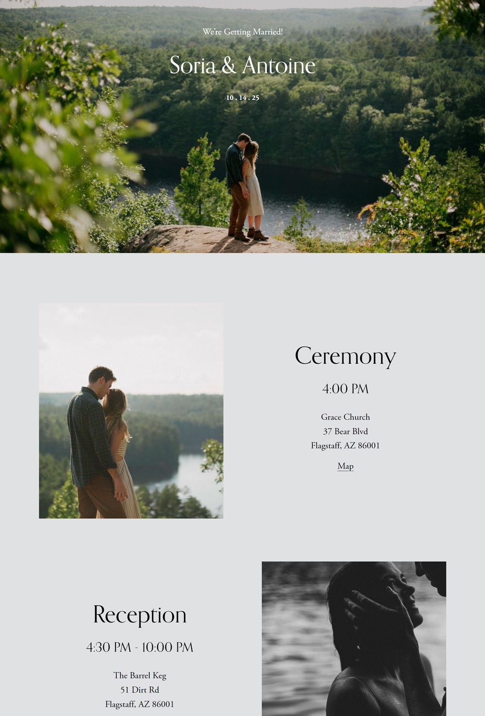
7. Soria & Antoine

Clean, minimalist, simple. Soria & Antoine is an excellent example of a clean, minimalist wedding website. It uses a neutral tone to focus the attention on the images and text, and it succeeded. The full-size header image displaying two happy couples when you first land on the page is a great way to start a wedding website. It has a simple story page that focuses on the couple and their stories. Another thoughtful feature we would like to point out is the Travel & stay page, where there's a button for your guests to make contributions if they'd like to.
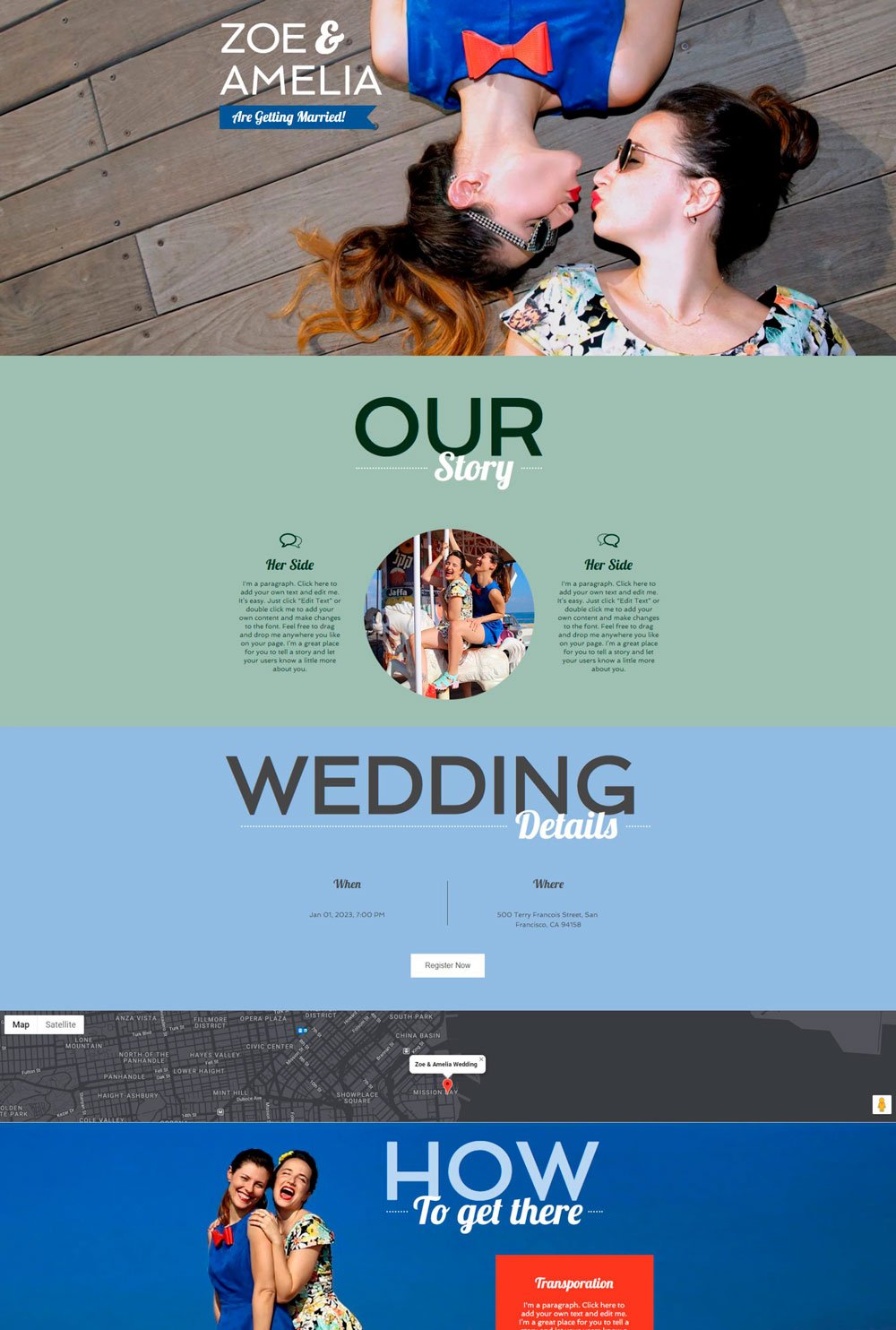
8. Zoe & Amelia

I love how colorful and bold this wedding website is. Zoe & Amelia uses bold colors and fonts to make a statement. You move between pages as if you are sliding through images, which gives a unique and more natural flow to the wedding website. Although the website uses bold colors, they are well-balanced with high contrasting elements and enough white space. This is a perfect inspiration if you are looking for a unique and bold website.
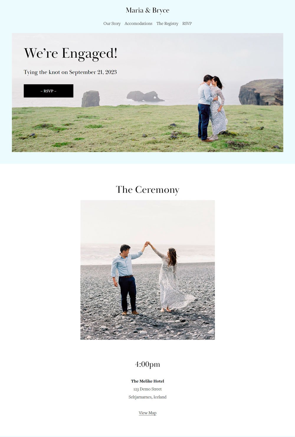
9. Maria & Bryce

This website combines functionality and beauty together. I love that you can see the RSVP button the first moment you land on the page. This is helpful for viewers who are extremely busy but still want to witness your blissful moment. The landing page gives viewers everything they need to know about the wedding ceremony in a few glances. This multiple-paged website comes with our story page that displays the love story in a natural, exciting way. It also comes with Accommodations, The Registry, and RSVP pages. This is an excellent inspo for beautiful yet straightforward pages.
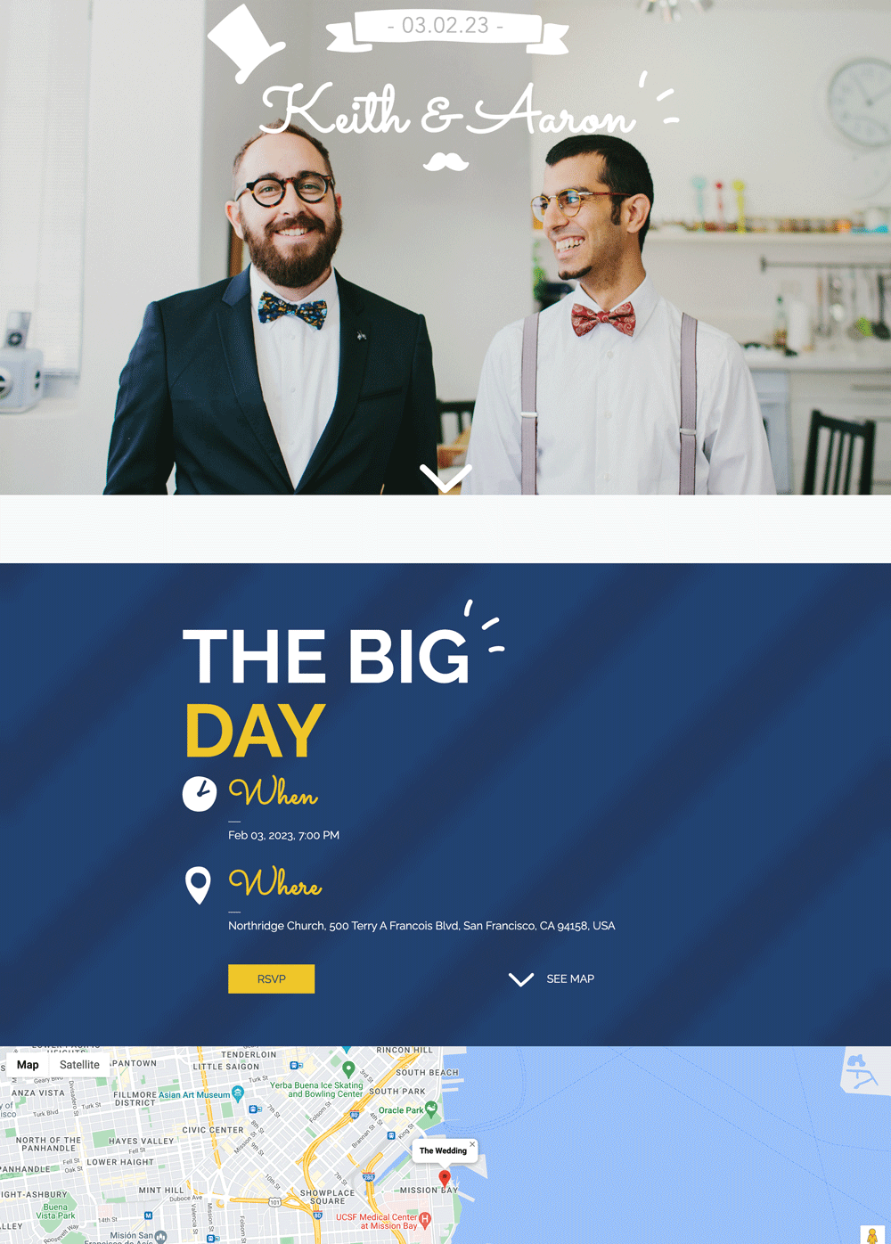
10. Keith & Adam

Oh, My! This is one of the most beautiful, fun wedding websites on our list! You can't just help but admire how structured and beautiful this website is. This one-paged website uses fun, quirky fonts, bold, soothing colors, and outstanding elements and animations to lighten up anyone's day. And you know what makes it more beautiful? It didn't waste any time and went straight to the vital information. The image slider under the Getting There section adds a bit of glam to it. However, it doesn't feature our story page. But who said that you can’t add yours? Unleash your bold side and release loads of dopamine in your viewers with the bold inspiration Keith & Adam portrays.
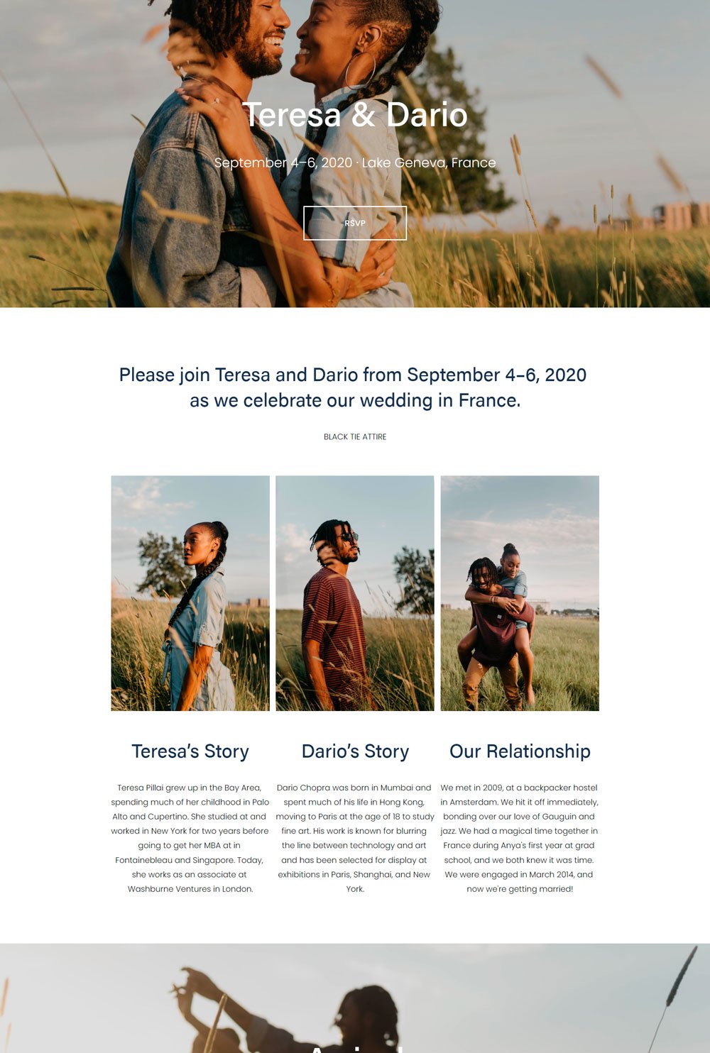
related article: 51+ General Contractor Websites (Plus Templates!)11. Theresa & Dario

You can't help but admire the consistency of the header image across each page. Theresa & Dario uses beautiful images, clean fonts, and whitespace to portray a simple, elegant wedding website. It displays a short introduction of the couple and how they met, which is a great structure if you want your guests to get to know you but don't want to go all-in with the details. It has the necessary pages, such as the RSVP, Location, and Gifts page. A nice thing to note about the gift page is how they gave guests different options to drop their gifts.
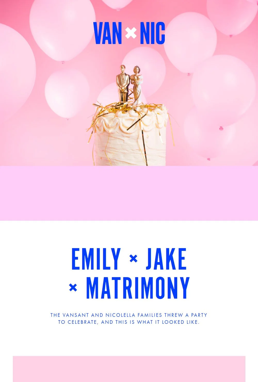
related article: 29+ Premium Squarespace Templates Shop For Any Business12. Van X Nic
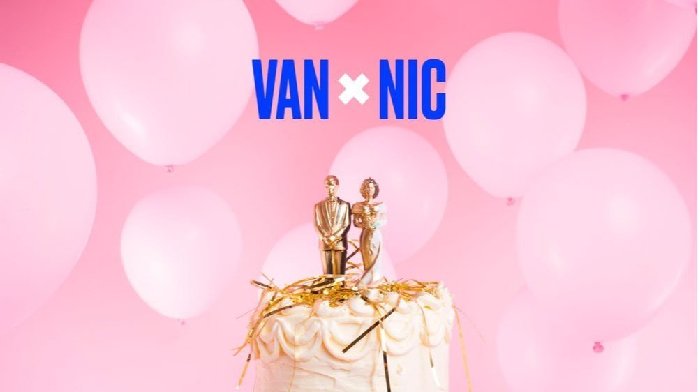
Colorful. Bold. Unique. If you are looking for a colorful wedding website that maintains the fun and goofiness of the wedding season, then Van x Nic will be a great inspiration. The blues and Pinks were combined to give that thrilling experience. Another thing will love about this website is the structure and the abundance of images. There were sections where they displayed the food menu, which was a nice touch. The arrangement of Van X Nic is accommodating for plenteous images and goofy vibes. We think this is a great, thoughtful, and colorful website from which you can draw inspiration.
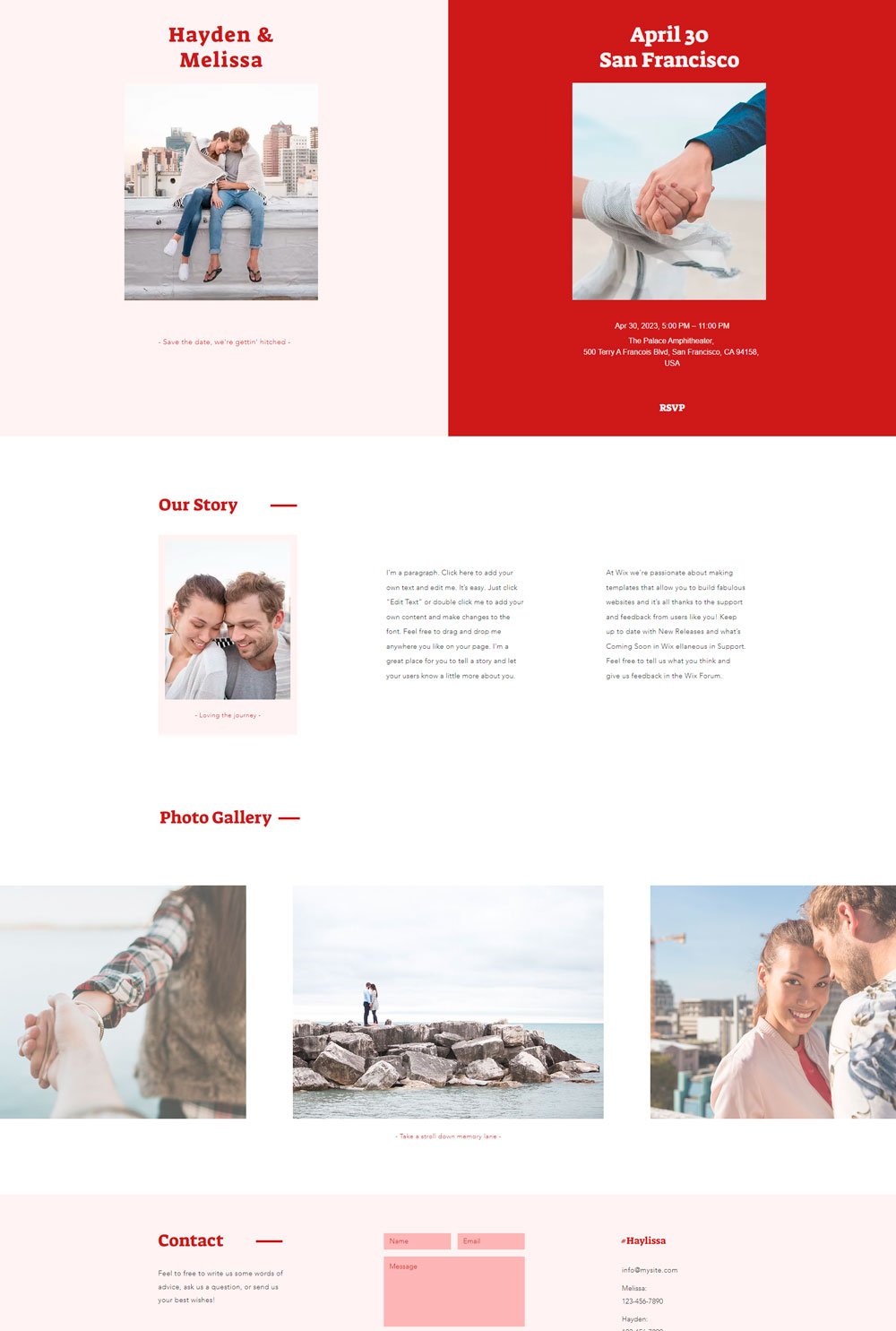
13. Hayden & Melissa

The Hayden & Melissa website stuck to two colors, and they made the best use of them to create a nice-looking website. The photo gallery section that was added to the website is thoughtful in case you have a lot of pictures you want to display, but you don't want your website to look messy. Also, the significant day page features everything your guests needs to know about the wedding and even display some of the groomsmen and bridesmaids' picture. To crown it all, they included a contact section where you can send your wishes, make inquiries or ask a question. This alone shows that they care about their guests.
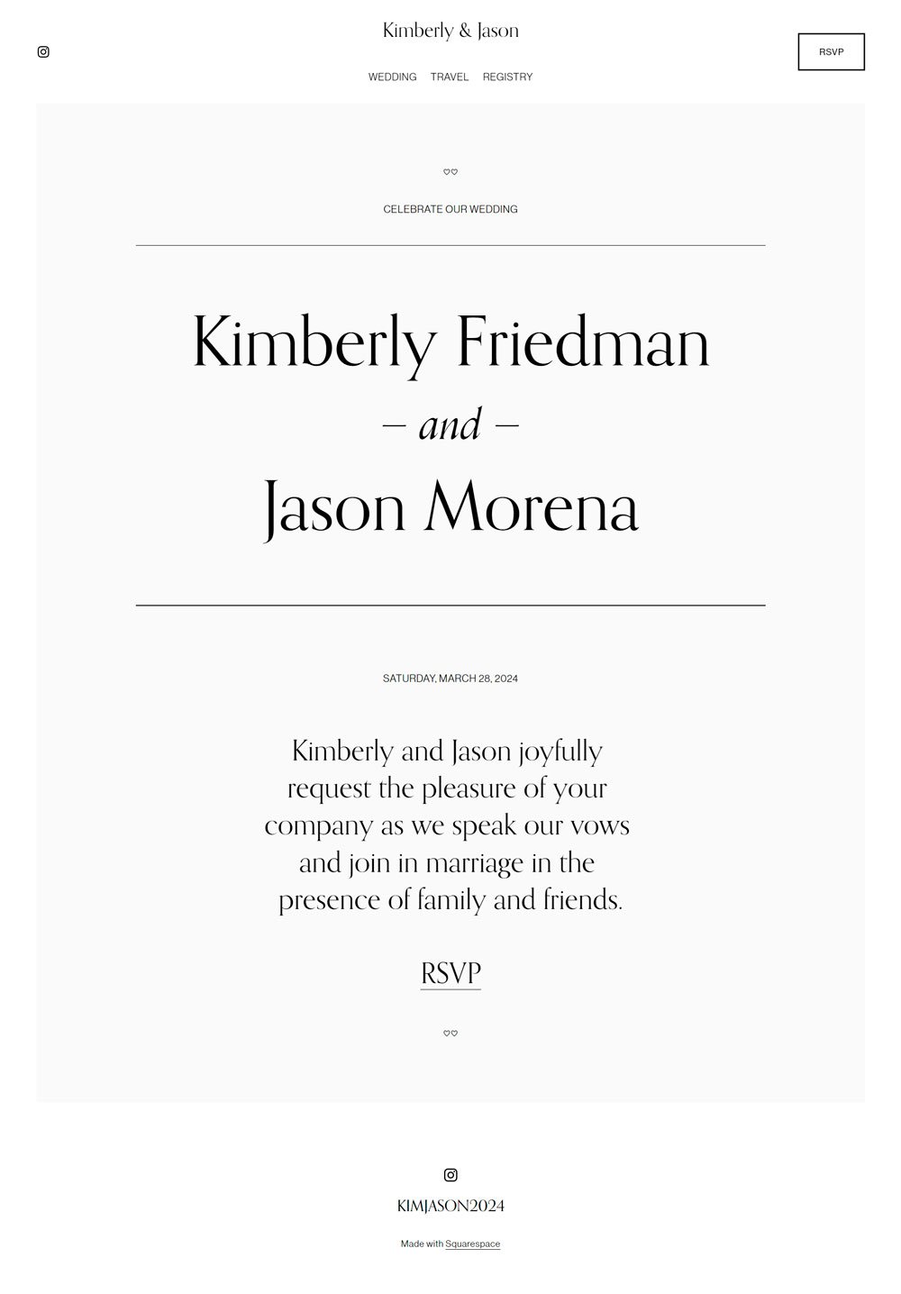
14. Kimberly & Jason

This website doesn't use any photos of the couples but still looks great. This is because the website's main aim was to pass across vital information about the wedding ceremony. Nothing more, nothing less. So, suppose you are thinking of creating a minimalist website that serves solely as a virtual invitation while avoiding our story and photo stress. In that case, Kimberly & Jason is your surest bet.
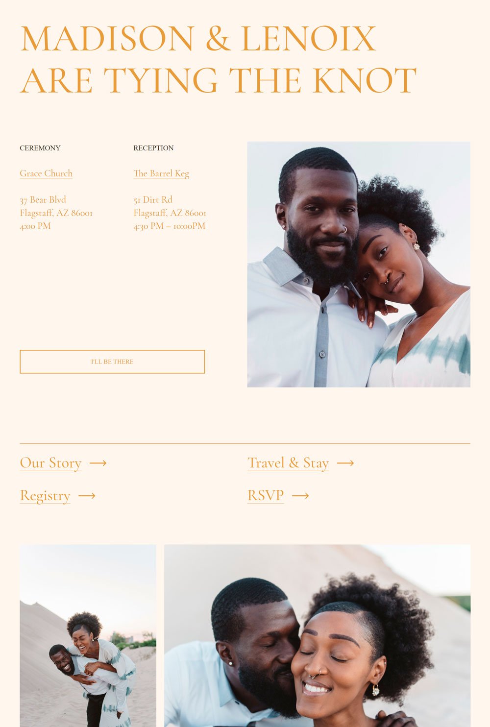
related article: 31+ Best Bakery Websites Inspiration & Templates15. Madison & Lenoix

The Madison & Lenox website is all shades of classy, and we love it. From the choice of colors to the strategic placement of images, the website allows the viewer to have a great time. Another thing I would like to point out is that it went straight to the point and highlighted the important information. The website also gave suggestions of the best accommodation to stay in case your guests are considering staying in a hotel. Overall, Madison & Lenox is a clean, classy website that pays attention to the comfort of its guests.
16. Charlotte McCoy

Some websites are just simply breathtaking. This wedding photography website is a great inspiration if you want to sweep your viewers off their feet. It opens up with a beautiful image of the couple and stylish text against it. The website has loads of beautiful images arranged in varying numbers to give that dynamic effect. This one-paged website comes with other necessary sections to host your story, registry, gifts, and other pages. Another thing worth considering is how Charlotte McCoy maintains its cleanliness and simplicity while passing across different information
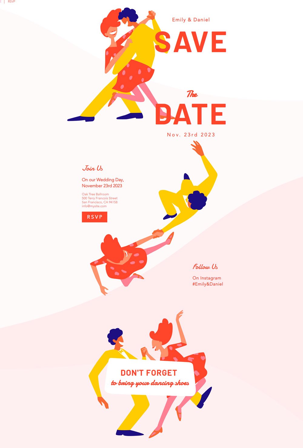
17. Emily & Daniel

Looking to get creative with your website? Emily & Daniel doesn't use pictures, but illustrations of beautiful couples having the moment of their life. The fun use of Munsell red, amber yellow, and light pink colors gives it a vibrant and fun look. Then, moving to functionality, this one-paged website highlights vital information about the wedding ceremony without any additional story. This is a great inspiration if you are looking for a fun website that focuses mainly on being a virtual invitation.
18. Alan Parks

Minimalism was the goal of this photography website. It uses a white background, black fonts to display information, and photography works to add life to the website. But, in the end, it allowed the images to do the speaking. Looking for a simple website? Alan Park is a great inspiration for a minimalist wedding website.
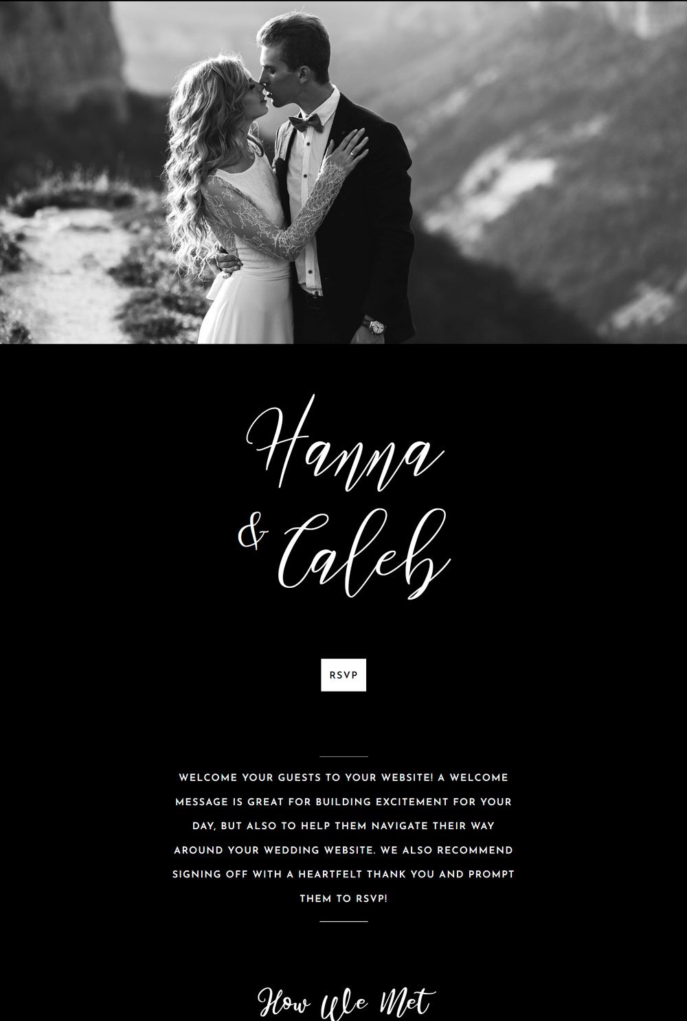
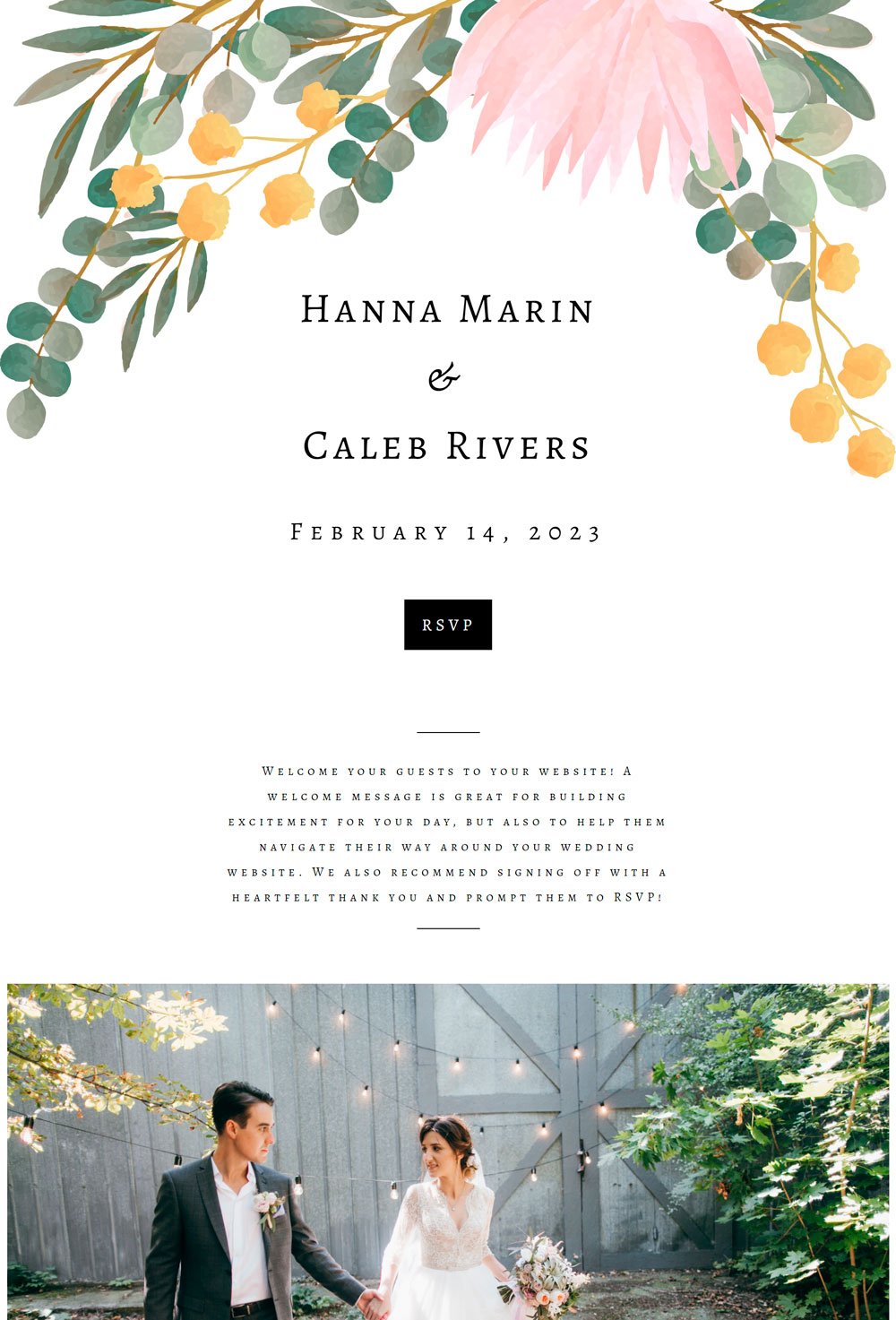
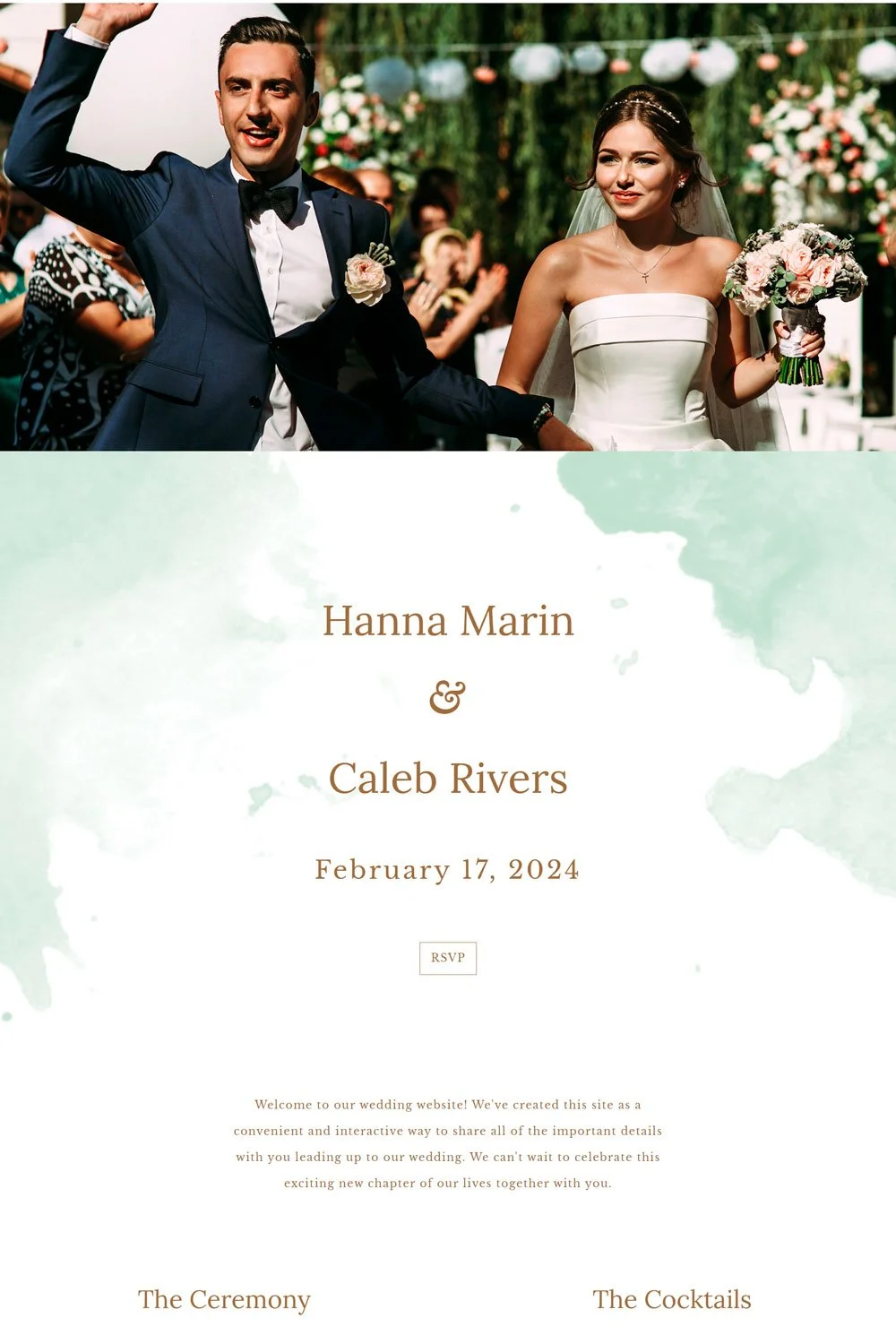
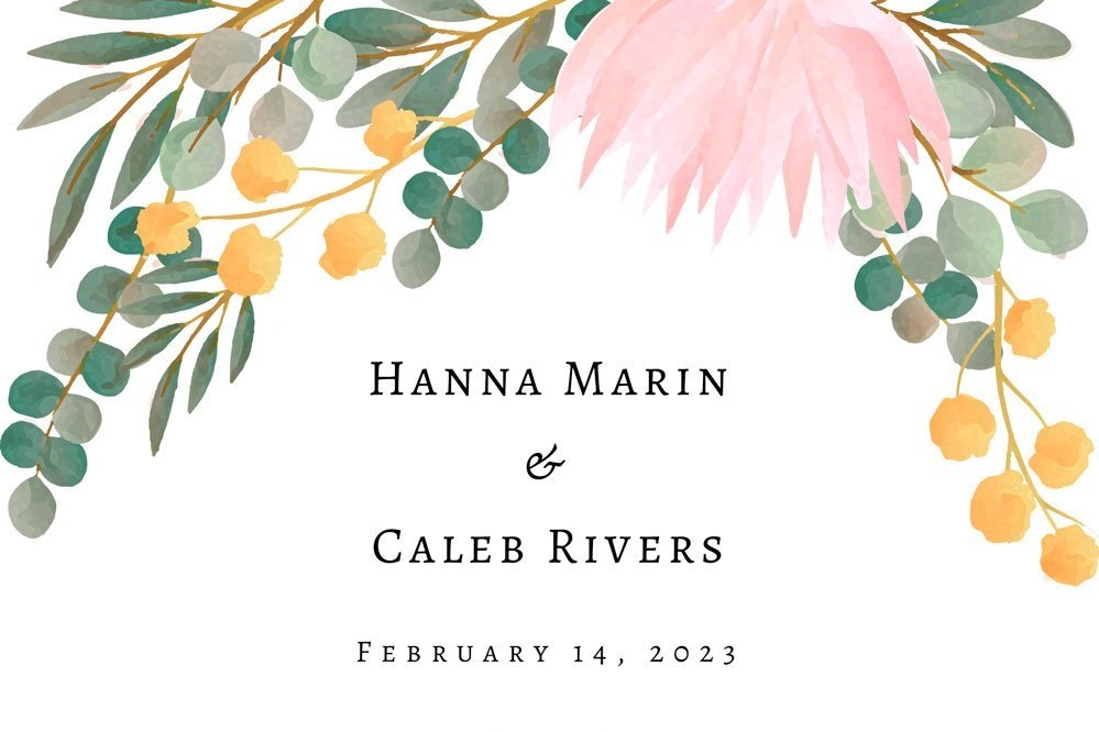
19. Hanna & Caleb

Hanna & Caleb use a black background and white text to give that sophisticated, classy look. I love the choice of fonts. They went with a stylish script font for the headings and a clean font for the body, which is a great way to create an elegant yet readable font design. The website is one-paged, including how we met, the schedule, food, and great recommendations of where to stay. Now, one notable thing I cannot overlook is the Add to Calendar button that allows the guests to add the event to your Google Calendar so that it won't skip their minds. How cool!
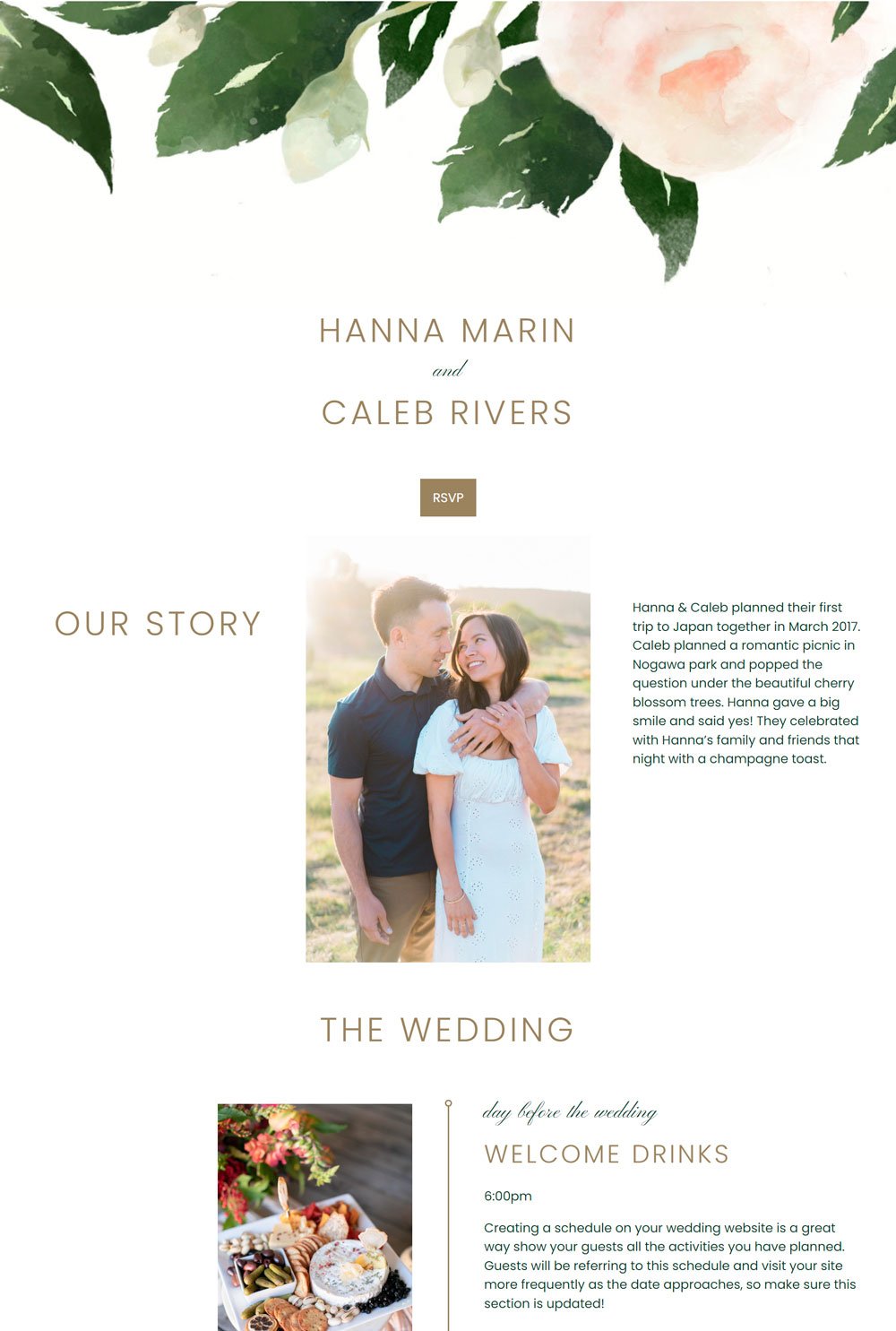
20. Hanna & Caleb 2
This is another version of the above website that uses white background against black text, in case you are not a black fan. The white background adds more light to it and gives that natural flow across the website.
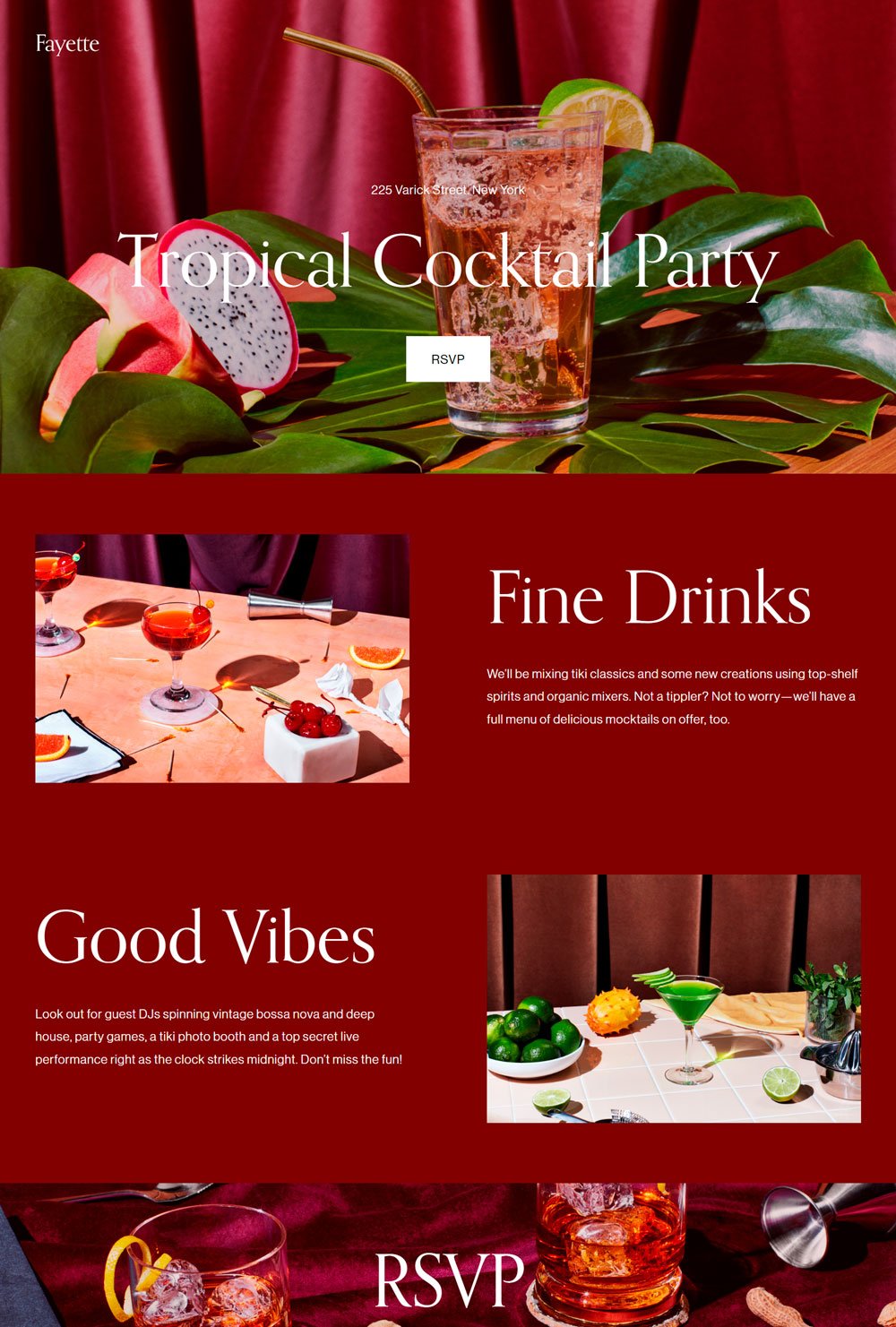
21. Fayette
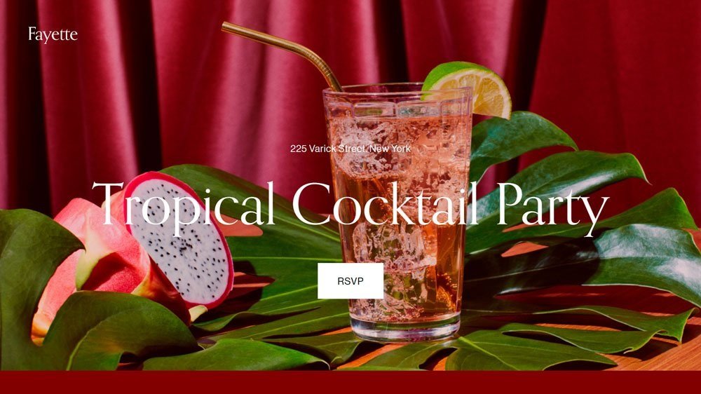
Fayette is an elegant website inspiration that isn't afraid of shining through. The choice of colors and the right images makes it look stunning. A significant characteristic of this website is that it keeps it short and straight to the point. Perfect inspiration for a simple virtual invitation wedding website.
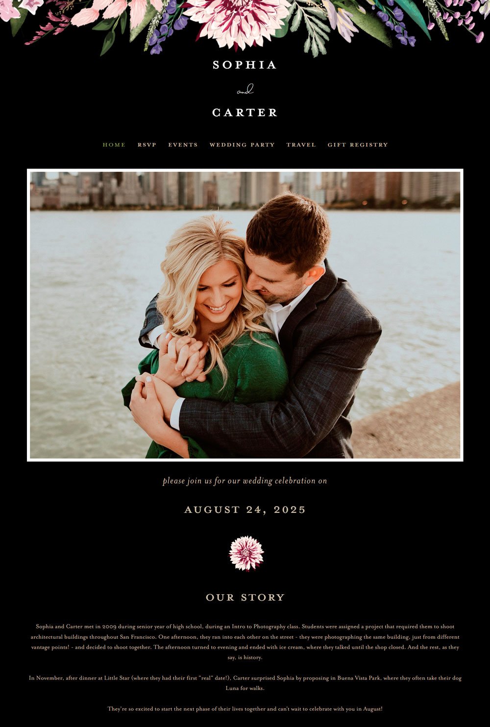
22. Sophia & Carter

The splash of gold, black, and white gives Sophia & Carter's website the sophistication it deserves. The flora pattern at the edge of the website gives it a beautiful wedding vibe. Sophia & Carter is an elegant font that chooses to keep things simple. I love that you get to see the menu first, so your guests can navigate to where they are most interested, especially if they don't have the time. In addition, it comes with a home, RSVP, events, wedding party, Travel, and Gift Registry page, which is everything a website needs.
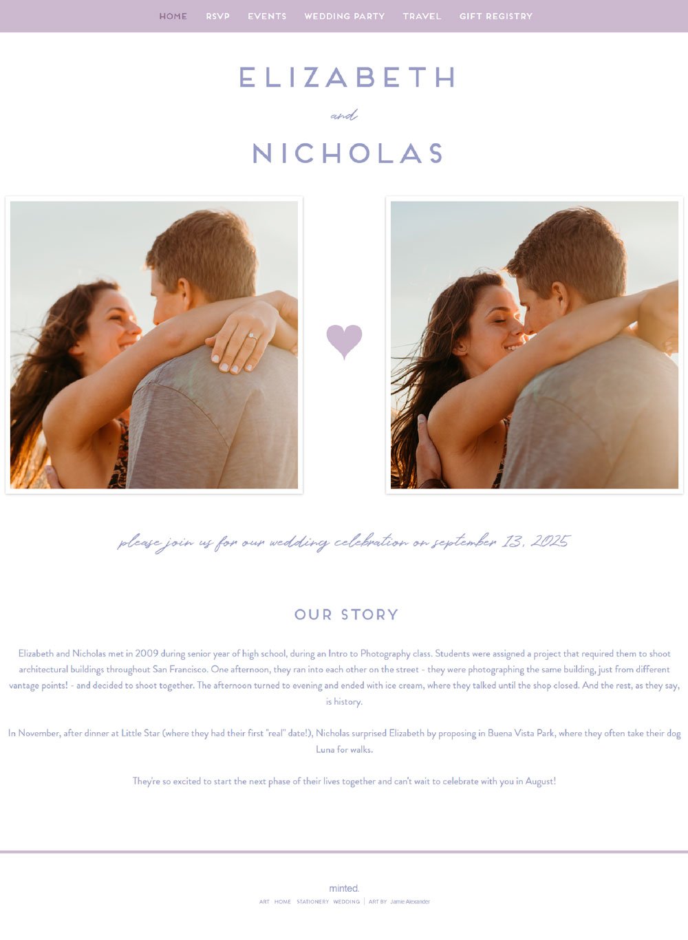
23. Elizabeth & Nicholas

The purple color adds a touch of luxury to it, and we love it. Elizabeth & Nicholas starts with the couple's photos and move to our story section. One thing we love about this website is how short and brief each page is. It highlights the critical information your guests need and ends it there. No extra fluff. As we said, the purple colors take the wedding website to a different level.
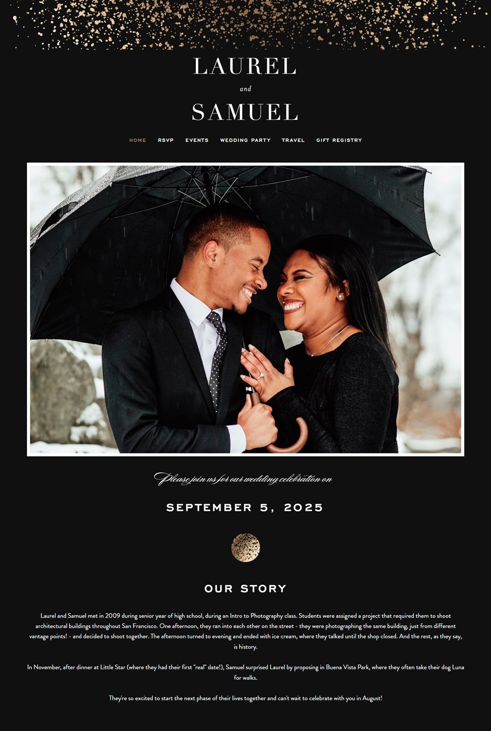
24. Laurel & Samuel

I 'love' love, and this website will make you want to fall in love over and over again. Laurel & Samuel is a breathtaking website that makes your heart melt at first glance. The beautiful image, the classy background, and the clean, simple fonts synchronized to give a stunning wedding website. The gold splatter at the very top of the website crowns it up. In addition, Laurel & Samuel comes with an RSVP, Travel, Events, and Gift Registry page. This website is a great inspiration if you are thriving to achieve a classy, sophisticated website.
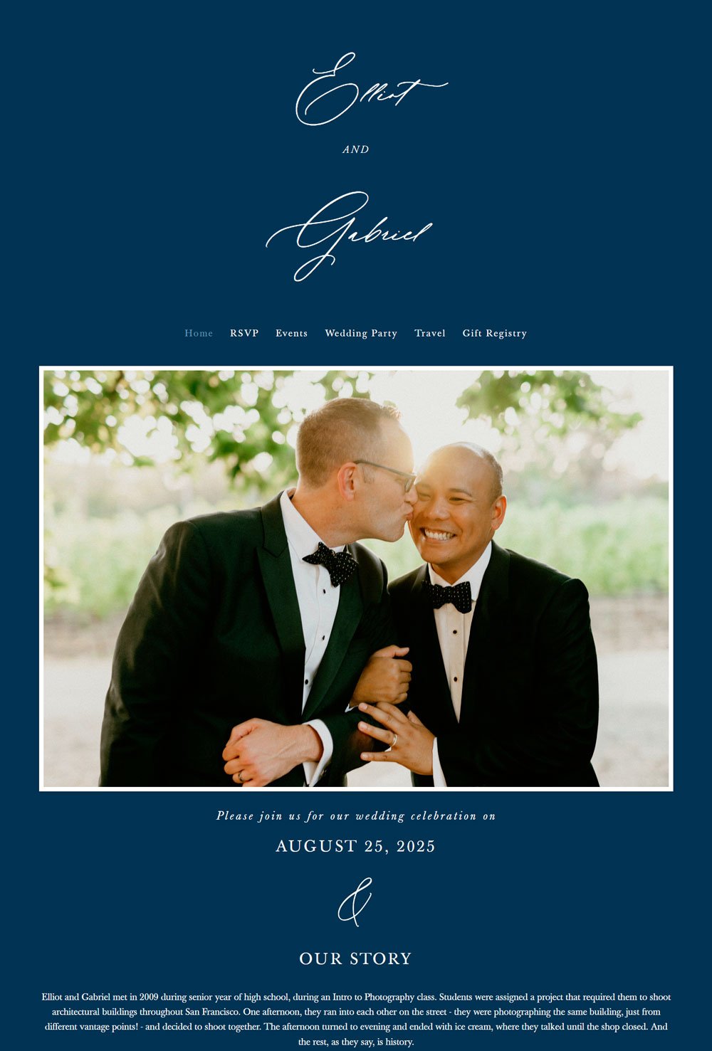
25. Elliot & Gabriel
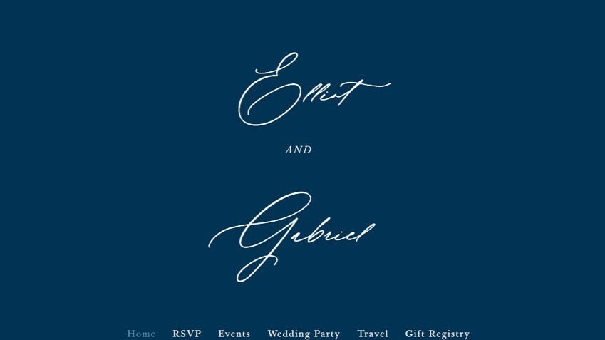
Choosing the right font can take your design to a whole new level. The elegant script font that opens up this website lets you know you are on an elegant wedding website. Elliot & Gabriel uses neutral colors and whitespace to turn the attention to the images and the text conveying the necessary information. It uses minimal images and goes straight to the point with its versatile pages.
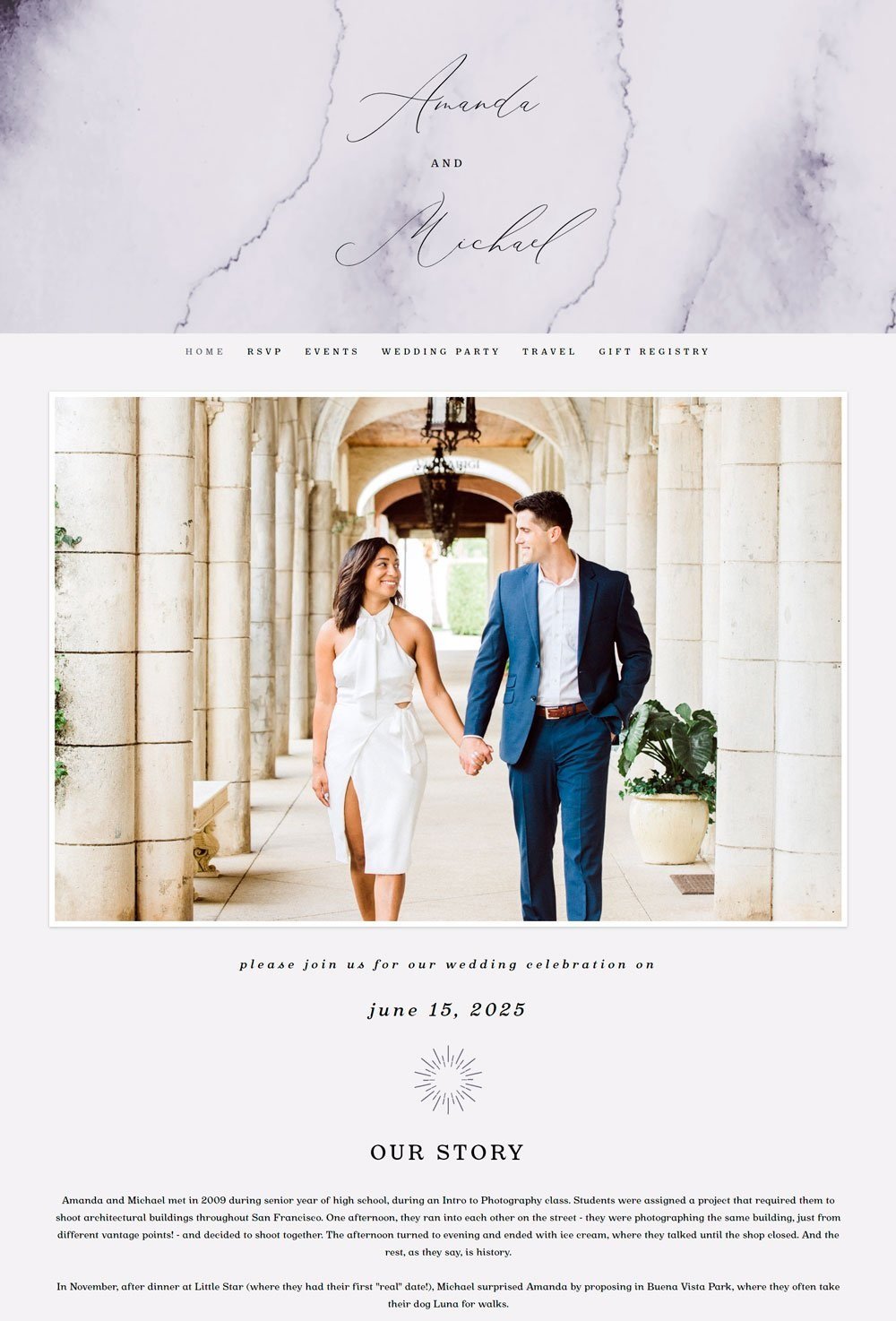
related article: 21+ Best Squarespace Blog Templates26. Amanda & Michael
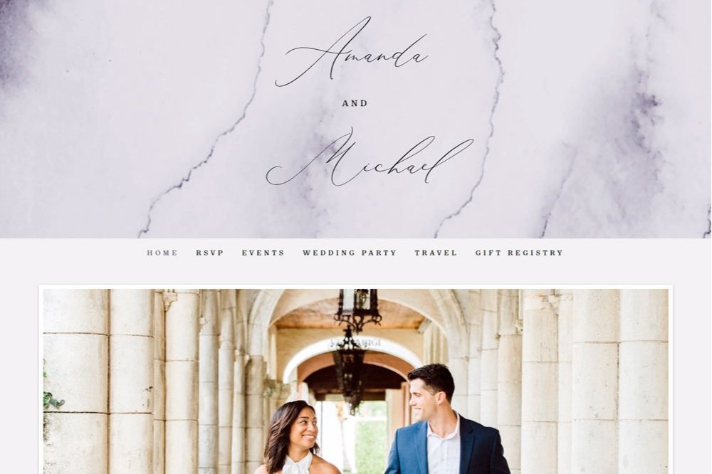
Another great website that can give you inspiration is the Amanda & Michael website. The stunning watercolor-like image that displays the couple's name at the beginning of the page sets the mood before the main image of the lovely couple. I love the neutral colors that stay consistent across the website to allow each element to have its individuality. Also, the menu that stays fixed when scrolling through the website is a thoughtful feature. It allows guests to navigate to whatever page they want to without going back to the top to access the menu.
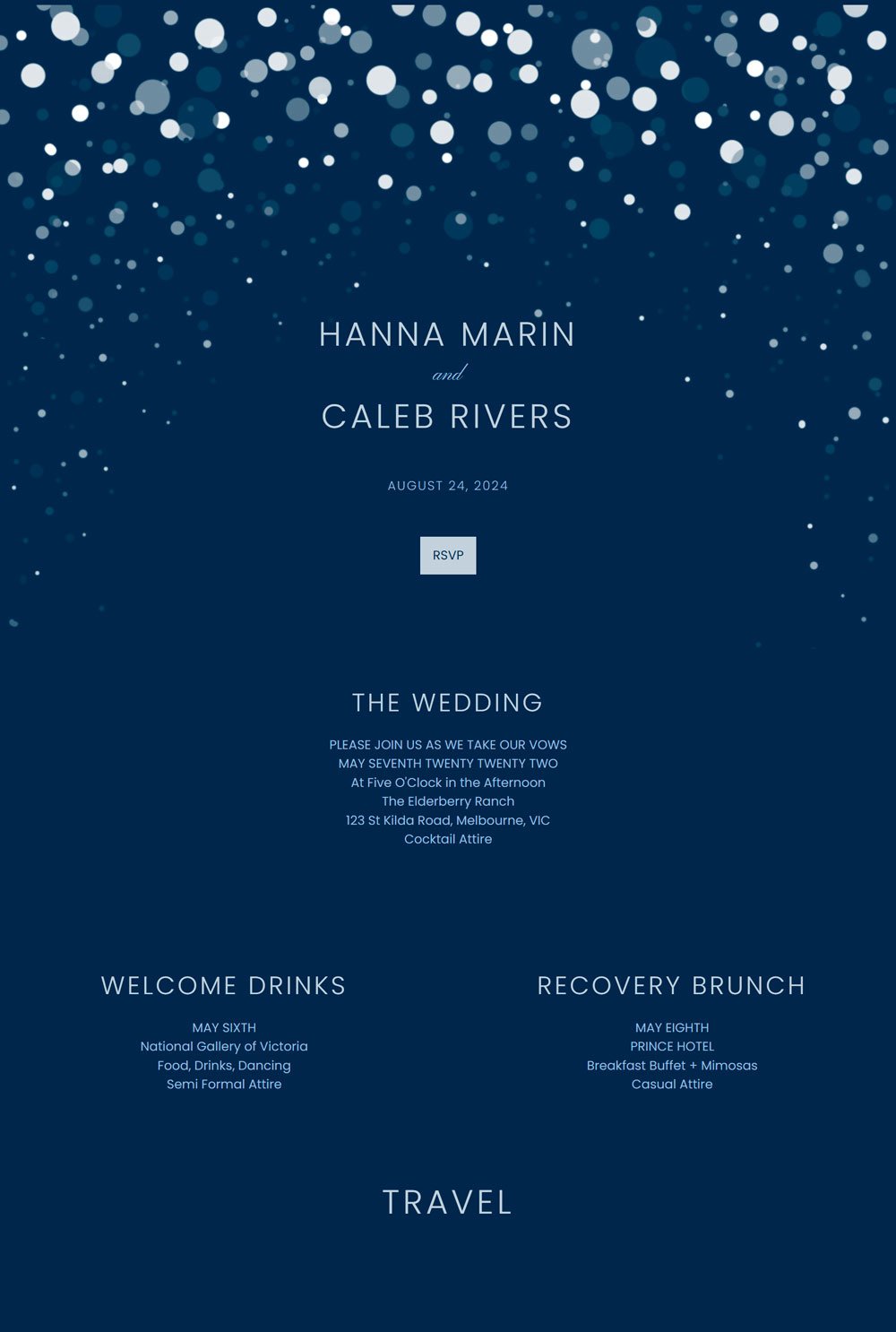
27. Hanna & Caleb 3

The elegant varying shapes of circles give the couple's name a magical, stunning look. This website makes use of navy blue color and different shades of blue to maintain a sharp contrast. It doesn't use any images, but it still maintains its elegance. In addition, it displays our story section and the vital information the guest needs to attend the wedding ceremony. One remarkable thing about this website is that it comes with a 'Get direction' button that shows the way to the venue from the airport, which is a thoughtful feature for guests that will be coming in a few hours before the ceremony. This is a great inspiration for couples looking to stay away from images and go straight to the important information.
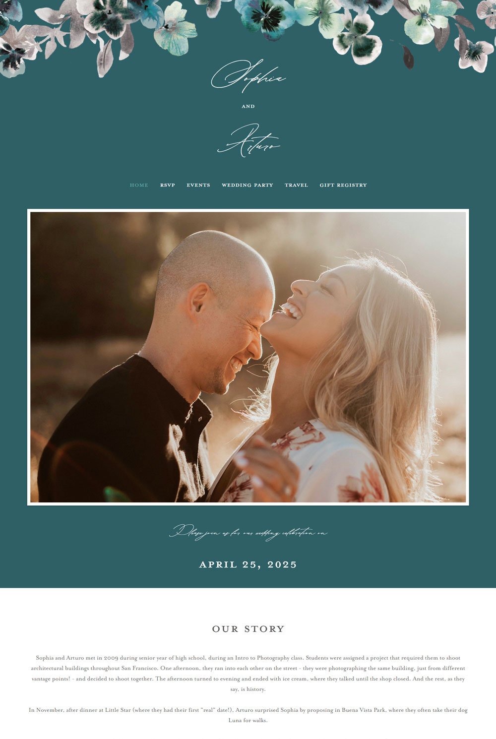
related article: 21+ Best Squarespace Portfolio Templates To Show Off Your Work28. Sophie & Arturo

Sophie & Arturo is simple and uses a few elements to add a bit of life to its minimalist nature. Its main goal is to focus on the images and information to be passed across. A great inspiration for couples thriving to create virtual information with little distractions
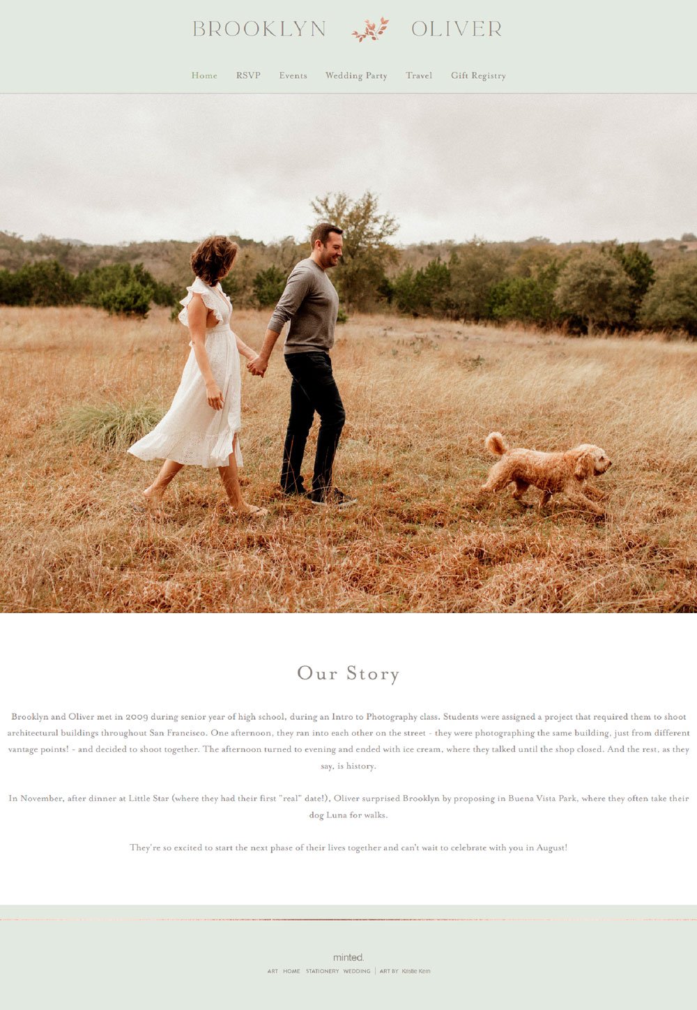
29. Brooklyn & Oliver

The full-sized image of the couple can bring a smile to any guest's lips. The image alone sets the mood for an incredible journey through the website. The following section is a short story that tells the story of what the couple meant in a few sentences. Brooklyn & Oliver has the necessary pages like the RSVP page, Wedding Party, Gift Registry, Events, and Travel page that allow guests to take the necessary actions.
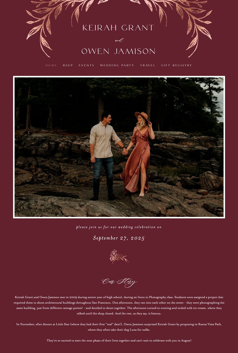
30. Keirah & Owen

The curling flowers that encompass the name of the couple are just breathtaking. The choice of maroon color gives a relaxing, soothing feeling to your guest's eyes. The terrific image that follows adds another shade of beauty to the website. One thing I love about this website is the way the colors, choice of fonts, and elements complement each other to give a wholesome, beautiful website. In addition, the website comes with a city guide where guests can check out fun things they can do around town while waiting for your wedding ceremony. How cool!
related article: 31+ Podcast Website Examples To Inspire Your Own31. Hanna & Caleb 4
The flora design at the top of the website introduces the couple's image. One thing I love is the RSVP button below the image. This one-paged website creatively uses space by using the alternating method to display information. You'd be scrolling through the website and booking your visit in a minute or less, which is perfect for busy guests. Lastly, the way the website points out different methods of transportation and accommodation is a great way to give your guests choices.
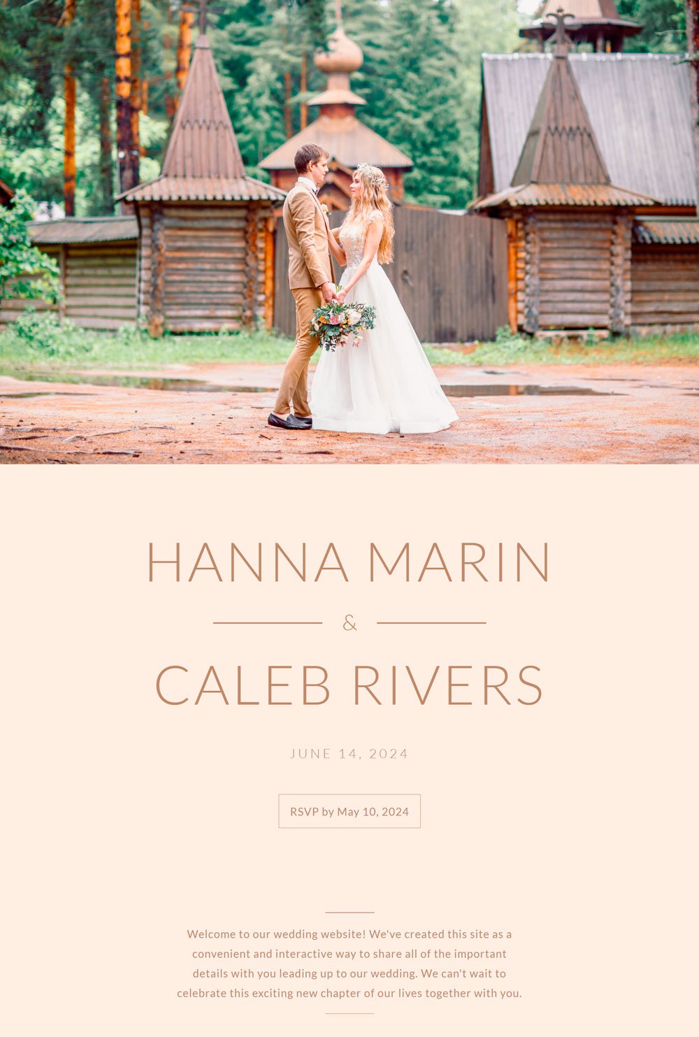
32. Hanna & Caleb 5

The colors are breathtaking and blend into the images perfectly. The different shades of brown give the website a solid, unique look. The choice of font and elements crowns up the look. One thing I'd want to dwell on is the way their schedule is displayed. The website highlights every schedule involved in the wedding ceremony alongside the time, often neglected by wedding websites. We love everything about this website, the images, the colors, and the structure. Everything. This will be an excellent inspiration for your wedding website.
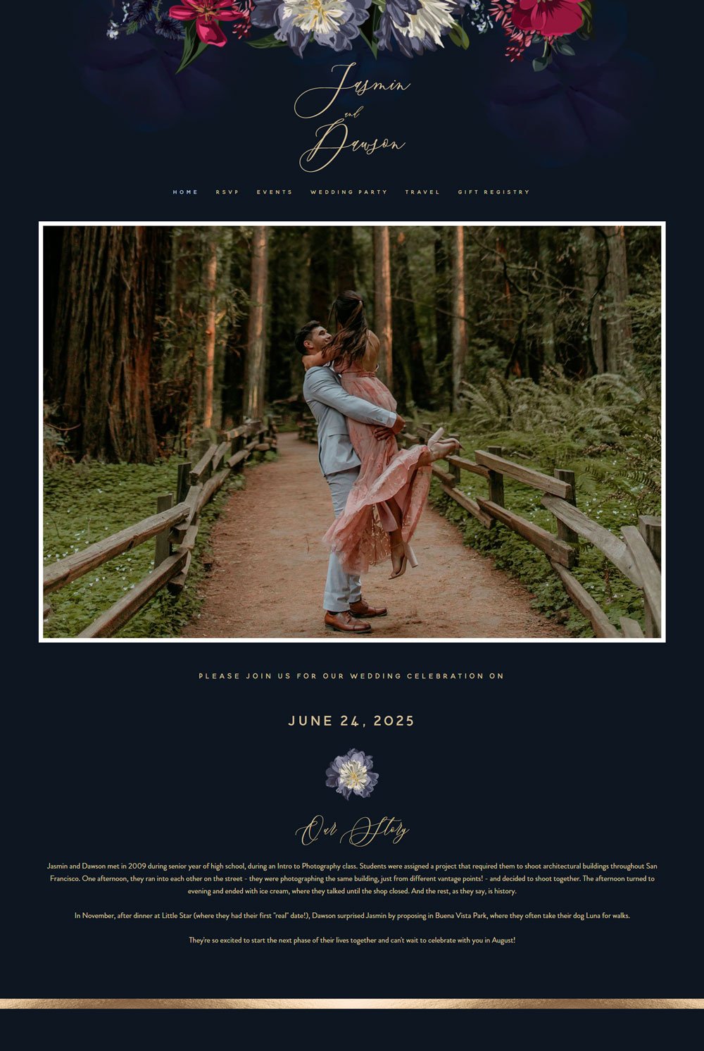
33. Jasmine & Dawson
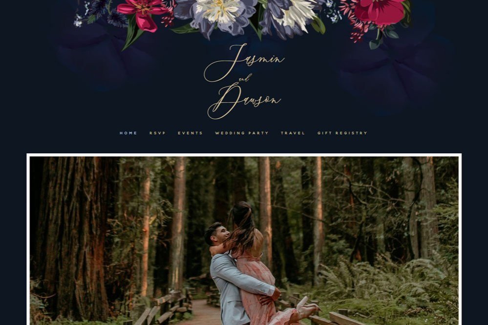
The combination of deep blue and gold plays out perfectly on this website. We love the minimalist nature and the stylish script font.
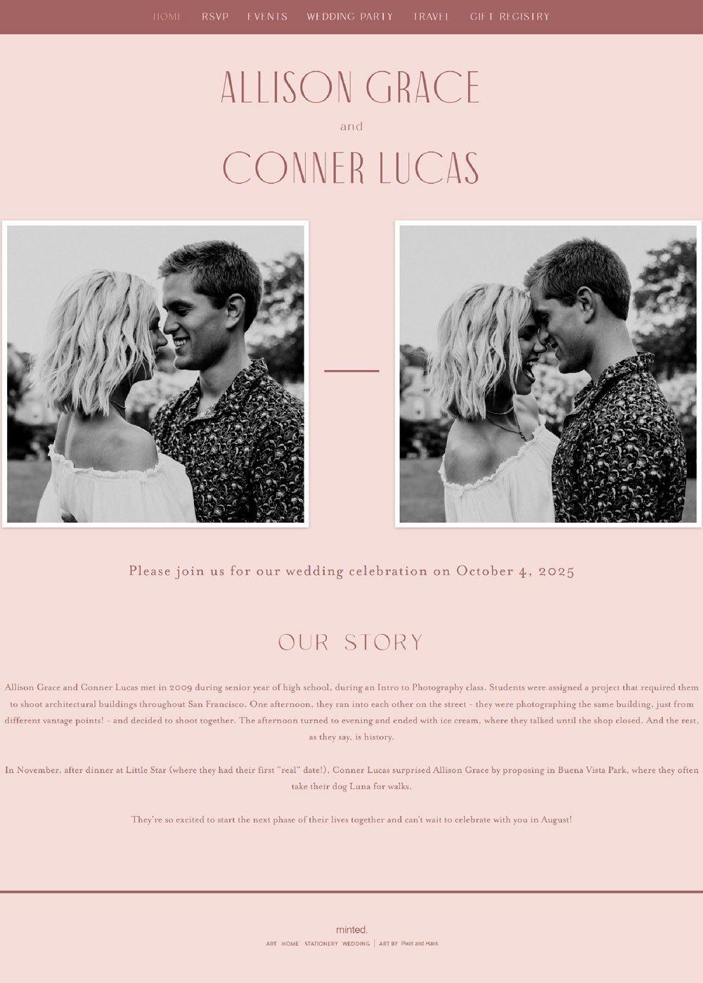
34. Allison & Conner

The lovely colors against the black and white pictures played out well. Allison & Conner uses beautiful colors, stunning fonts, and outstanding elements to create a stunning yet straightforward wedding website. So, if you are looking for a simple website design, this will be a great inspiration.
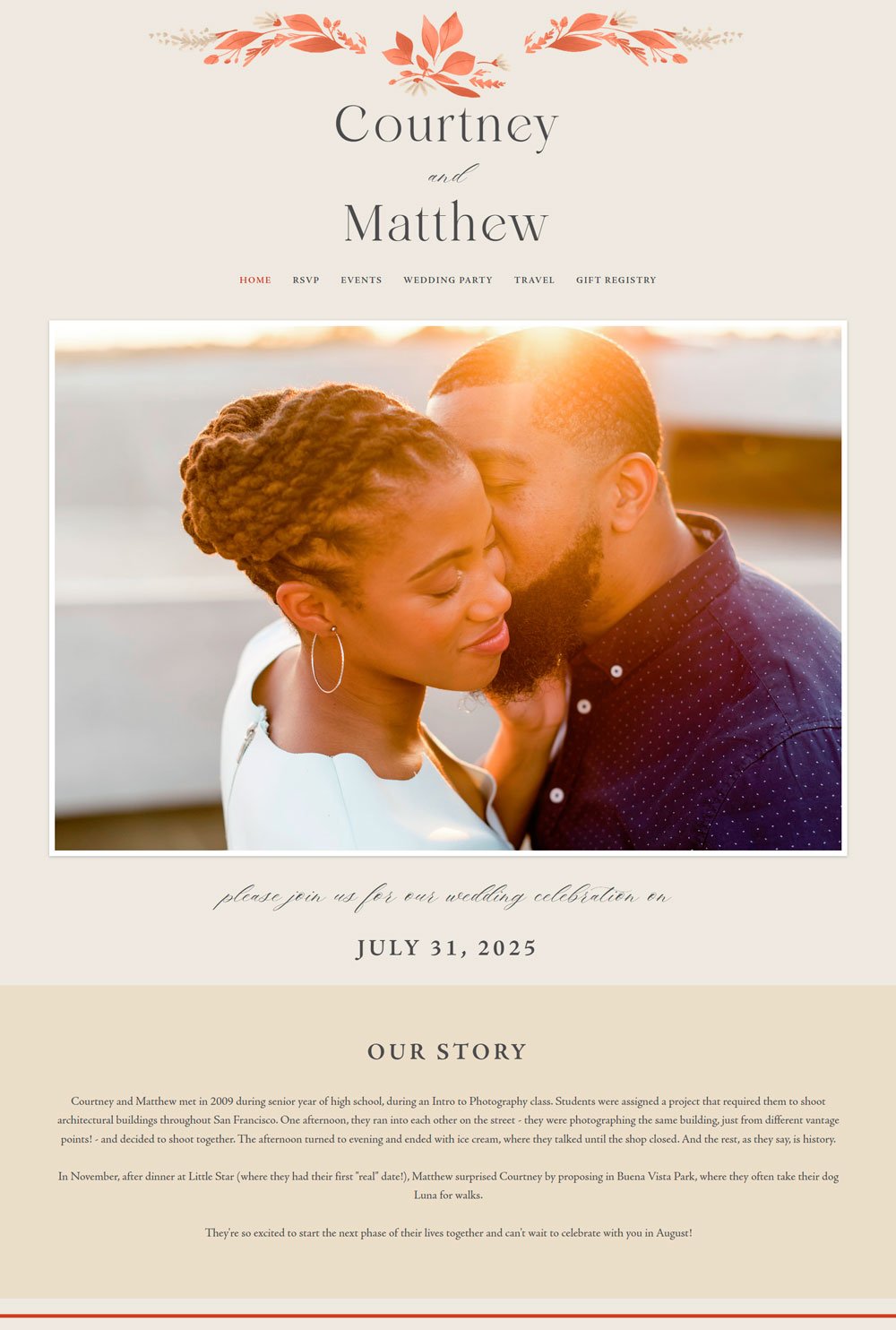
related article: Beauty Salon Website Templates For Squarespace35. Courtney & Matthew

Courtney & Matthew's website is a simple, stunning website that smoothly portrays the information. The flora element across the website adds a touch of vibrancy to the website. In addition, the Wedding Party page displays the groomsmen and bridesmaids that will be at your side that day, which is a great way to give your guest more information about whom to expect. Overall, Courtney & Matthew is an excellent inspiration for your wedding website.
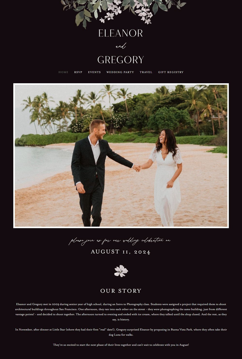
related article: 41+ Best Squarespace Plugins For Your Website36. Eleanor & Gregory

The black background and white text give Eleanor & Gregory a classic look. The website introduces the couple's love story in a short section just below the image, which is a great way. In addition, the website comes with useful pages to display our information.
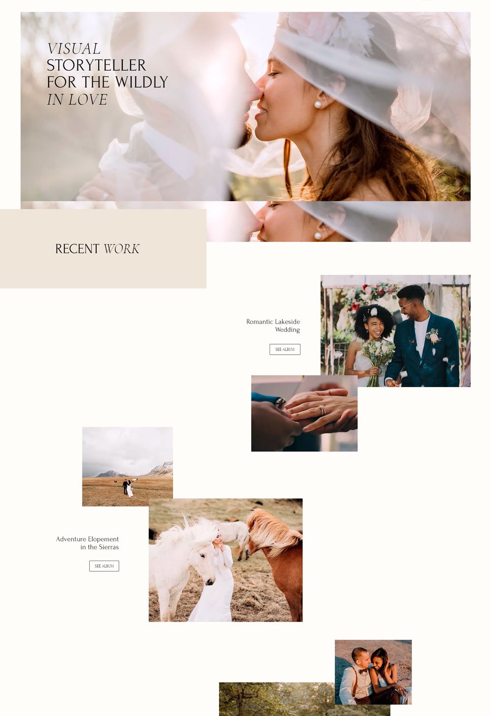
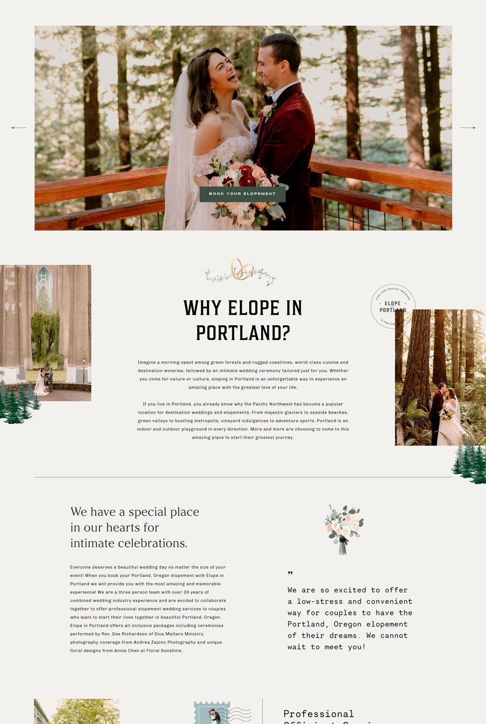
37. Elope in Portland
We want you to get the best inspiration for your website; that's why we featured this photography website. The first thing to note is the sliding image block at the top of the page, which is an excellent way for your guests to go through your stunning images. Also, the neutral colors and whitespace were purposely done so that viewers could focus on the images, which is obviously the selling point of the photographer. This is an excellent inspiration for your wedding website, especially if you have pre-wedding images you want to highlight. You can draw inspiration from the portfolio page when creating your story page. The portfolio structure allows the photographer to talk about each set of images, which is a great feature.
38. Rick Liston
The Rick Liston gives a phenomenal, vintage, and modern feeling simultaneously. The choice of colors and fonts makes the website stands out. The strategic placement of the images and the GIF of Rick popping Champagne adds life and fun to the website. The about me page can be an excellent inspiration for your story section, and the information page is a great inspiration for Registery, accommodation, and Travel page. Rick Liston uses beautiful elements and images to create a stunning website.
39. Moments & Waves

The first thing you will notice is the couple's animation that automatically starts playing when you land on the page, making your heart melt instantly. Oh, my! This website is just simply stunning. You can't help but lose count of how many times you stroll through. The home page introduces beautiful images that are perfect for our story section. The gallery page will work well for a photos section where you can display more of your beautiful images. Moment & Waves is simply stunning and will be an excellent inspiration for your upcoming wedding website design.
related article: Stunning Squarespace Real Estate Template40. Joy Zamora
Getting creative with a website and not playing by the rules sometimes works well. Joy Zamora uses bold colors and stunning font to create a breathtaking website. Its dynamism makes it stand out from other websites. The services page is the perfect page to draw your story section inspiration from. It features beautiful images and text space where you can create a memorable narration of your beautiful story. Another thing to note is the image background on the about page. It plays out well, and it is something you can use in some parts of your wedding website if you are tired of solid color backgrounds.
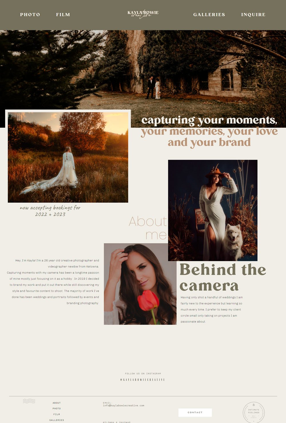
41. Kayla Mowie

Kayla Mowie is all shades of elegance and simplicity. This website uses overlapping images and fonts to give that unique look. The gallery page is a great inspiration to display more of your photos, the inquire page is excellent for the RSVP page, and the photos page for you our story page. Kayla Mowie is a beautiful website we recommend for you to draw your inspiration from.
You have what it takes to create your wedding website!
Weddings are joyful, memorable events, and nothing should stop you from having the best and most beautiful wedding website to share your stories! We want you to have the best wedding experience, and we hope you've found enough inspiration to get you started on your wedding website design journey!
If you are still wondering about the best website for your wedding, don't hesitate to scroll up and check out the five websites I have recommended for you.
Looking for a web designer for your wedding website or any kind of website? I am here, ready to help you turn your dream website into reality.
