
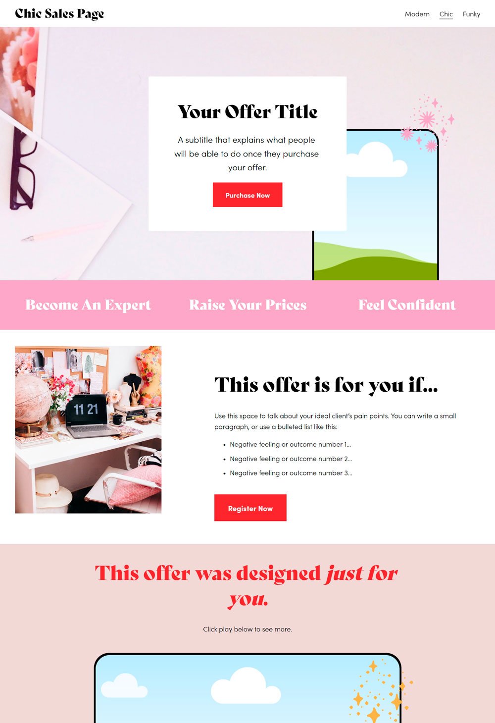
17+ Sales Page Templates: Skyrocket Your Sales Now!
There are billions of products online fighting for people's attention. Selling your products and services is beyond posting a bunch of pictures with a big 'buy now button. You need more than that. You must show your potential customers why they need to buy your product and the undeniable benefits they will gain if they have it.
One sure way to do that is through the sales page. A well-constructed sales page can increase conversion rate and business growth. Therefore, we will look at 17+ sales page templates you can purchase and learn from.
Squarespace Sales Page video tutorial
Why Sales Pages Are Important
A sales page is a bridge between your potential buyers and your product: A buyer must be convinced beyond reasonable doubt that your product will make their life easier, and one way to eliminate those doubts and establish the authenticity and usefulness of your product is through sales pages. With a good sales page, you can establish credibility, state the product's price and compel them to take action.
They are easy to build: Sales pages are easy to build once you've carried out adequate research about your target audience. Fortunately, there is a lot of software that you can use to build your sales page, so you don't have to worry about spending tons of money to construct a sales page for your template.
Learn how to build a sales page on Squarespace right now!
Squarespace Sales Page Templates
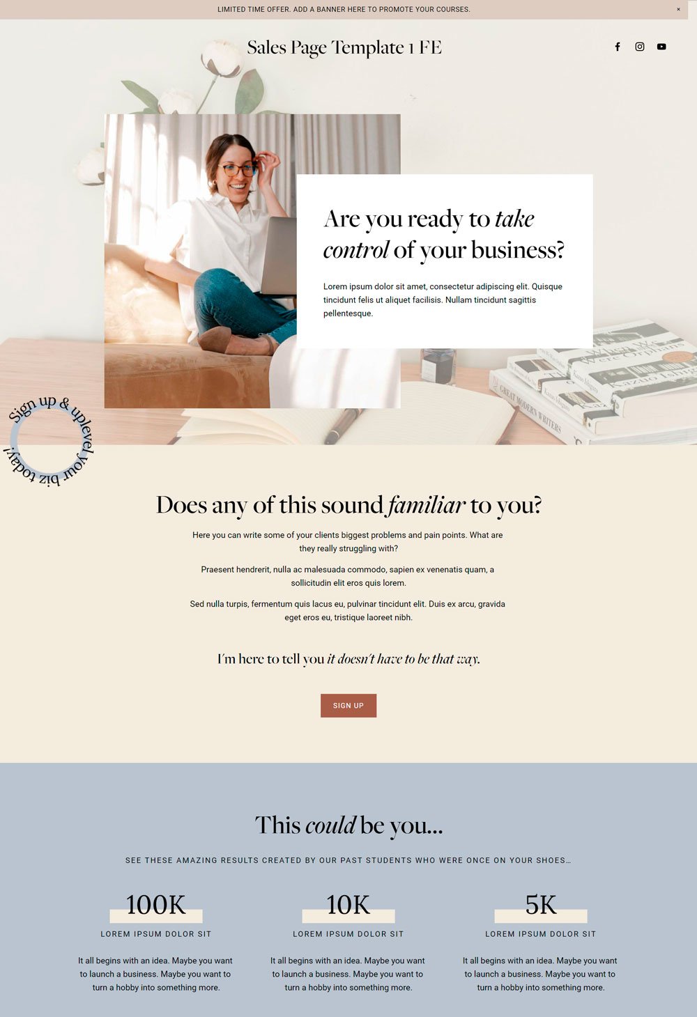
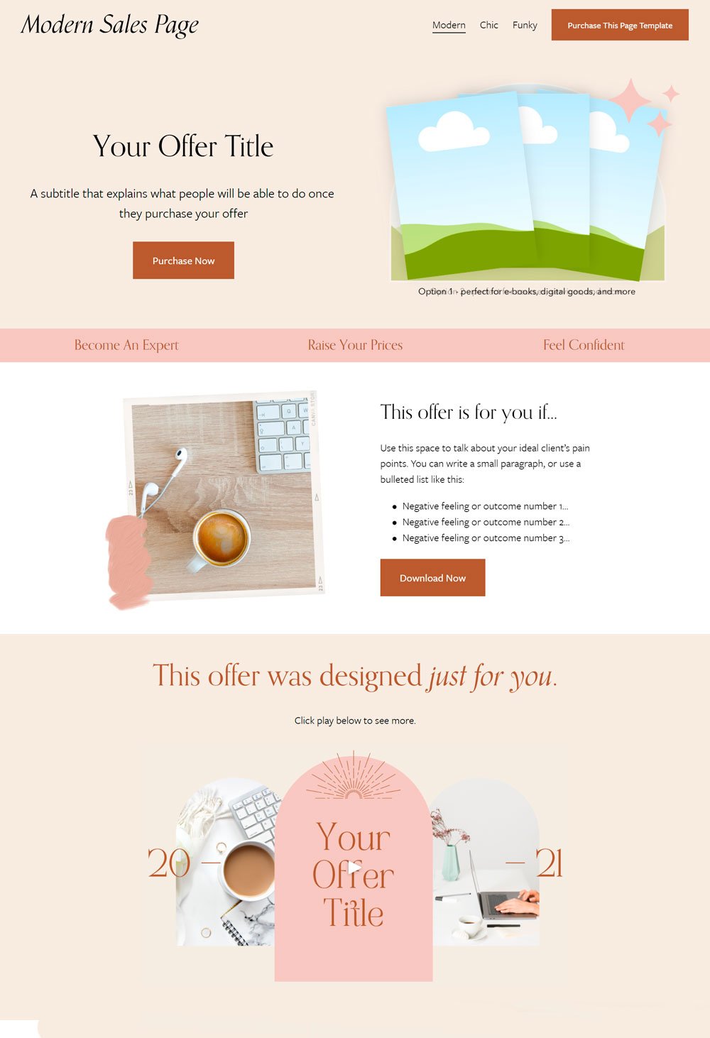
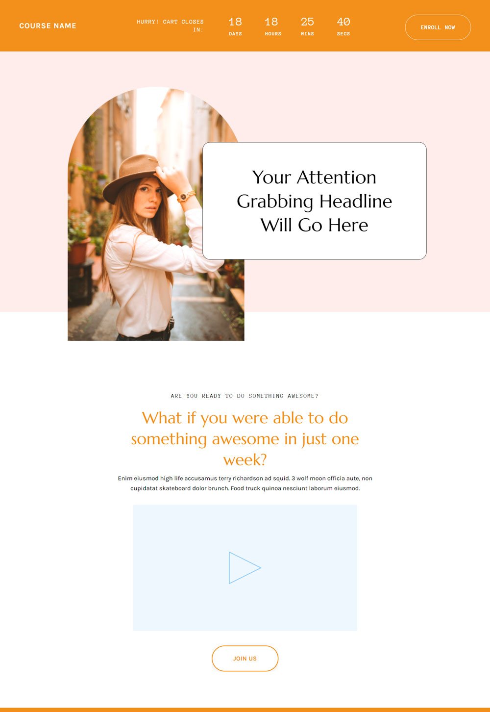
1. Modern sales page template

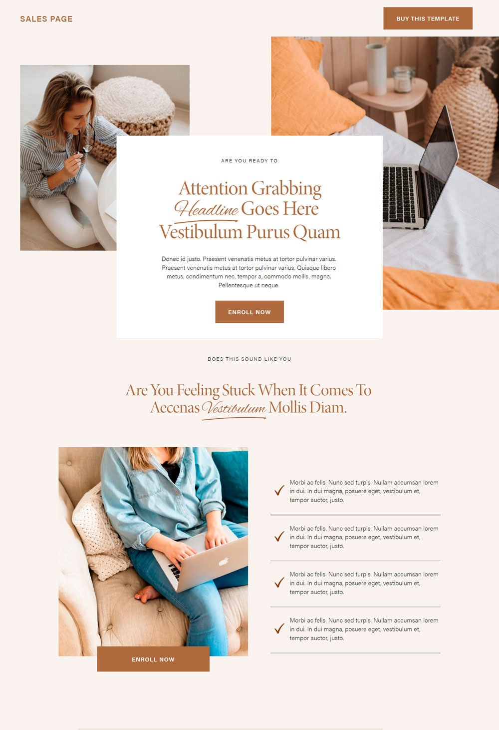
This sales page template from our store went through a lot of research, processing, and best practices. Every section contributes to the building climax that eventually makes your customers stop snoozing and buy your product. Here is an overview of why this sales page will convert.
What it did wellA visible heading: A great sales page should start with an enticing heading or any other element that instantly captures the visitor's attention. This template ensures that the heading section stands out from the rest of the text by using contrasting colors and font sizes.
Relating With The Visitor's pain points: A rule of thumb when designing a sales landing page is to relate with the buyers' pain points. They do not care about how great your product is; rather, they care about how your product can solve their pain points and make their lives easier. This template has sections that allow you to address your buyer's pain points. An example is the 'Are you feeling stuck' sub-headline. That is a great section to dig into your user's pains and leverage them to your advantage.
Showing Results: Due to many failed expectations, buyers are usually skeptical about the authenticity of a product, and a way to eliminate their doubts is to show clear relatable results your products have solved. One way to do that is through relatable testimonials, a result section you will see in this template.
Tip: When designing your sales page, ensure you include high-quality images and multiple CTA buttons that convert.

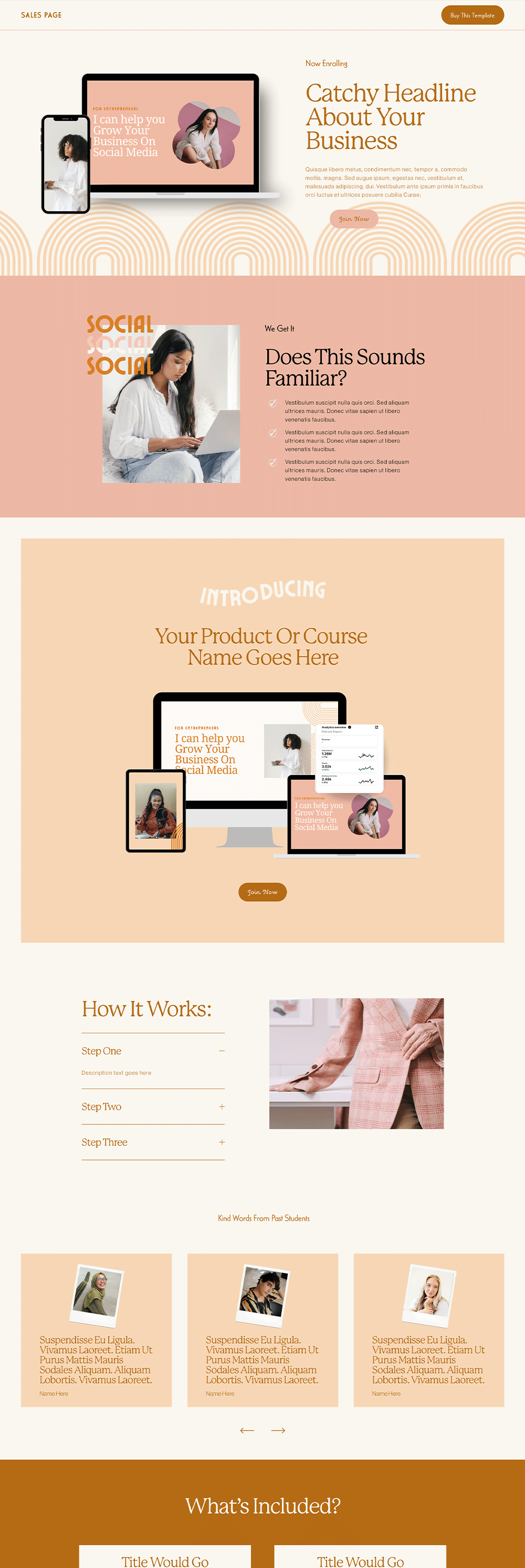
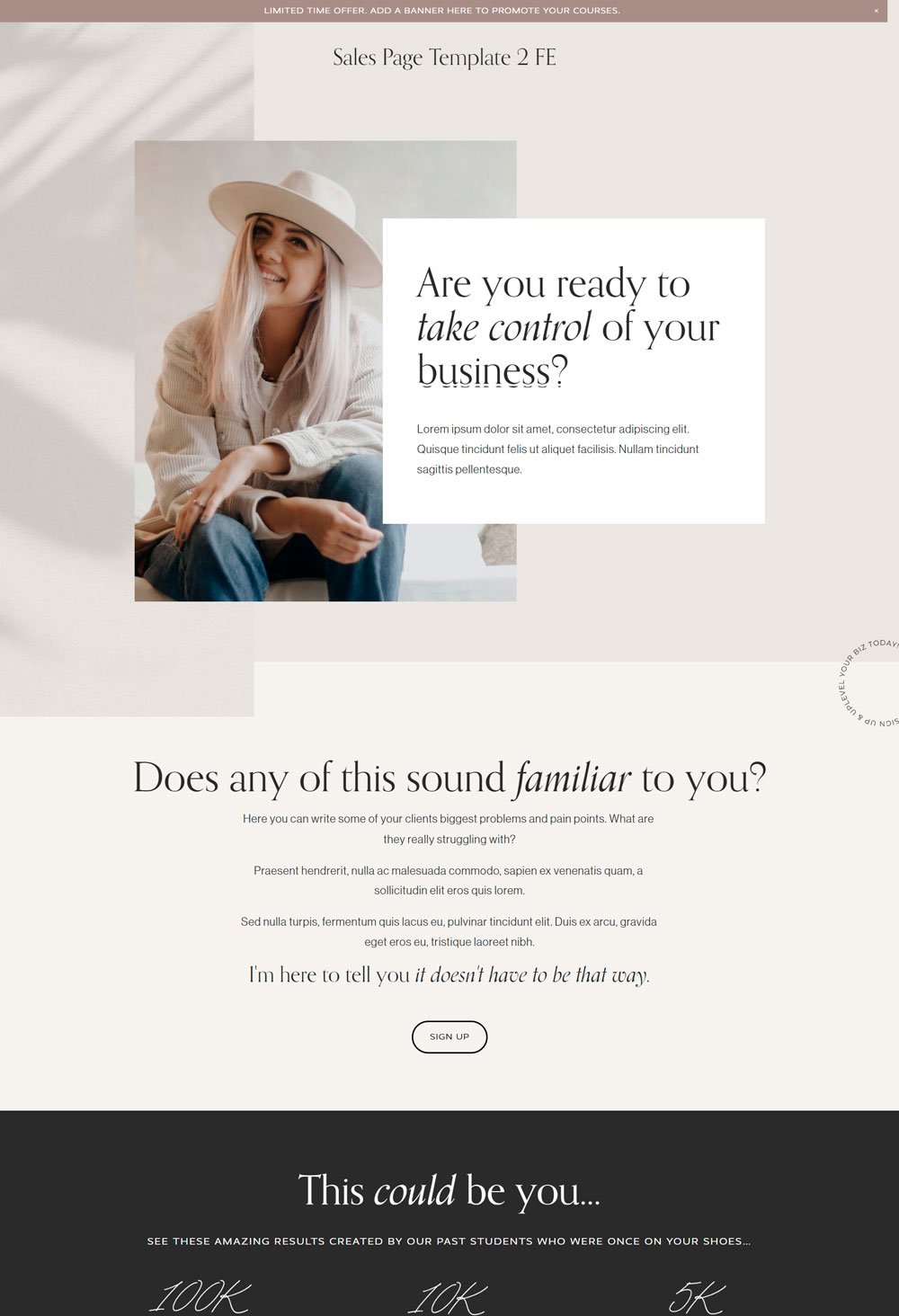
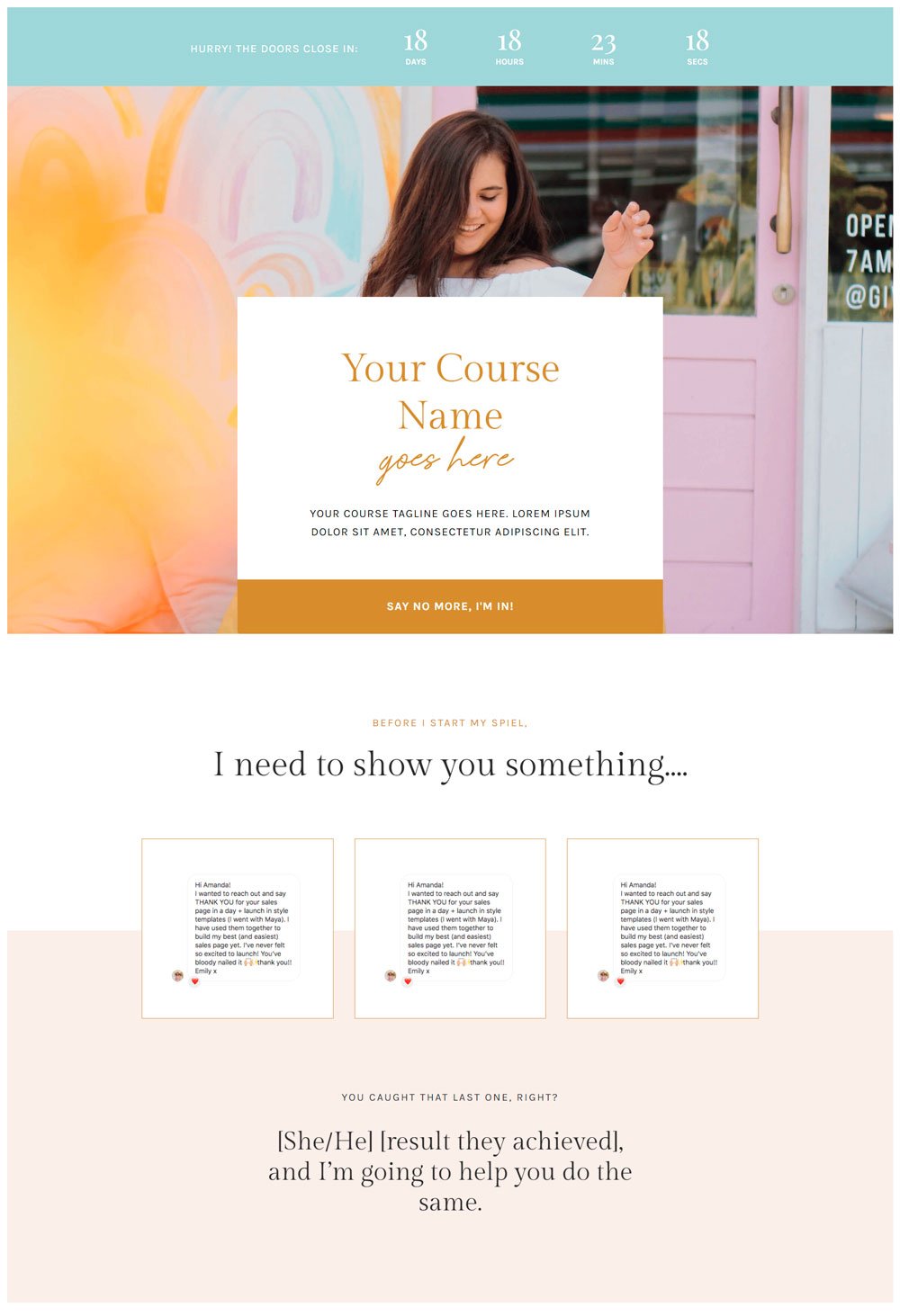
This long-form sales page is great for establishing trust for complex products requiring a high investment. It allows you to build a relationship with the buyer, provide comprehensive knowledge about your product and eliminate all doubts they may have.
What it did wellFull Breakdown of the Product: If you are offering a commitment-demanding or complex product such as a cybersecurity subscription or an intensive course, you must be able to break down what the product is about and what it will stand to gain. On this sales page, you will see a 'course breakdown' section where you can explain the benefit of your product or service to your potential customer.
Extensive Use of Images: One mistake many sales pages make is the lack of visuals. Your potential customer must be able to see what they are buying. Never hesitate to add visuals of your product or any other images that will aid the imagination of your customers.
Eliminating Doubts: There is a section named 'is this course right for you?' which is a great way to eradicate any doubts your customers may have. Will good research and the right value proposition, you will gain insight into the hesitating thoughts that may keep your customers from taking action so that you can address them in your long-form sales page.
Tip: Your sales page must have several cooperative CTA buttons. Never leave your buyers to guess what next they should do.
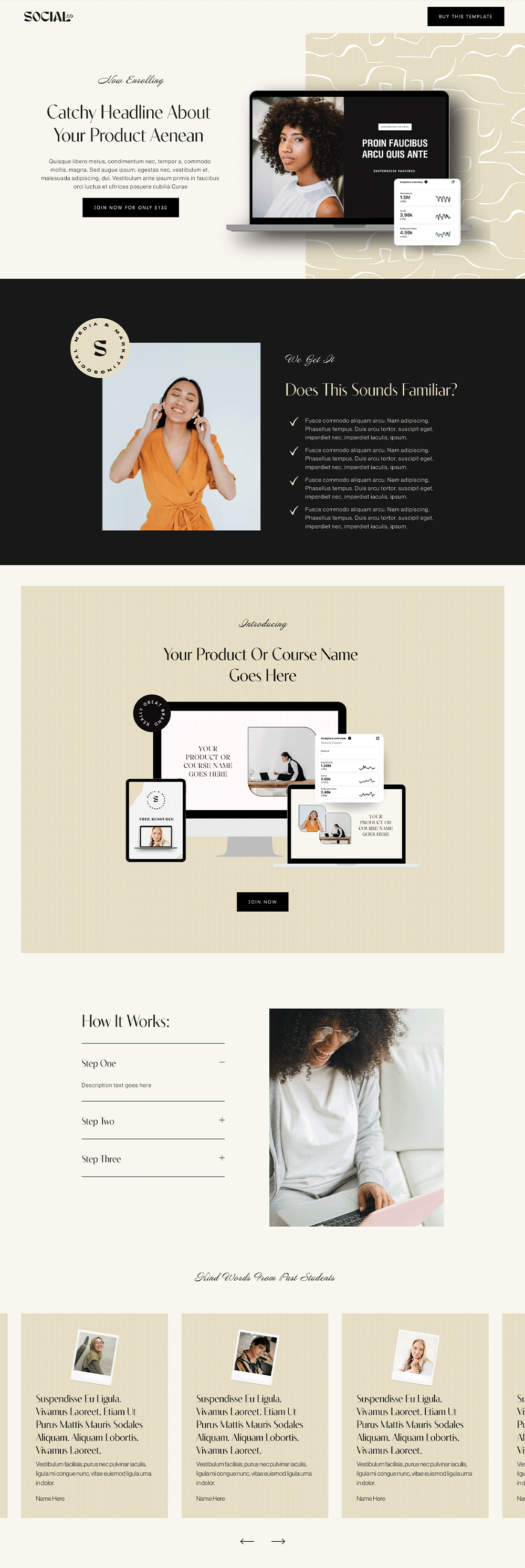
3. Social.co

Social.co is a full website template with a converting sales page. You can purchase the full website, which of course, comes with the sales page, or purchase the sales page differently. The sales page for this website template is named 'courses,' so if you check it out, click on courses on the navigation bar.
What it did wellClear Call To Action buttons: What is a sales page without clear CTA buttons? The social. Co sales page has actionable buttons placed in strategic sections to ensure that the buyer always knows what to do.
Direct Pricing plans: As you can see in the price section of the sales page, the pricing plans are well highlighted with their benefits. One thing to note when designing a sales page is to tell the buyers the product's price. If you've provided a clear reason why your product is worth more than the price you give, then there won't be any problem investing in one.
FAQs: Another section that will be helpful for the doubting Thomases is a FAQ section where you can answer all their pending questions before they conclude that they don't need the product.
Tip: Stick with clear and concise copies. Let the written content on your sales page be straightforward and convincing.

The sales page (course) page comes loaded with strategic sections, concise and direct message spaces, and clear call-to-action buttons. One thing this sales page template does well is that its sections are intertwined to create that seamless storytelling. When building a sales page, ensure that you create a smooth flow and digestible sections to prevent buyers from becoming bored.
What it did wellGreat Testimonials: Testimonials still work wonders when it is focused on how the product has benefitted the person rather than stroking the product's ego. This sales page template has two testimonial sections to create social proof and help the buyers relate.
A considerable amount of white space: The last thing you want is your sales page to look choked up. Not only will the information look messy, but it will also discourage the readers from going far. Boho Social does a great job of giving each section and element breathing space.
Author's section: Believe it or not, some buyers will buy a product because they can relate to the author's story. While it is not always necessary to include an author's section on all sales pages, it can make a huge difference. As I said, the best thing is to research your target audience and what they need before building your sales page.
This template is a good one for higher conversion rates.
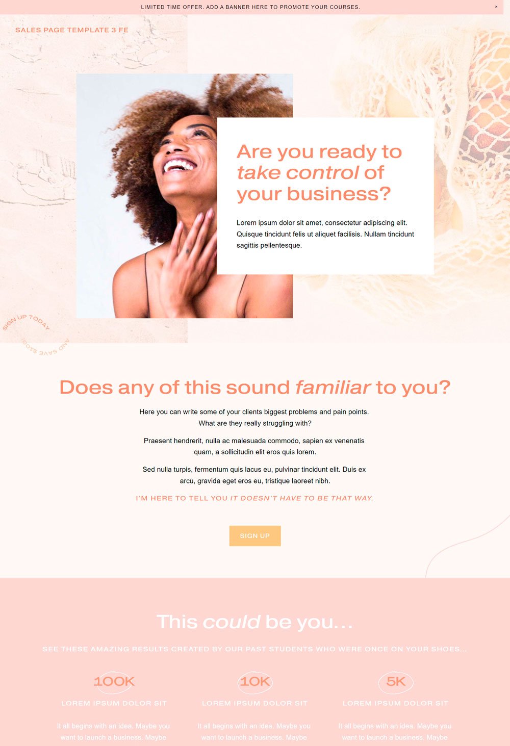
5. BCC Sales Page

The Bigcatcreative sales page template is self-explanatory and gives you a step-by-step guide on creating the perfect sales page for your product. This long-form sales page covers everything your customer needs to know about your product before committing.
What It Did WellBenefit-oriented Headline: You will see the section's headlines throughout the template. This is a great way to ensure your customers are not lost in this long sales page, and their interest is constantly increasing with the attention-grabbing headlines. However, it depends on you to make the best use of the headlines.
Social proof: Social proof may not be enough, but it contributes greatly to the decision-making process of your potential customer, and the BCC sales page does it well. The 'this could be you' section shows a numerical achievement of the course. When combined with relatable testimonials, it can be a great tool.
'This is for you' section: Sometimes, you need to relate diversely to your audience's pain points. The 'this is for you' section on the sales page is a great way to integrate their problems further and list all the benefits they will gain with your product.
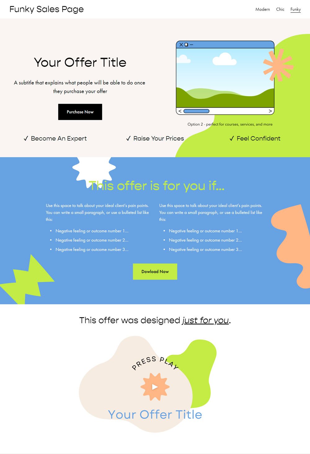
6. Booming Design Sales Page Templates
One thing that can make a difference in the conversion rates of a sales page is visuals, especially captivating images of the product and what it can achieve. The Booming Design Sales page does that well. You can see a lot of visuals scattered around the page.
What it did wellVideo section: Never underestimate the power of visuals. Adding a great, converting short video to a sales page can make a major difference, and that is what you get in this template. In addition, there is a video section where you can either show your product in action or talk about the benefit of your product.
Storytelling Design: The three variations of this sales page are stunning. The design captures the storytelling technique, and it seems like each section is intertwined with another section, leading to an ever-increasing climax.
CTA button: The sales funnel contains various CTA buttons placed at strategic places, which is an important thing no sales template should leave out.
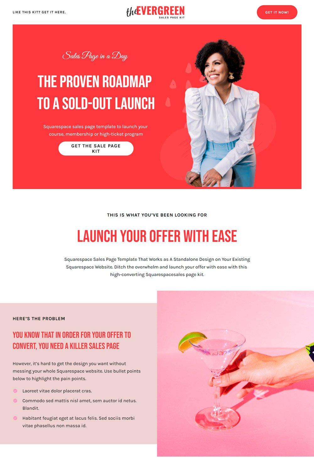
7. Evergreen

Nothing beats a compelling headline and a captivating image. Evergreen is a thoughtfully designed sales funnel that considers the law of marketing and design. The sections, white space, and copy make it clean, compelling, and a great template to purchase.
What It Did WellClean Design: You don't want your sales page looking messy, and Evergreen ensures to stay out of that. The white background and red contrast make every information piece stand out and give the page a professional look. If you are not a fan of red, you can easily switch colors since it was built with Squarespace.
A unique selling proposition option: In the 'What makes the offer different' section, you can easily talk about one or two things that make your product different and better than similar products. You must understand that your buyer believes that there are other similar products with a lower price than yours; therefore, you must be able to tell them what you offer differently.
related article: 31+ Podcast Website Examples To Inspire Your Own
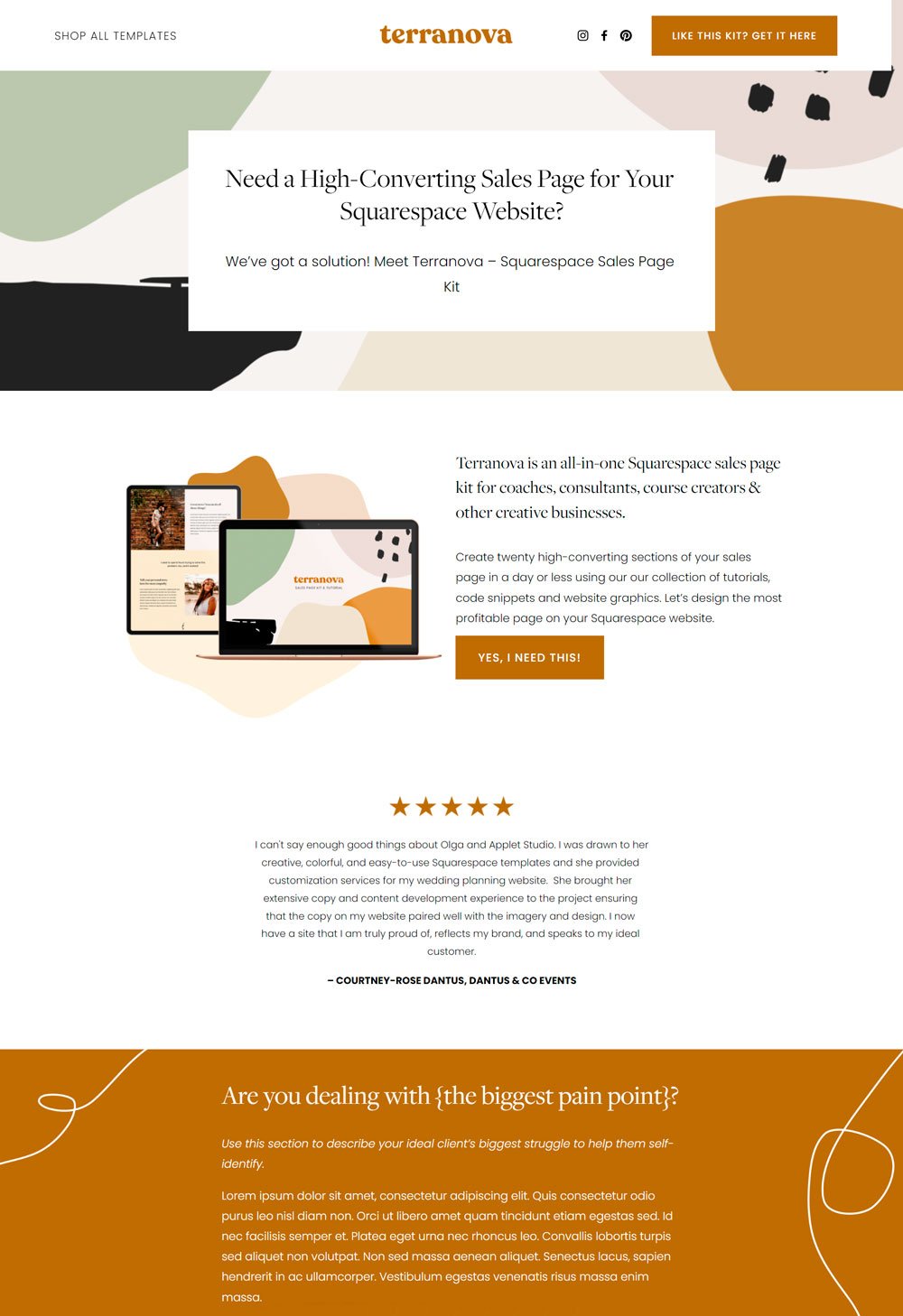
8. Terranova

One thing Terranova did well is creating an avenue where you can personalize your sales page. Depending on your target audience, buyers want to relate personally to a story. They want to see someone else who faced similar pain points with them and how they used the product to solve their pain points. Terranova ensured it left adequate space for that. So, if you are building a personalized sales page, you can check this page out.
What it did wellClear Pricing Options: If you offer a product with pricing plans, you must list the differences between the plans and how each plan is suitable for different needs. The 'more purchase options' section on Terranova did a great job highlighting that.
Author's section: For a long-form sales page, sometimes it makes sense to give prospects access to who you are and how you live your life. It can also influence their buying decision.
What should have been improvedThe sales page should have more CTA buttons, especially in the long sections. However, you can easily add more CTA buttons if you eventually purchase the template, so it is a win-win situation.
Kajabi Sales page templates
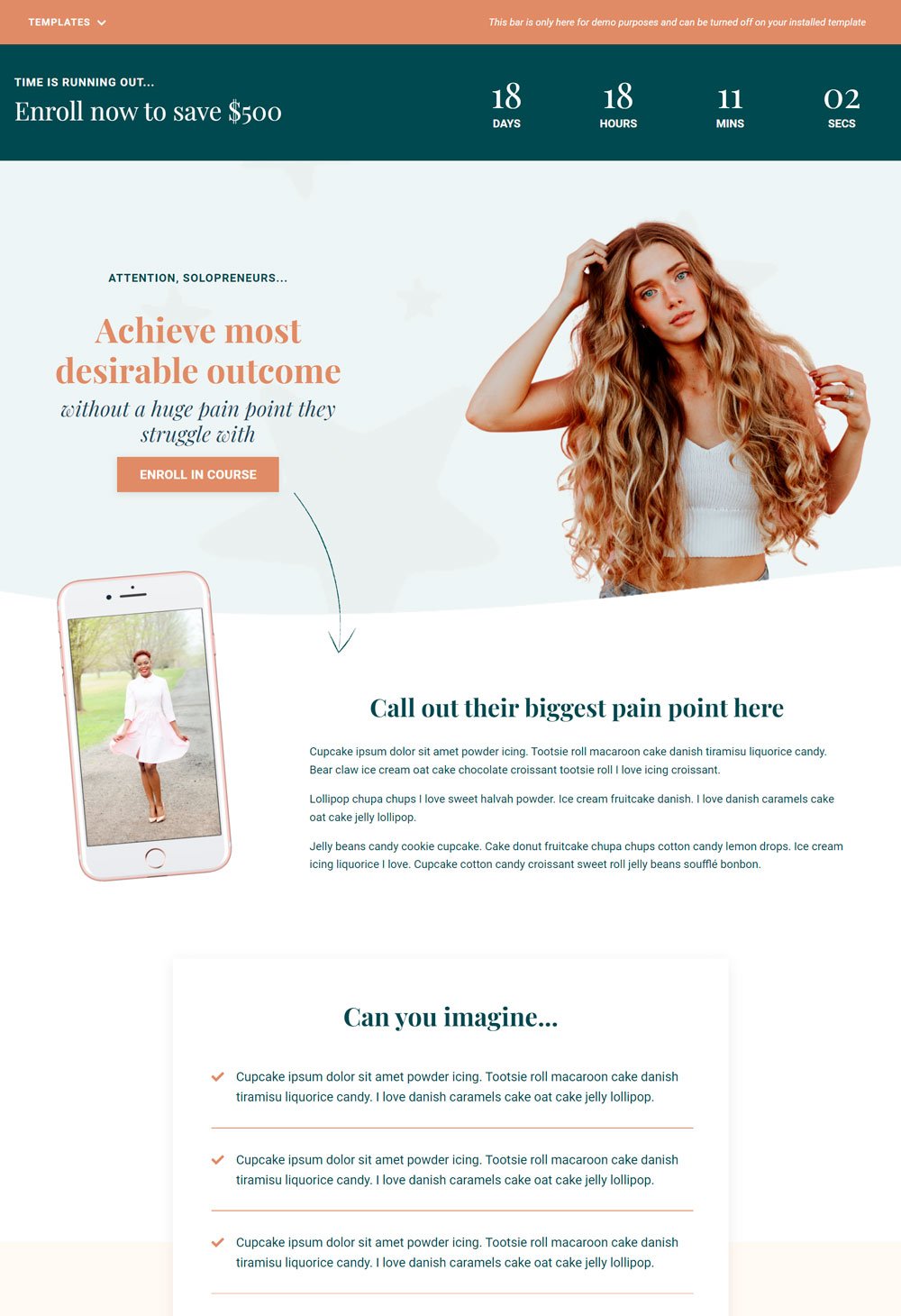
9. Athena

Athena's sales page is effective and thoughtfully designed. Athena keeps things simple with its spacious white space and generous use of colors. In addition, the sections are thoughtfully demarcated to give viewers a break between each piece of information.
What it did wellCountdown timer: Want to create a sense of urgency in your customers? Use a countdown timer. Due to the psychological makeup of humans, the feeling of losing a reward can make one take action. Using a countdown timer in this template is highly effective and can contribute to your buyer's decision.
An Overview of The Product: In the here's what is waiting for your section, The Athena template leaves provision for a sneak peek. You have to be able to give your buyer a sneak peek into what they will gain with your product.
Bonus Section: This may not apply to all products, but including a bonus pack with your main product can influence people to buy the product. One way to make this effective is to offer a complementary product with your main product.
related article: 51+ General Contractor Websites (Plus Templates!)10. Emma

The Emma long-form sales page is well-designed to cater to the needs of your sales goals. The Emma comes with clean fonts and designs and great marketing tactics. The generous use of visuals makes it appealing, and the colors contribute to its overall look.
What it did wellHow It Works Section: Although this is a course-related sales page, how it works section is a great addition if your product is complex, or you wish to let your buyers know how the process works. This will allow them to get a view into the process.
Testimonial at the beginning of the page: It is a clever idea to put the testimonials first before they even dive deep into their product. This sets the ground and opens their minds to the possibilities the product can bring into their lives. Adding testimonials at the beginning of your sales page is a great idea!
Course Overview: As I mentioned earlier, a sneak peek into your product whets the appetite of your potential buyers and positively influences their decision.
keyword: bullet points, instant access,
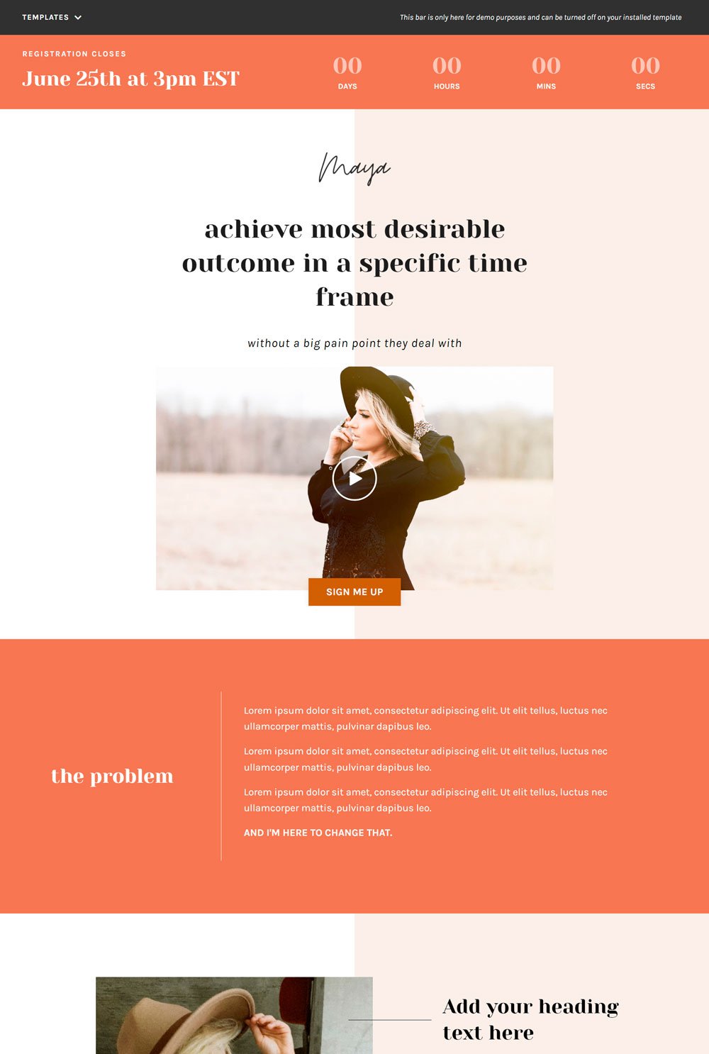
11. Maya

Maya was born ready to be a sales page. The headlines, visuals, and social proof give it a compelling aura. The design is elegant and simple enough to allow buyers to scan through the important elements without being distracted.
What It Did WellShort Video: A compelling video can increase your sales page conversion rate. Although it can be hard to get it right, if done well can be an added advantage. Maya comes with a video at the head of the sales page, which is a great addition.
Call To Action Buttons: What is the use of a sales page if there are no strategic and compelling call-to-action buttons? Maya ensures that CTA buttons are placed at strategic locations.
Payment Options: Most sales pages overlook this little addition, but it can also make a difference. Maya includes different payment options to let buyers know they can pay with their preferred card before clicking the 'buy now button. You will be surprised that some buyers get discouraged from taking action because they don't want to pass through the stress of a third-party payment method.
related article: 31+ Best Health Coach Websites (Plus Templates!)12. The Marie

Marie is a Kajabi sales page template that covers the nitty-gritty of a sales page. You get access to everything that can lead to higher conversion rates. One thing I love about Marie is the 'Enroll now' CTA button you immediately see after you land on the page. This is a great addition for buyers who already know about your course and want to purchase and move on with their lives.
What It Did WellComparison section: There is a 'when you implement my proven system' section, which compares their initial problem and the solution they'll gain when they finally enroll for the course. Placing the problem and the solution side by side is an effective way to help your buyers imagine life after your course.
Bonus Section: The bonus section will be great for you if you offer a course or product that includes a bonus. You can highlight the freebies they will gain if they eventually purchase your course. As I said earlier, ensure your bonus is complimentary with your product. Do not offer a free necklace for a marketing course purchase.
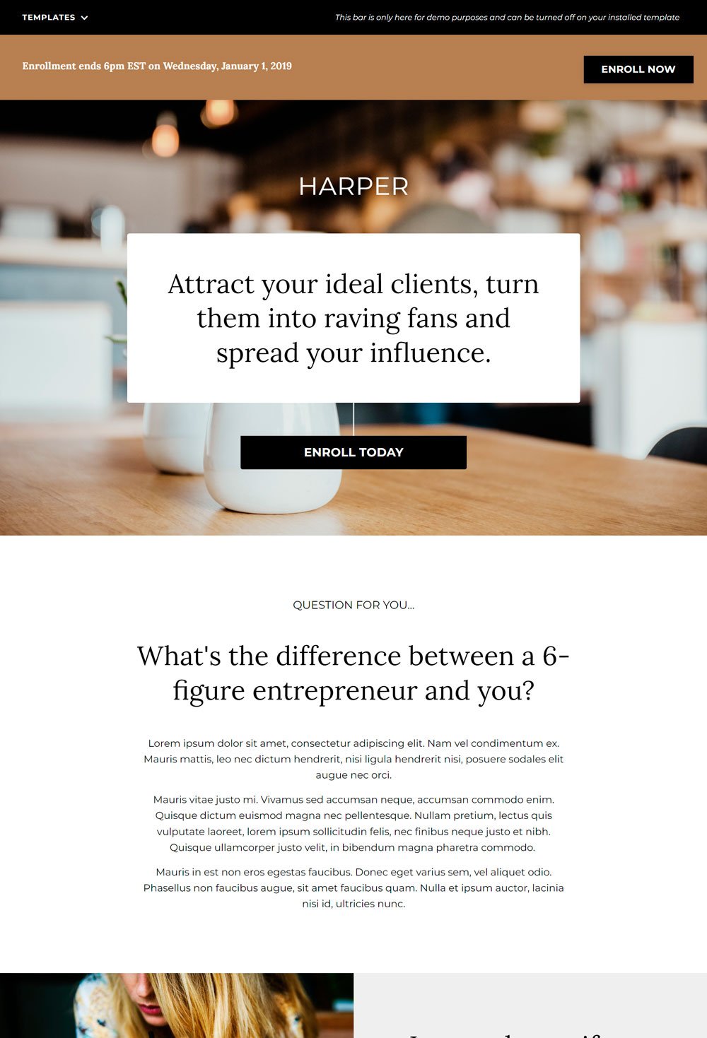
13. The Harper

Instead of a countdown timer, Harper went with a deadline for enrollment, which is a great variation if you want to create a sense of urgency but are not interested in using a countdown timer. Harper is a well-designed sales page with the necessary elements that will lead to a higher conversion rate.
What it did wellCreative CTA buttons: The boring 'buy now' or 'sign up' are effective, but sometimes they may not be compelling. But if you include something like 'Yes, this is exactly what I need!' like Harper did, it may provoke emotions that will force your buyers to take action. So again, I will give Harper applause for its compelling CTA copy.
Clear and compelling headlines: Although this is a template you can purchase, the headline alone already makes it compelling. In addition, the headline for each section shows a distinct difference from others.
Testimonials: Harper also did great with featuring testimonials at strategic places and a CTA button in case a buyer is convinced beyond a reasonable doubt.
related article: 17+ Best Personal Trainer Website Template And Examples14. The Addison

The first thing you notice is the design of this template. Addison is aesthetically stunning, and it is obvious. Even if you change the colors, this template may look great. Besides the design, Addison's use of visuals is commendable. It isn't overwhelming or scanty.
What it Did WellShort Video: Videos are a great addition to sales pages if done well. Addison did not leave out a video column where you can showcase your product in action or any other creative marketing idea you may have if you don't want to include a video, no problem! You can easily delete the section, and you are good to go.
Success Story Section: Testimonials are great, but adding a long-form testimonial/success story can establish a valid point, especially if it comes from a real human. He has greatly benefitted from your product. The 'success story' section on Addison is a great addition.
FAQ section: FAQs are great for clearing any doubts your buyer may have at the end of the page. Addison includes an FAQ section, which is a great thing to do.
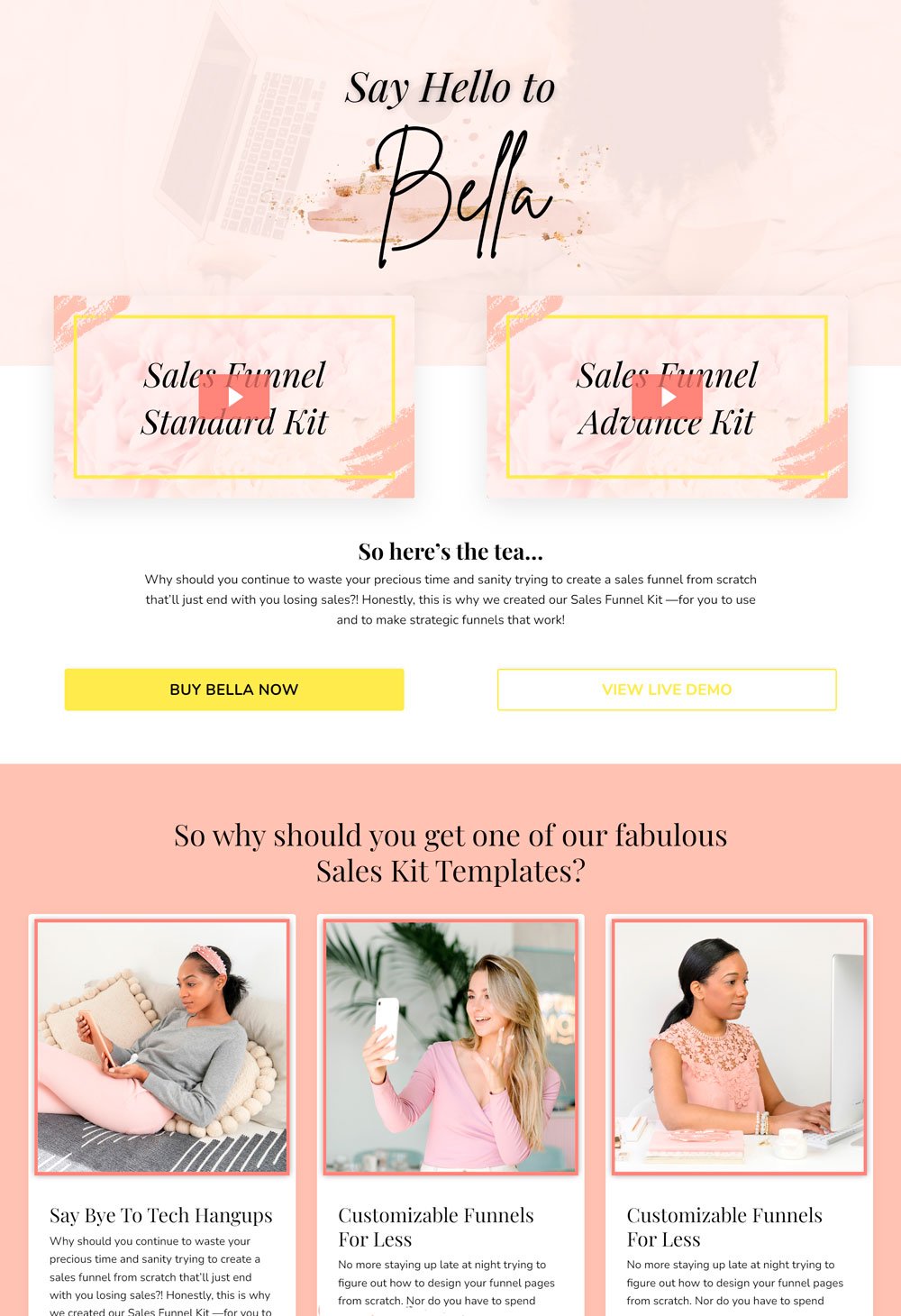
15. Bella

Bella is a comprehensive sales template kit with all the pages you need for your product, including registration, thank you, and about page, amongst many others. We will be focusing on the sales page. Bella's sales page was designed with conversion in mind and did it well.
What it did wellGreat Use Of Visuals: Visuals can make a difference in how your written content is perceived. Bella, ensure it strategically and aesthetically uses visuals to communicate your copy. Apart from the short video at the head of the page, the images used throughout the frame have nice frames to amplify further use.
Comparison section: Bella has a 'life before the program' and 'life after the program' section, and it is an effective way to give your buyer insight into what your product can do for them if they finally go with it.
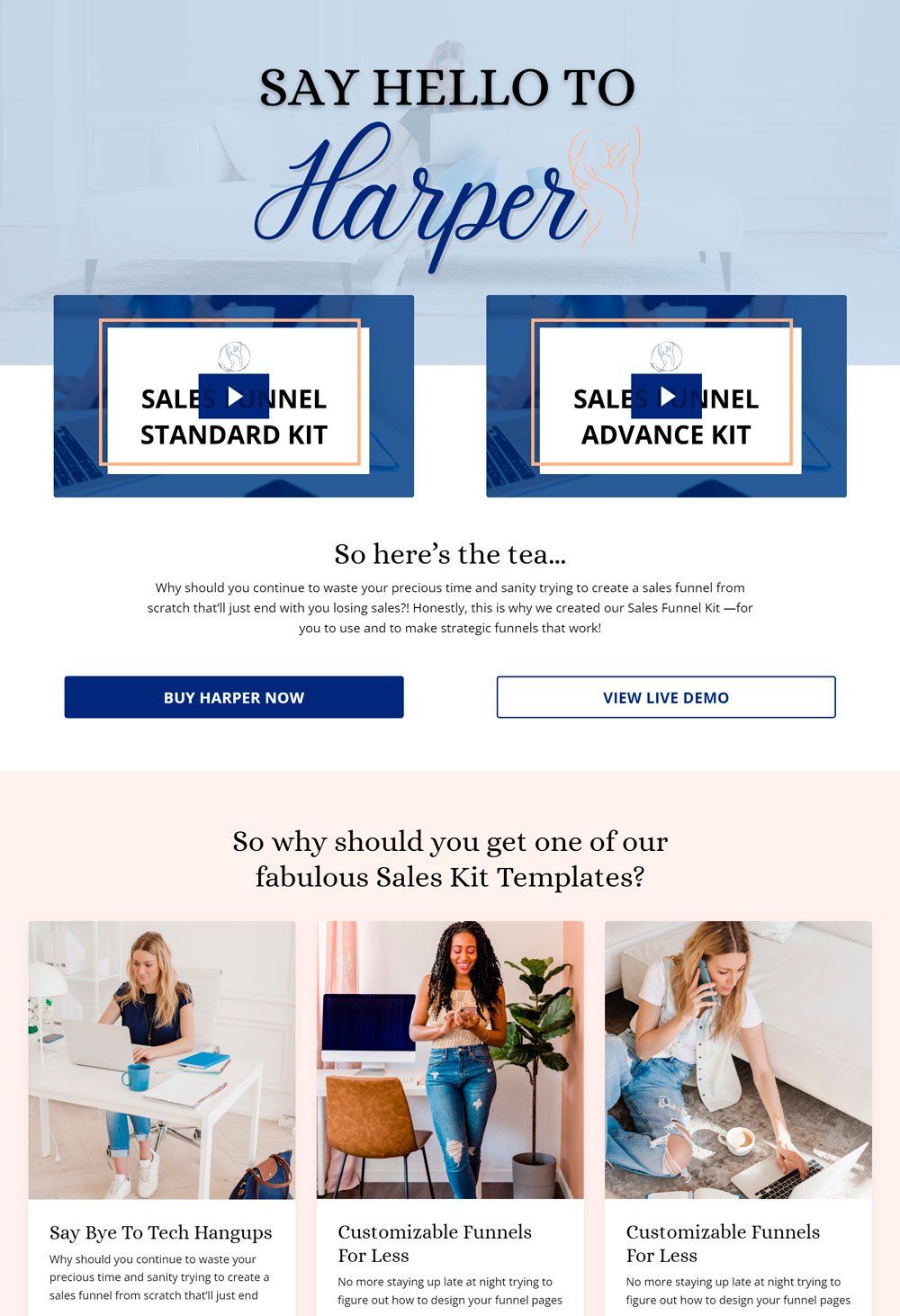
related article: 25+ Best Actors Website Template To Try Out!16. Harper

Harper has a beautifully designed sales page that follows all the marketing protocols to the letter; needless to say; it is also aesthetically pleasing. In addition, you will realize that it follows a problem-solving framework where the problem is highlighted, and then the solutions are provided.
What it did wellGreat Testimonials: Harper gives a lot of room for long-form testimonials, which are more effective in some scenarios. Doing this creates social proof and informs the potential buyer that your product works.
Visuals: Harper also makes good use of visuals. Images are placed at strategic places.
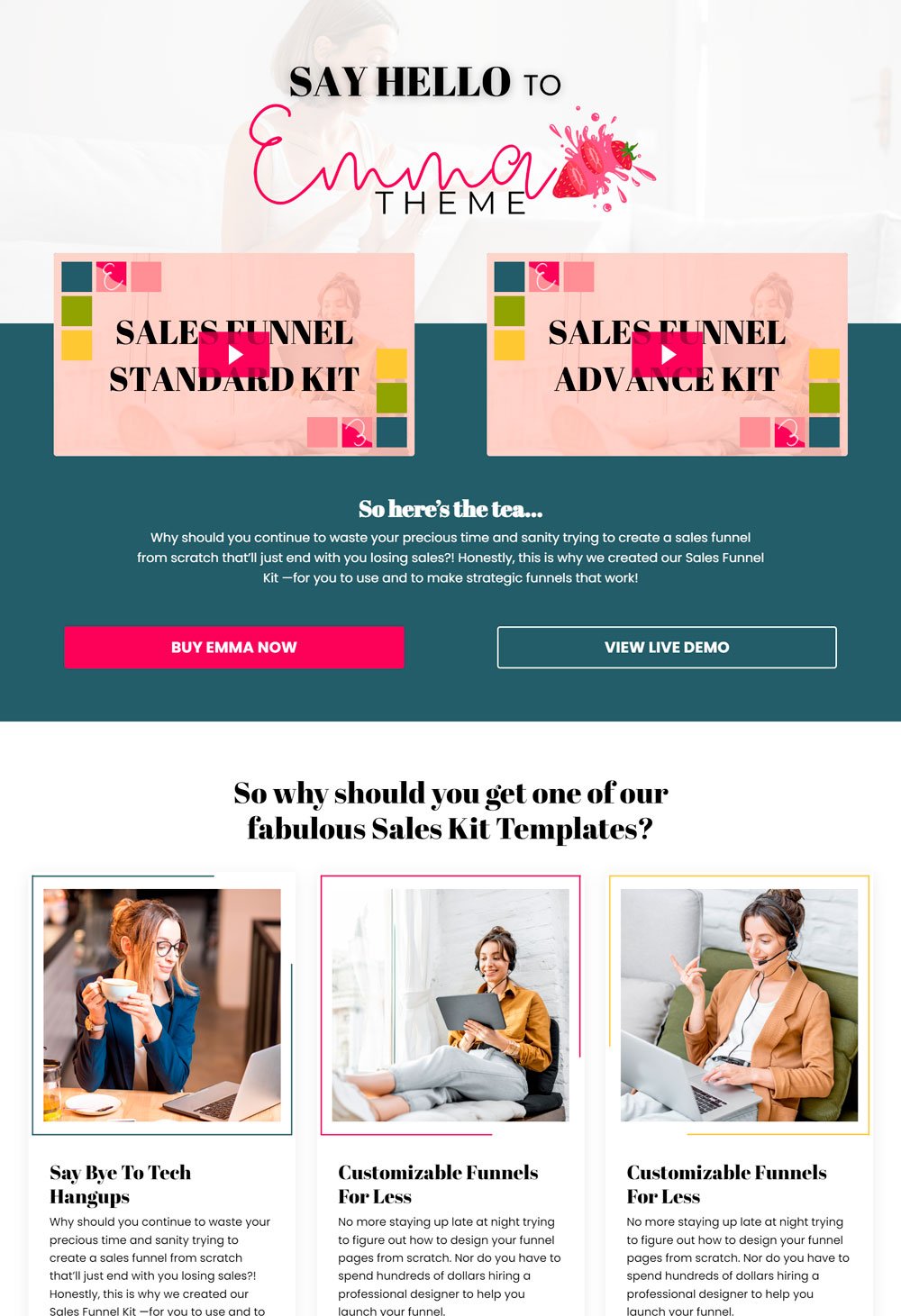
related article: 31+ Best Interior Designer Website Templates (Simple, But Gorgeous)17. Emma

Emma is another beautifully designed website with a sales page included. The sales page is thoughtfully designed and has all the right elements that lead to high conversion rates.
What it did wellCTA buttons: Emma has strategically placed Cta buttons that ensure that a buyer takes action before leaving the page. These CTA buttons are also well-designed to be visible.
Clear Sections: Another thing worth mentioning on Emma's sales page is the clear distinction between sections. You know what each section stands for with the designs and contrasting colors.
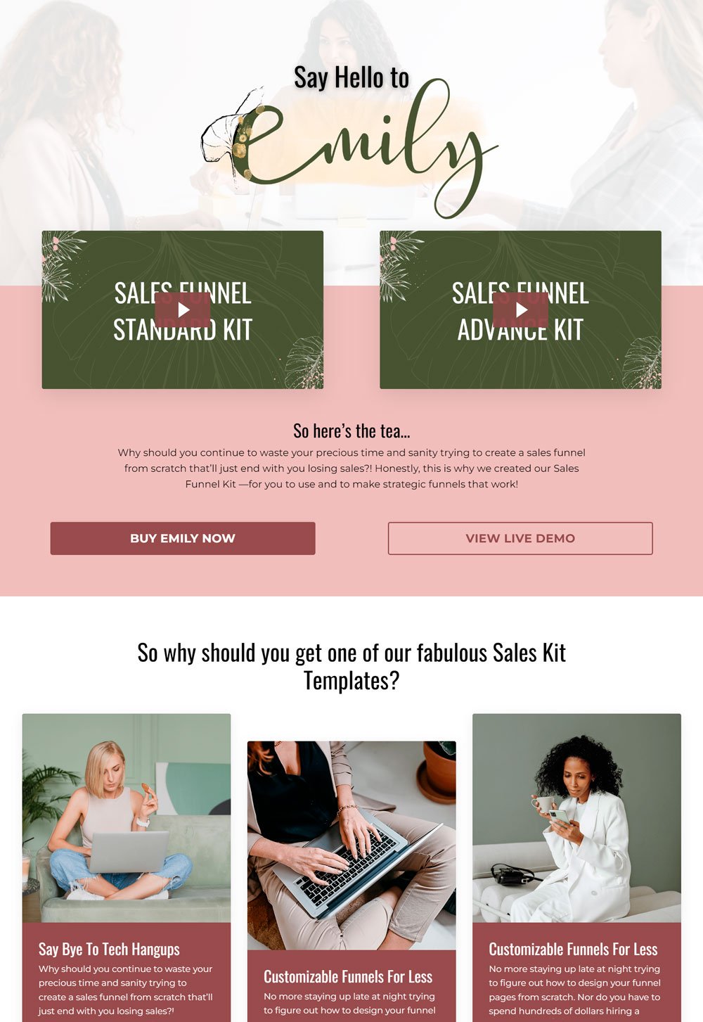
18. Emily

Another sales page template coming your way is Emily. Emily was designed for course creators and consultants, but can pass for any product. The use of colors and font sizes makes it aesthetically pleasing.
What It Did WellMoney Back Guarantee: Sometimes, what a buyer need is a refund option, even though it is rarely used, except if the product is quite bad. They need something to reassure them that the product will not waste their money. So, a Money Back Guarantee is a great way to influence your buyers' decisions.
FAQs: Answer all the pending questions your customers may have before it negatively impacts their choice. A FAQ section is one important section that a long-form sales page should have.
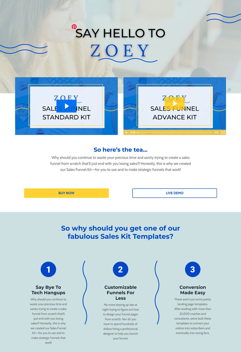
related article: How To Create A Website With Canva ( Step By Step Tutorial )19. Zoey

I love the way Zoey keeps everything clean and straight to the point. The sales page takes the bull by the horn and explains why you need the product.
What It Did WellCTA buttons: Zoey has clear call-to-action buttons in strategic areas. Your buyer will always know what to do, no matter where they are on the page.
Great Use Of Visuals: One last thing to note is the strategic use of visuals around the sales page. Wherever you turn, there is a nice image aiding the content you are reading.
related article: Website Copy Template: How To Write Effective Web Copy That Converts17+ Templates At Your Beck And Call
There are 17+ sales page templates you can purchase on Squarespace or Kajabi. But, of course, nothing is stopping your product from selling. Fortunately, these two platforms come with full customization options, so you can make necessary changes to fit your need.
If you are interested in building a sales funnel with Squarespace, then check out how to build a landing page with Squarespace and the best practices to observe!
