
Homepage Website Checklist for Coaches: What to Include
Your homepage is doing way more than saying “hi.”
It’s quietly (or not-so-quietly) convincing someone to stick around, trust you, and maybe even book that call.
And if you’re a coach? That first scroll really matters.
You don’t need fluff—you need clarity. Connection. And a layout that guides people where they actually need to go. This guide breaks down what to include so your homepage does its job—without the guesswork. See real Squarespace website examples for coaches.
Why the Homepage Matters More Than You Think
When someone lands on your site, you’ve got seconds—not minutes—to make them care. That means your homepage needs to do more than look “professional.” It needs to:
Build trust at first glance
Clearly communicate what you offer
Guide visitors toward action (without overwhelming them)
Load fast and look great on mobile
Be easy to navigate—even when someone’s distracted and scrolling from the school pickup line
It’s a tall order. But it’s doable when you’re intentional.
The Non-Negotiables: What Every Coaching Homepage Must Include
This isn’t about ticking boxes. It’s about building a flow that feels effortless to the visitor. And when that happens? They’re more likely to stick around, book a call, or sign up for your list.
Let’s walk through each must-have section—with examples and best practices for Squarespace users.
1. Clear Value Proposition (Don’t Make Me Guess)
What it is: Your elevator pitch, above the fold.
Why it matters: People need to know—immediately—that they’re in the right place.
Do this:
Write a headline and subheadline that answers these three questions:
Who do you help?
What do you help them achieve?
How is your approach different?
Example:
“Helping overwhelmed entrepreneurs find clarity, structure, and confidence through 1:1 coaching and practical planning tools.”
📌 Bonus tip: If you're using a Squarespace custom design, choose a layout that lets your headline breathe—don’t cram it in a carousel or on top of a busy image. Your About page is a great place to echo and expand on this.
2. Professional Branding That Feels Like You
What it is: Your logo, fonts, colors, and vibe.
Why it matters: People decide how they feel about your business before they even read a word.
Do this:
Use your logo consistently in the header.
Stick to 2–3 core brand colors.
Choose one headline font and one body font—and use them everywhere.
This is where templates can help you fast-track a clean, consistent look. Browse these pre-made Squarespace templates if you're not ready for a full custom design.
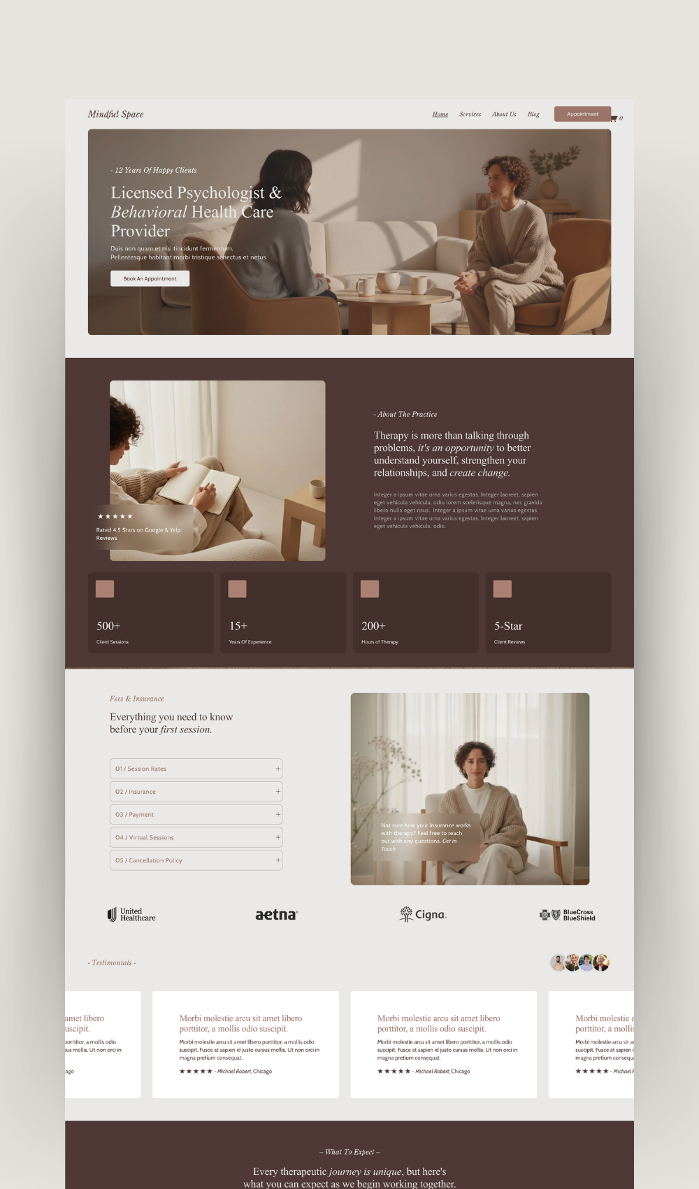
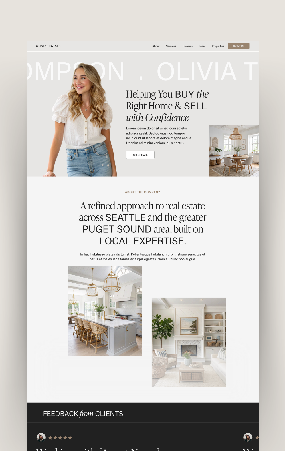
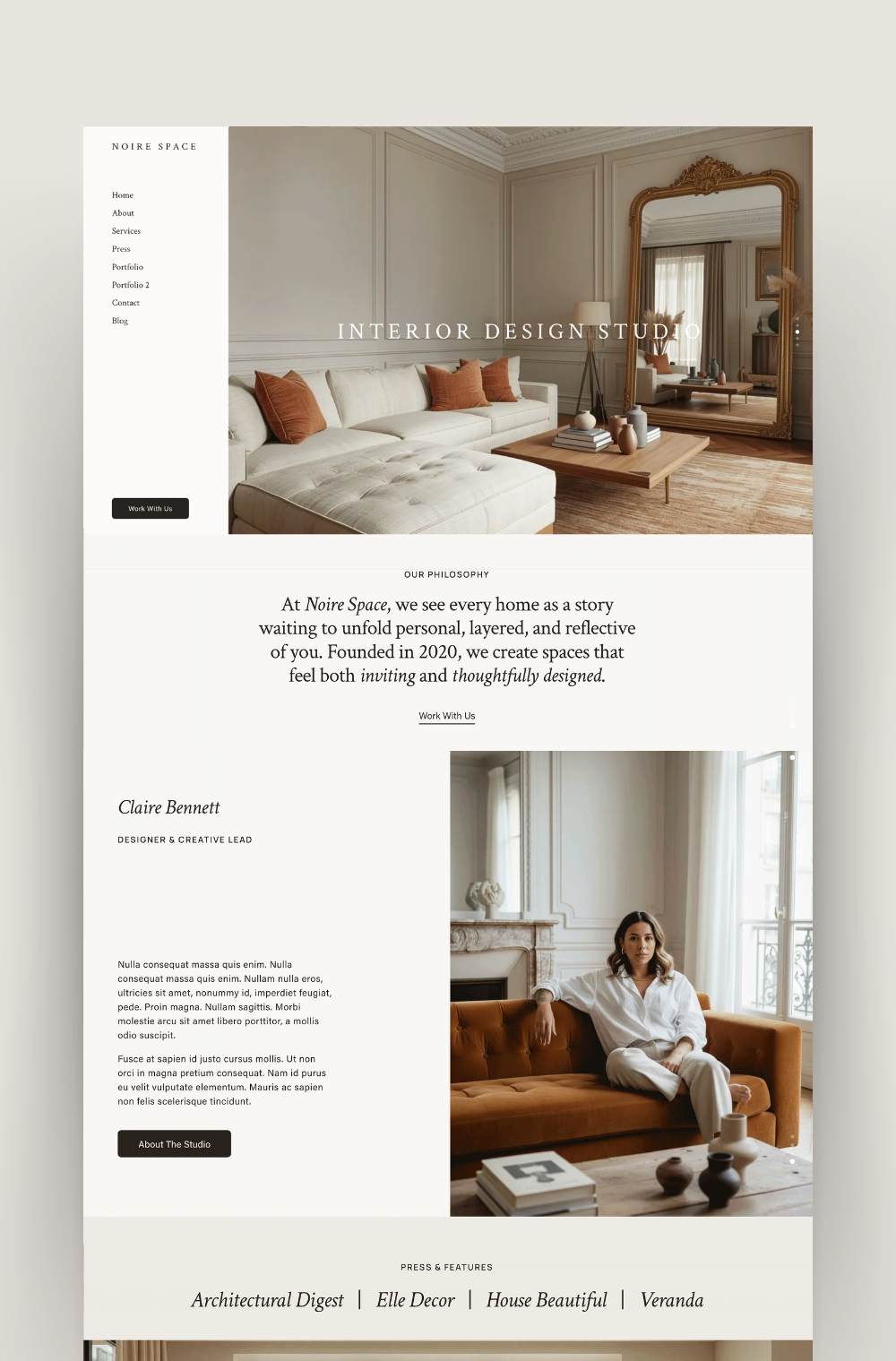
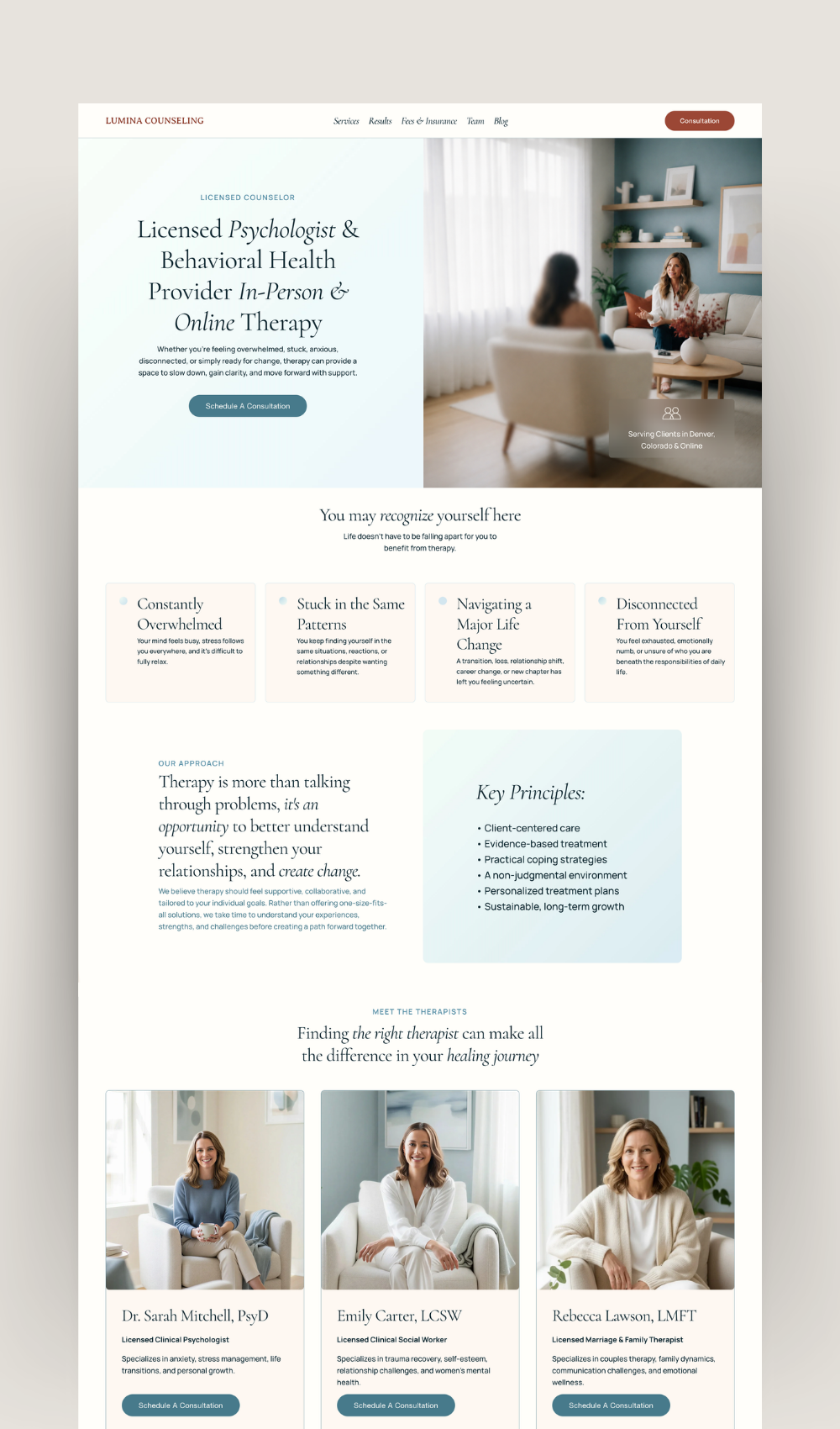
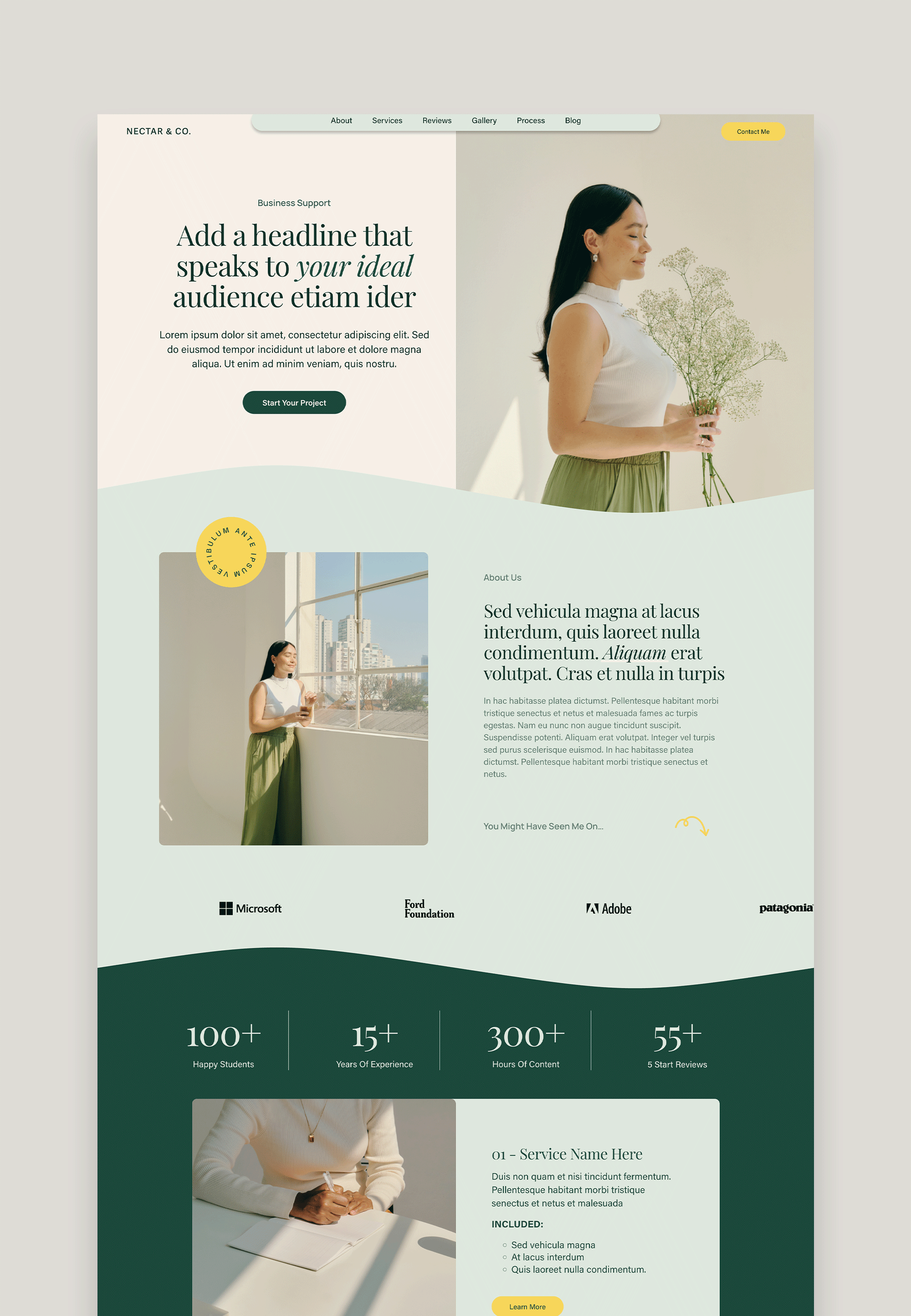

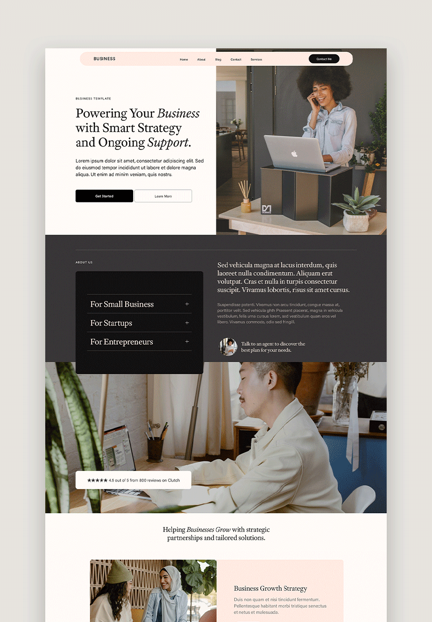
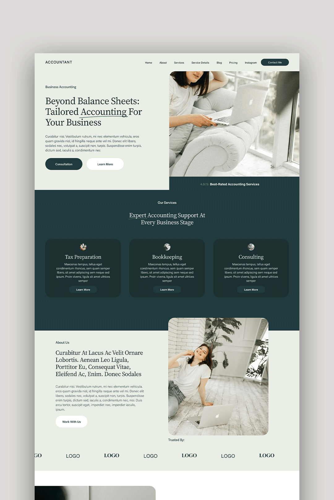
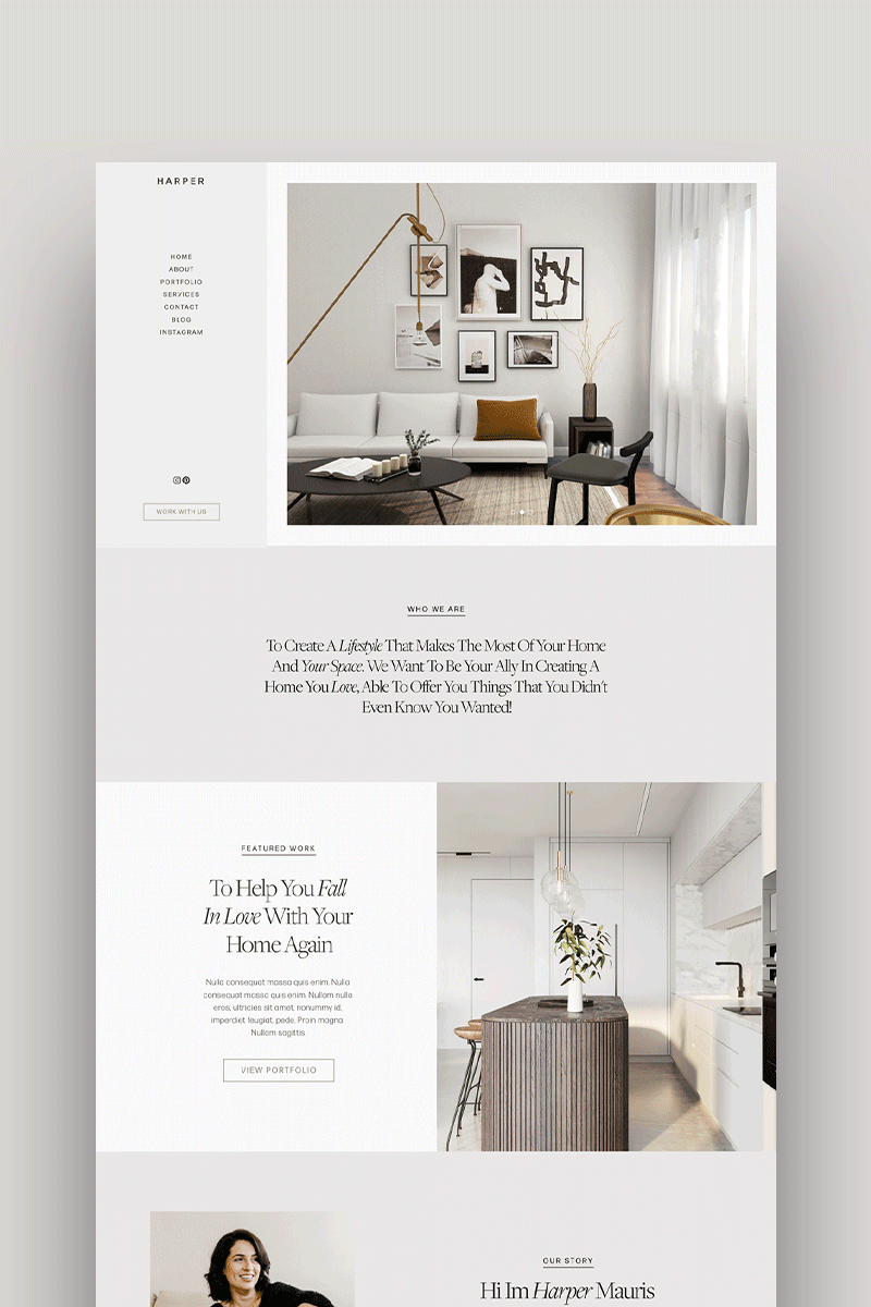
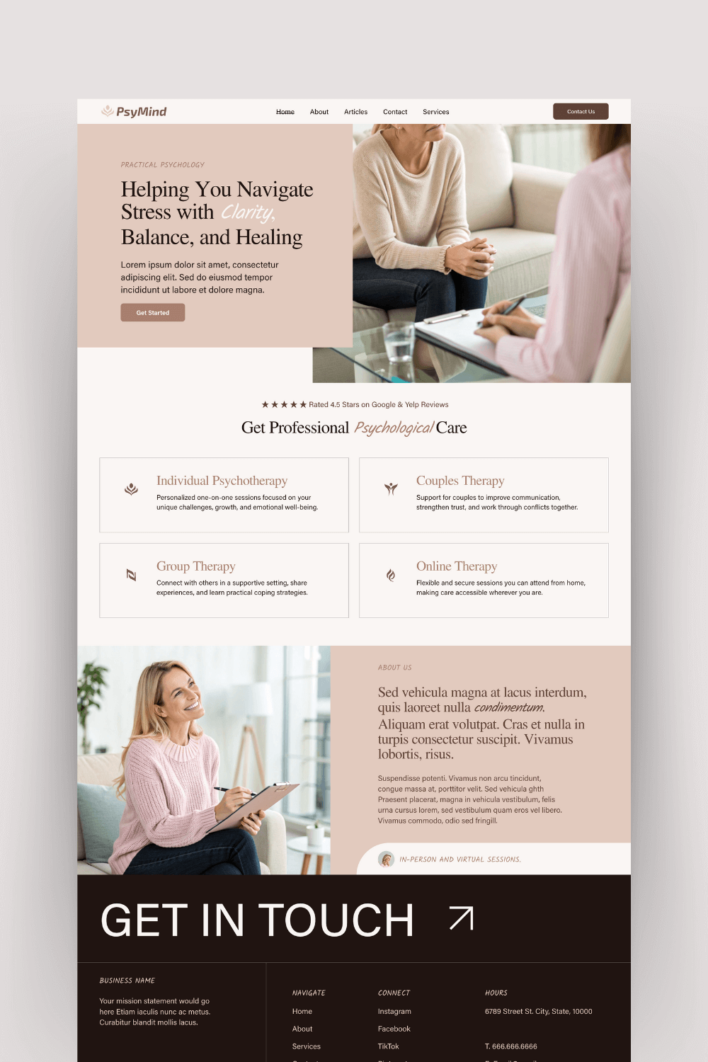
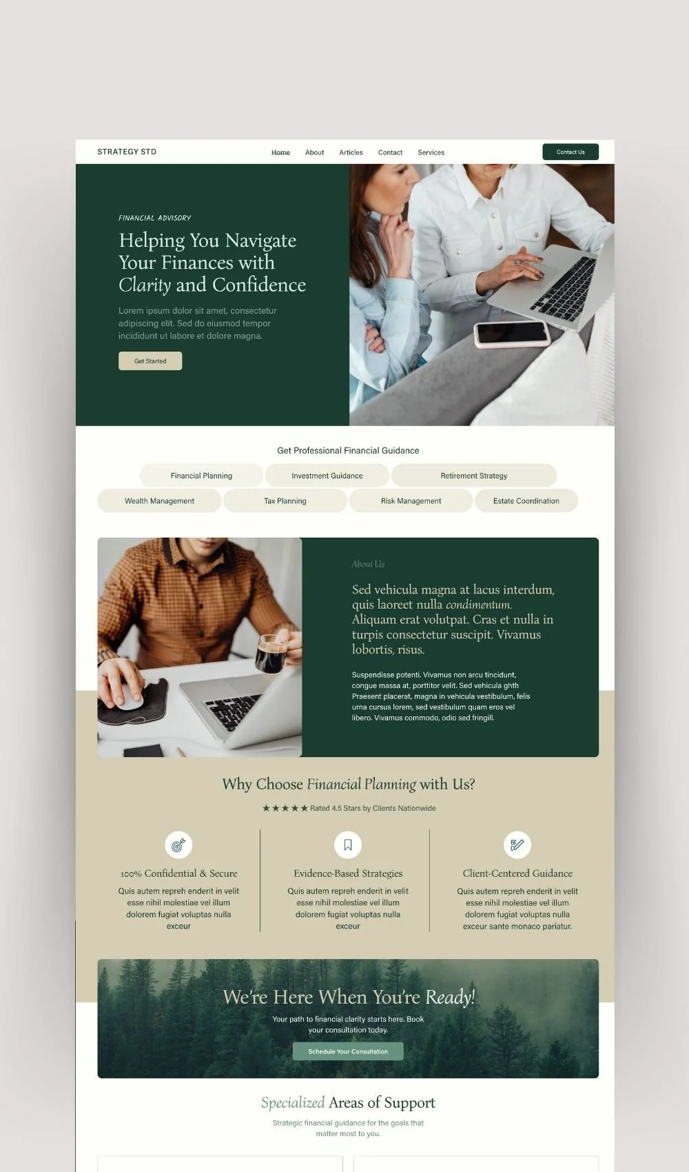
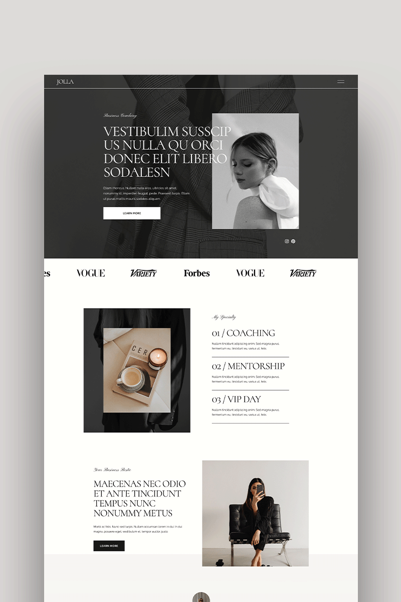

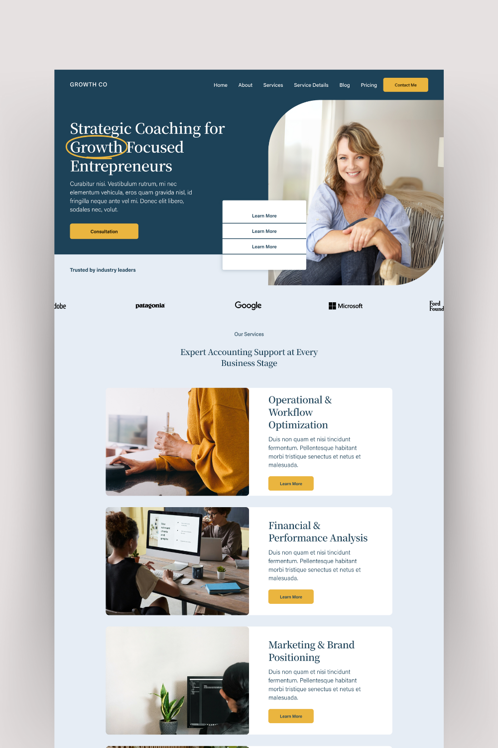
3. High-Quality Hero Image or Video
What it is: The first visual your visitor sees.
Why it matters: Images shape emotions. Emotions shape decisions.
Do this:
Use a crisp, well-lit photo of you looking confident and relaxed.
If you're camera-shy, choose a brand-aligned stock photo (just skip the cliché keyboard + coffee mug combo).
Videos? Keep them short, friendly, and autoplay off.
Tip: Avoid over-editing or overly posed shots. You're building trust, not selling perfume.
4. Primary Call-to-Action (CTA) That Doesn’t Get Ignored
What it is: A button with a purpose.
Why it matters: You’ve got attention—now give it a direction.
Do this:
Place your CTA button above the fold.
Use direct, benefit-driven language. (“Book Your Free Strategy Call,” not just “Learn More.”)
Make it visible in multiple places throughout the homepage.
And yes, link it to a dedicated consultation booking page with clear info and easy scheduling. Link it to your consultation booking page or services for a seamless path.
5. Brief About Section (Real Photo. Real Voice.)
What it is: A short intro about you.
Why it matters: Coaching is personal. People buy into people.
Do this:
Add a friendly photo of yourself (no need for a stiff headshot—just look approachable).
Write 2–3 sentences about what you do, who you help, and why you care.
Link to your full About page so they can read more if they’re interested.
Think of this as a handshake—not a TED Talk.
6. Overview of Your Coaching Services or Offers
What it is: A snapshot of what you sell.
Why it matters: Clarity converts. If people don’t understand what you do, they won’t take the next step.
Do this:
List 2–4 core offers or coaching programs.
Use short descriptions with icons or visuals for quick scanning.
Link each one to its own service page.
Keep it light here. Don’t overwhelm people with pricing tables or dense descriptions. Save that for later clicks.
7. Social Proof That Shows It’s Not Just You Saying It
What it is: Testimonials, logos, or stats.
Why it matters: Trust isn’t given. It’s earned—and proven.
Do this:
Choose 2–3 powerful testimonials that focus on results.
If applicable, show recognizable client logos or key stats (“100+ clients served,” “95% client retention”).
Format them in a clean, carousel or stacked layout.
Need help displaying testimonials beautifully? This article on Squarespace testimonials has design tips you can use right away.
8. Clear Navigation Menu (Yes, Even on Mobile)
What it is: The menu bar at the top of your site.
Why it matters: A confusing navigation = lost leads. People won’t search for what’s not obvious.
Do this:
Include essential links: About, Services, Blog (optional), Contact.
Keep the number of menu items between 4–6 max.
Use clear labels—no cutesy names like “The Journey” when you really mean “About Me.”
On mobile? Use a sticky header so the menu is always accessible when scrolling. Bonus points if your CTA (like “Book a Call”) is highlighted in the nav bar. My Homepage Checklist breaks it down section by section.
9. Lead Magnet or Email Signup That Feels Like a Gift
What it is: A freebie that grows your list.
Why it matters: Most people won’t book a call on their first visit—but they might sign up if you offer something helpful.
Do this:
Offer a lead magnet that solves a specific problem (e.g., “The Clarity Workbook for New Coaches”).
Add the signup form to a high-visibility spot: mid-page or just before the footer.
Use simple fields—first name and email is enough.
💡 Pro tip: Squarespace integrates with email tools like Mailchimp or Flodesk, so set up automated welcome emails to deliver your freebie and keep in touch.
10. Featured Blog Posts or Free Resources
What it is: A small section that highlights helpful content.
Why it matters: Shows you're active, credible, and generous with knowledge.
Do this:
Display 2–3 featured posts with thumbnails and short descriptions.
Link to your coaching blog or resources page.
Focus on evergreen, relevant topics like “3 Signs You're Ready for a Coach” or “How to Stay Accountable to Your Goals.”
Even if you’re not a big blogger, this section positions you as a resource—and that builds trust. No blog yet? Here’s why SEO blogging is non-negotiable for coaches.
11. Contact Info and Ways to Reach You
What it is: Buttons, forms, email, and social links.
Why it matters: If someone wants to talk to you, don’t make them dig.
Do this:
Use a “Contact” or “Let’s Connect” section toward the bottom of your homepage.
Include a direct CTA (e.g., “Reach Out to Ask a Question”).
Link to a separate Contact page with a form—or embed a simple form directly here.
📌 Also include:
Social media links
Optional live chat tool if you offer real-time messaging
Your calendar link if you use something like Calendly or Acuity (which integrates beautifully with Squarespace)
12. Mobile Optimization That Isn’t Just a Checkbox
What it is: Making sure your homepage looks great on all devices.
Why it matters: Over 60% of your traffic is probably mobile. If your buttons are too small or your site’s slow to load? They’re gone.
Do this:
Use Squarespace’s mobile editor to preview and adjust each section.
Check padding, image sizing, and button spacing on mobile view.
Avoid overlapping elements or overly wide headers that get cut off.
And don’t forget: load speed matters. Compress your images, reduce video file sizes, and avoid too many animations that slow things down.
13. SEO Essentials (So People Actually Find You)
What it is: Strategic search engine optimization across your homepage.
Why it matters: A beautiful homepage no one can find… won’t do much for your business.
Do this:
Add keywords to your H1 and H2 headlines.
Write a compelling meta description using your core keywords (keep it under 160 characters).
Use alt text on all images—describe what’s in the photo and tie it to your topic.
Compress images and avoid slow-loading elements.
Use Squarespace’s SEO settings to update page titles and URLs.
Need help? I’ve written a full guide on Squarespace SEO for Coaches with step-by-step help.
14. Optional: Embed a Short Welcome Video
What it is: A short 1–2 minute video introducing yourself.
Why it matters: Video creates a deeper connection—and visitors get a sense of your voice, energy, and coaching style.
Do this:
Keep it casual. Don’t worry about being “perfect.”
Smile, introduce yourself, say who you help, and invite them to take action.
Host on Vimeo or YouTube and embed using a clean player style.
You don’t need a video, but if you're good on camera, this can fast-track the trust-building process.
15. Strategic Use of White Space and Design Flow
What it is: The breathing room between elements on your homepage.
Why it matters: Cluttered pages confuse the eye. White space gives your content room to shine.
Do this:
Use padding generously around each section.
Break up long chunks of text with headlines, bullets, or visuals.
Don’t cram too much “above the fold.” Let the scroll tell a story.
If you want to see how real coaches use this strategy, browse my Squarespace Website Design Portfolio to see examples of spacing, flow, and clarity in action.
Homepage Mistakes Coaches Should Avoid (Seriously—Don’t Do These)
Let’s be real. Even the most well-meaning coach can unintentionally sabotage their homepage.
Here are the common pitfalls I see all the time—and how to fix them:
Overwhelming Visitors With Too Much Info
The Fix: Keep copy concise. Guide visitors with one clear CTA per section. You can always expand on deeper pages.
Using Vague Headlines Like “Welcome” or “Empower Your Life”
The Fix: Get specific. Tell me who you help and how. Generic phrases don’t convert.
No Clear CTA (or Way Too Many)
The Fix: Choose one main goal per page (e.g., book a call, download a freebie). Everything else supports that goal.
Poor Image Quality
The Fix: Use professional photos or high-quality stock that reflects your energy and audience. Blurry, cluttered, or off-brand visuals break trust.
Forgetting to Test Mobile View
The Fix: After every change, preview your homepage on mobile. What looks great on desktop might look messy on a phone.
Your Homepage Checklist
Here’s a recap of everything we’ve covered, so you can audit your own homepage or plan your next launch:
| Element | Purpose | Quick Reminder |
|---|---|---|
| Value Proposition | Clarify who you help and how | Clear headline + subheadline |
| Branding | Build trust and recognition | Consistent logo, fonts, and colors |
| Hero Image/Video | Create connection | High-quality visuals that match your brand |
| CTA | Drive conversions | One strong button, above the fold |
| About Section | Build rapport | Real photo + 2–3 sentence intro |
| Services Overview | Explain what you offer | Icons, short blurbs, links to deeper pages |
| Social Proof | Establish credibility | Testimonials, stats, or logos |
| Navigation Menu | Improve usability | Keep it simple and obvious |
| Lead Magnet/Signup | Grow your email list | Irresistible freebie + visible form |
| Blog/Resources | Show expertise | Feature 2–3 helpful posts |
| Contact Info/Chat | Open connection | Make it easy to get in touch |
| Mobile Optimization | Keep visitors engaged | Test spacing, font sizes, and load speed |
| SEO | Boost search visibility | Optimize keywords, titles, images, meta info |
| Optional Video | Deepen connection | 1–2 minutes max, hosted externally |
| White Space & Flow | Guide attention | Use clean layout, break up sections thoughtfully |
Should You Use a Template or Go Custom?
If you’re building your homepage on Squarespace (smart choice), you’ve got two great paths:
1. Use a Done-for-You Template
Perfect if you:
Are just getting started
Want a beautiful layout fast
Don’t have the budget (yet) for custom
Templates like Chloe, Jolla, and Sophia are designed specifically for coaches. You just plug in your content, hit publish, and go.
2. Invest in Custom Website Design
Ideal if you:
Are growing fast and need a tailored experience
Want something completely unique to your brand
Prefer to hand off the tech and strategy to an expert
Need a good Squarespace website designer for coaches? I help coaches like you launch custom Squarespace sites in just 5 days—explore my custom design services to learn more.
What to Do Next
Here’s how to put this into action:
Audit your homepage using the checklist above
Identify 2–3 quick wins you can tackle this week
Decide whether a template or custom design is right for your next move
If you're not sure where to start, book a free consultation—I'd love to hear about your goals
One Last Thing...
Your homepage doesn’t need to be perfect. But it does need to be clear, confident, and aligned with how you want to serve.
And if you’re second-guessing your layout, stuck in DIY overwhelm, or tired of starting from scratch, just know—you don’t have to figure it out alone.
Whether you start with a Squarespace template or build something completely custom, you’ve got options. And I’ve got your back.