
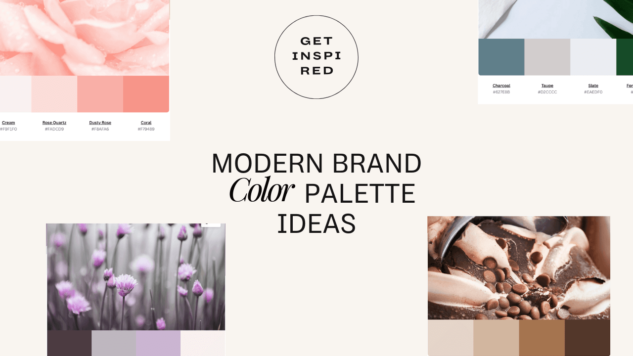
35+ Modern Color Palette Ideas for your Brand. Get Inspired. (2022)
If you are searching for modern brand color palette color inspiration, you are in the right place. Below you can find a collection of beautiful colors for your next project.
Just scroll through the collection below and copy the hex codes to try them in your designs.
You can also head over to Canva Color Wheel to create your color gallery.
Color Wheel To Help You Choose Your Colors

The Canva Color Wheel is a new color-hexagon tool, which allows you to easily create or find the perfect colors. Simply place each color hexagon on Canva's color wheel and adjust it until they form your desired tone. Now you have an actual picture that helps you choose colors and can be used anywhere, such as in your designs, social media posts and more!
While it’s great to select the colors you enjoy for your brand, more important is that they appeal to your target audience. To discover how color can help your brand communicate with your audience.
RELATED ARTICLE: 47 BEST ART DECO FONTS FOR ANY CREATIVE PROJECTS
Brand Identity Color Palette Ideas
Sometimes it is really hard to pick a color palette for your brand identity. And that's only because there are so many awesome palettes out there to choose from. Now what's more awesome about this post is we are going to solve that problem. How? By looking at some stellar examples of brand identity color palettes, you can use as inspiration.
1.Maroon Color Palette.
Maroon is a primary dark red color, named after the French word maroon, meaning "brown". It is also a deep shade of red. Maroon often appears similar to burgundy or brown, but it is not identical in color to either. In fact, there is no fixed color that can be called maroon and all common definitions of the word refer to shades of red rather than shades of brown.

2. Vintage Color Palette.
Green is a color of growth rising out of rich earth, the hint of new leaves, the freshness, and hope of the first warm days in spring. Whether you're looking for inspiration or simply trying to inject some life into your home, this green palette will surely do the trick.

3. Orange Color Palette.
The Orange color palette combines the vibrancy of orange and yellow with the softness of light gray, resulting in a fashionable look that is great for interiors. The bold, bright hues that come from this palette will instantly liven up any space, no matter how small it is.

After settling on your business name, fonts, and color schemes for your brand, its time to make a website. But where do you start? Worry not - we've rounded up all the best places to find beautiful templates that can help you build a stunning website in no time. Check out these 14+ Premium Squarespace Templates Shop For Any Business.
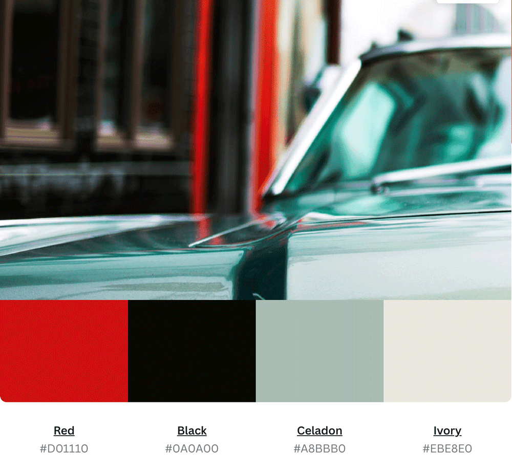
4. Red Color Palette.
Red is a bold, intense and energetic color that can have extreme emotional reactions. It is hot and active and vibrates rapidly. red stimulates the appetite and can promote higher levels of energy. It can be used to enhance creativity and sexual desire.
5. Black Color Palette.
Black is the color of mystery and magic, an unsung hero in the world of color. At once bold, sophisticated and clean, Black has the ability to make a statement without saying a word. The darkness of this hue evokes mystery, romance, and style.

6. Purple Color Palette.
Purple has been around for centuries, but its popularity is still going strong. Combine this vibrant hue with a soft gray or white to give your room a calm, relaxing feel. Purple is a bold and beautiful color. When used in web design, it creates a sense of luxury and sophistication.

7. Blue Grey Color Palette.
The blue gray color palette is a popular color scheme used in many different types of design. The palette uses cool hues that are easy on the eyes. The subtle blend between warm and cool tones creates a space that's both relaxing and inspiring.

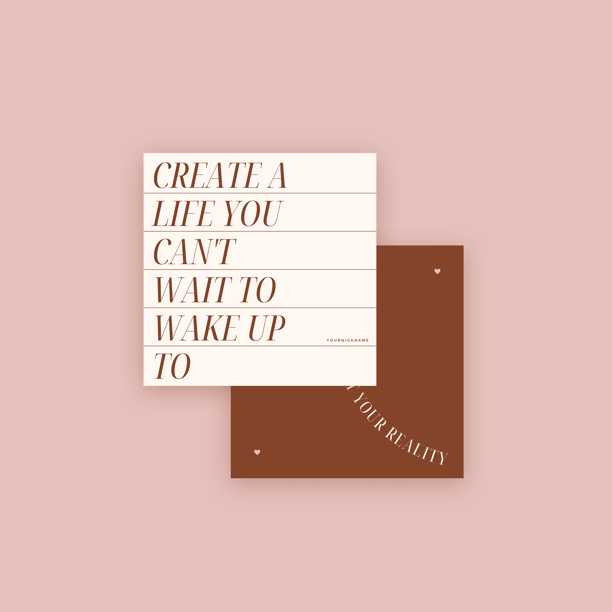
8. Burgundy Color Palette.
This color palette is bold and dramatic, with layers of rich hues. The base brings a more neutral tone, with warmed notes that include umber brown and berry accents for depth. A fierce pop of red adds a bit of drama and exuberance to the mix, while browns add warmth and balance.

We make it simple for anyone to create beautiful social media templates.


9. Brown Color Palette
Brown can be described as a beautifully earthy color that comes from brown soil, tree bark, and many other natural materials. The color itself is hundreds of shades, ranging from light tan to deep chocolate brown. This color palette, it's supposed to create a feeling of calmness and balance.
You'll love these color palettes! These palettes are so beautiful that you'll want to linger, live and dream in them. You will love how beautiful these color combinations are 30+ Luxurious Color Palettes To Inspire Your Branding with you all.
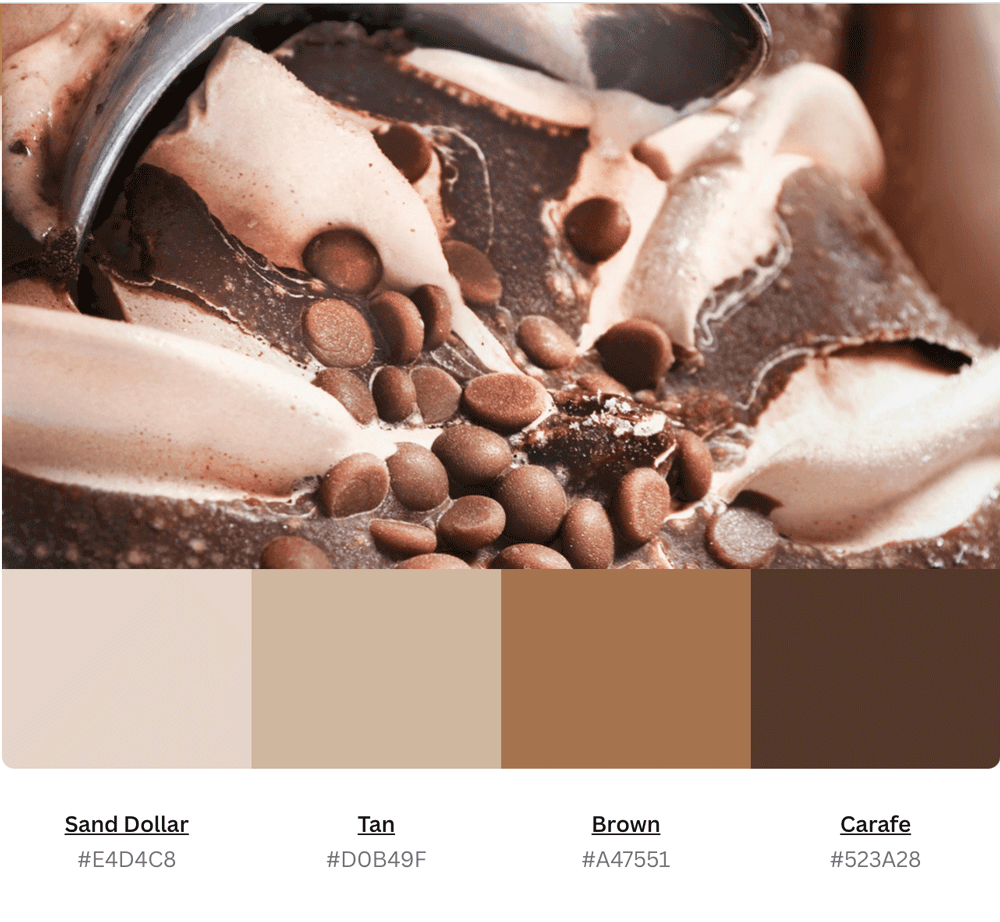
10. Ice Cream color combination
It's like the vanilla ice cream of color schemes, but with more character and richness. This mix of tan, cream, beige and light brown has a kind of timeless vintage feel which makes it popular right now, but also makes it perfect for using in projects that need to look professional and sophisticated.

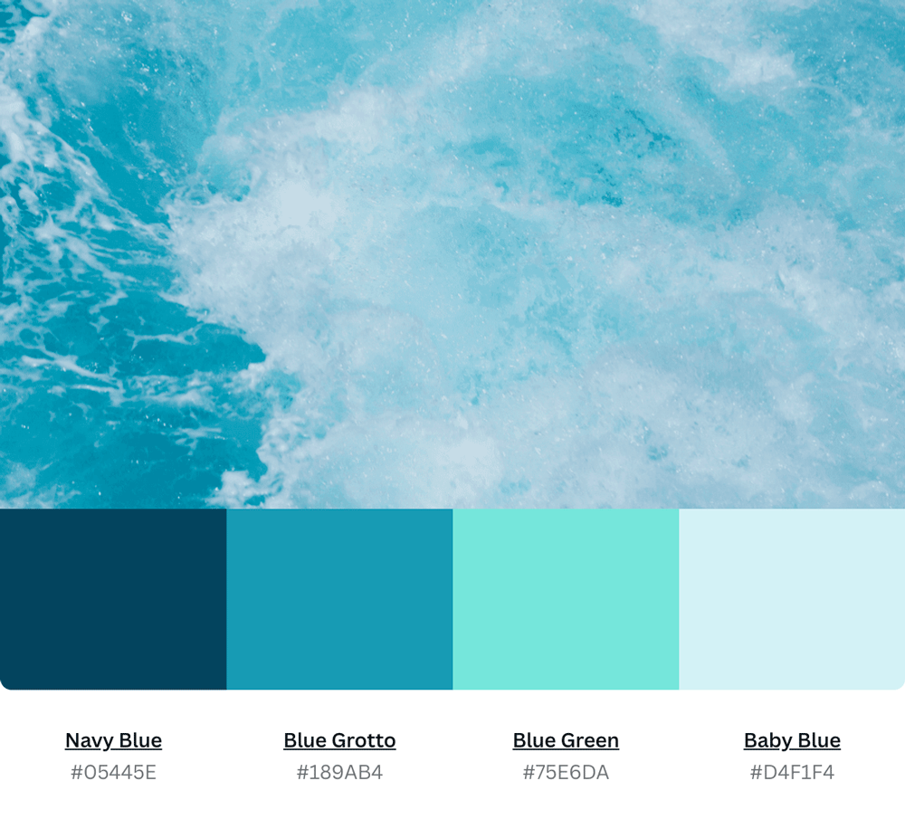
11. Blue Green Color Palette.
Blue Green Palette for graphic design and branding inspiration. From the subtle tone of blue-green to the saturated gradients of aqua green and sea foam, this color palette pays homage to the cool oceanic hues found far beneath the surface of the sea.
12. Ocean Threads color combination
Ocean Threads is a new bright and fun color palette that can be used in a variety of applications: print, web, design. Ocean Threads is an original combination of aquatic blues, tropical greens and crisp white. These tones have been carefully selected to create harmony between your designs while keeping the focus on your message.
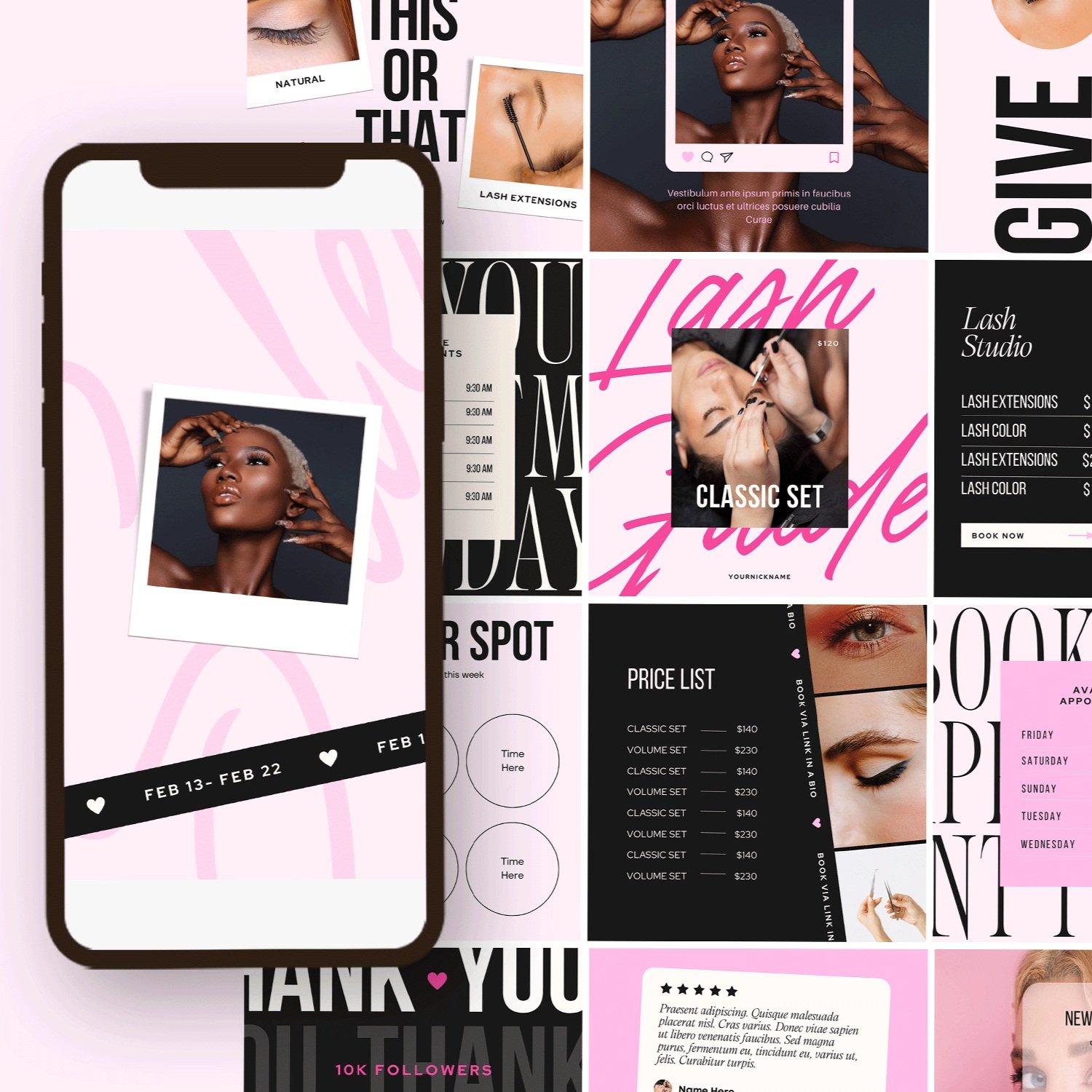
13. Rose color combination
With 4 tones of pink and purple, this palette is ideal for creating romantic designs and branding for weddings, passion projects and other feminine endeavors. From soft pinks to deep hues of berry, our color experts selected the most flattering hues to work together in harmony on your next project.

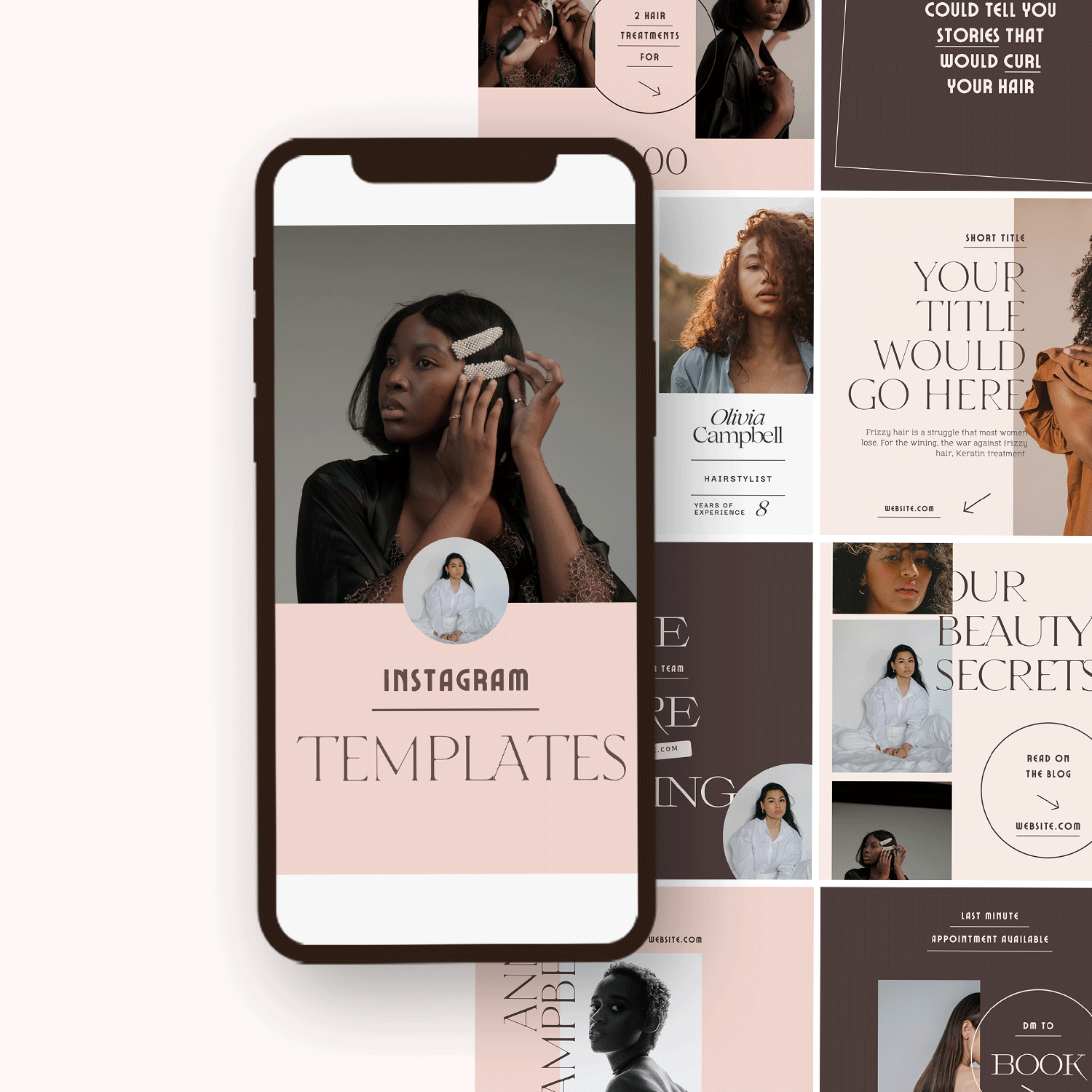
14. Chocolate color combination
Chocolate color is a combination of dark orange, red, brown and black. It is the color that most people associated with chocolate, which brings a sense of warmth and happiness. Chocolate color is also associated with sweetness and comfort because it makes us think of hot chocolate or melted brownie. This combination is also very stylish and popular for graphic design in the digital era today.

15. Pink Right color combination
In this design the most common color scheme, pink and brown, is used. The combination of pink and brown makes the design aesthetically fresh, beautiful and a vibrant one. The use of this color combination is ideal for any type of product that you want to promote, like food, as it has an appetite stimulating effect or something appropriate for a particular event or occasion.

16. Green color combination
The grassy hue of the mid-tone green blends perfectly with darker shades, making this color combination perfect for designs that need to 'pop'. Pair it with bright oranges, reds, and yellows to create a vibrant summer look, or use neutral shades like white, gray and black to bring out the softness in your design.

17. Pink & blue color combination
Pink & blue color combination is the go-to choice for graphic designers. The two basic color schemes can help you create a modern and chic look in your business. The combination of pink and blue has been used over many years because of its versatility to produce almost unlimited number of shades.

18. white Gray color combination
The most popular shade is white, but if you don’t want to go all out, then gray is a good international color choice. It’s a common neutral that works well with a variety of colors and can also stand alone. Try pairing it with metallic accents for a sophisticated look that doesn’t feel too contemporary.

19. Teal & Coral color combination
Coral and teal is a fresh palette that combines the brashness of coral with the serenity of teal. This color combination is playful yet sophisticated, perfect for those who feel their personality lay somewhere between the two.

20. Cream & Beige color combination
The color combination of beige and cream is a win-win pair for any graphic design. The beige color is associated with warmth, cleanliness, tenderness, kindness and affection. This color may look boring, but if paired with the right shade of brown or tan, you could get a beautiful effect to your design.

21. Charcoal color combination
Charcoal is a color with many different meanings. It can be associated with elegance and sophistication, or it can be used to evoke feelings of warmth and comfort. This color scheme is perfect for any graphic design project that you want to portray as sophisticated and tasteful.

22. Light Blue Color Palette.
The color combination of light blue and dark blue is a good choice, since they are both cool colors. A predominantly dark background would create a strong contrast, while light backgrounds will require more skill in balancing and harmony.

23. red Rose Color Palette
A combination of red and pink with natural off-white color which is inspired by the nature. The vibrant color conveys feelings of warmth, romance, elegance and vitality. What's more, this color can also have negative effects. The red rose color also suggests eroticism.

24. peach color combination
Peach is a color that makes users feel warm and comfortable. The tone of peach pink is lower than that of other reds, so it's perfect for showing warmth and softness. The rose from the wallpaper is more beautiful with the addition of peach. Peach rose in this design feels natural and elegant, which can be used for various occasions.

25. Rosewater color combination
Rosewater is a soft and romantic combination of rose and watercolor pigments. You can combine this color with others in the Rosewater color family or mix it with beiges and whites to create great foundations for card making, scrapbooking and any other paper arts projects.

26. Charcoal & Peach color combination
Charcoal and Peach make for a classic color combination that you'll love to use in any design. Whether you're planning out a new logo or looking for inspiration, this trendy gray and peach combination is great for adding feminine details to designs of all kinds. These two colors pair perfectly with shades of green, blue, and purple, so we encourage you to experiment with them and see what else you can come up with!

27. Rose Nude Color Combination
Rose Nude provides a calming and peaceful appearance that could be used in a wide variety of situations. This color scheme has been designed to help you visualize the potential of your website, key business message or branding campaign.

28. Beige Salmon Color Combination
The Beige Salmon color combination is a good choice when you want to go for something safe and subtle. Beige is a relaxing hue, while Salmon provides just the right amount of contrast. Together they're warm and friendly, creating a highly accessible composition. A great pick for whenever your message needs to be conveyed in a straightforward manner that's also visually pleasing.

29. Beige, Cream Color Combination
Beige and cream are perfect for earthy and elegant designs, or for creating calm environments. These classic tones complement each other well and work perfectly together when applied to a variety of design projects.

30. Orchid fuchsia Color Combination
The graceful fuchsia bouquet color combination makes for beautiful product branding. This harmonious hue combination guarantees that all products sold under this brand will look like a set and deliver a consistent message to the consumer.

31. Cream & Gold Color Combination
Gold and cream color combination has been used as a classic color palette, bringing warmth and a sense of sophistication. This combination provides an especially welcoming feel when used in creative ways like logos, packaging or home decorating.
32. Nude Ebony Color Combination
Nude Ebony is a beige color that brings out the warm tone of any design. It pairs well with whites and neutrals and is a great alternative if you don't go for the white. This combination features a beige tone with brown undertones that add-in warmth without making it feel overpowering or bright.

33. Nude Ebony Color Combination
The Nude Ebony color combination is a classic two-tone that features light and dark tones. The lighter top half of the logo is paired with a darker bottom half to create a subtle yet elegant effect that is easy on the eyes and great for both print and web.

34. White & coffee Color Combination
White & coffee color combination for branding is a very attractive and unique design that will be an immense plus to the modern corporate identity or business cards. As you see in these images, this is a style that can be used for many purposes—from restaurant and coffee shop identities to labels of gifts and souvenirs.

35. Champagne & Tan Color Combination
This Champagne & Tan color combination is perfect for creating a warm and inviting brand. Using Champagne as your primary color can help you create products and marketing materials with a luxurious feel, while Tan will help ground all of your elements so that they don't get too overpowering or distracting.

How to use brand color palette
Modern Brand Color Palette Ideas.
Ultimately, the best way to apply these ideas is to get creative. Create your own color scheme, or take inspiration from the ones above. Test out new hues to see how they look on your brand identity—but most importantly, have fun. Showing that visual personality and flair can be a great way to stand out from the crowd.
Looking for a unique website design for your business? Explore our Squarespace Web Design packages for a stunning website. Need to enhance your site's visibility? Our Squarespace SEO services are here to assist you. Curious about our work? Take a look at our Squarespace website designer portfolio for some inspiration!